In an era of information overload, the most powerful visual communication is often the most restrained. The single-letter logo—frequently referred to as a lettermark—has emerged as the gold standard for brands seeking to balance high-end sophistication with instant recognizability. By distilling a company’s identity into a solitary, carefully crafted character, designers are creating visual anchors that resonate across digital screens, product packaging, and global marketing campaigns.
The Evolution of Minimalist Branding
The history of the lettermark is rooted in the ancient tradition of the seal and the monogram. For centuries, royalty, artisans, and merchants used single characters to denote ownership and authenticity. However, the modern application of the single-letter logo serves a different, more strategic purpose: the "app-icon economy."
As consumers navigate an increasingly crowded digital landscape, brands must compete for attention in a space where pixels are precious. A complex, multi-layered logo often loses its clarity when shrunk to the size of a smartphone app icon or a browser favicon. Consequently, the trend has shifted toward "essentialism"—the philosophy that a design is not finished when there is nothing left to add, but when there is nothing left to take away.
Anatomy of a Successful Lettermark
Creating a successful single-letter logo is an exercise in surgical precision. Unlike wordmarks, which rely on the legibility of a full name, or pictorial logos, which use representational imagery, the single-letter logo must convey the "soul" of a brand through geometry, negative space, and typographic nuance.
1. Geometric Reduction
Designers often begin with a standard typeface and systematically dismantle it. By manipulating line weight, stroke endings, and the relationship between curves and corners, a letter is transformed from a static character into a dynamic symbol. For instance, in the collection of 50+ modern designs currently shaping the industry, many utilize "open space" to trick the eye into completing the letter, effectively turning the viewer into an active participant in the brand’s visual story.
2. The Power of Negative Space
Negative space is the secret weapon of the minimalist designer. By carving out shapes from within the letterform, designers can hide secondary messages or industry-relevant motifs without cluttering the silhouette. This requires a high degree of technical skill, as the design must remain legible at both billboard-scale and thumbnail-scale.
3. Chronology: From Sketch to Scalable Asset
The development of these logos follows a rigorous creative lifecycle:
- The Conceptual Phase: Designers generate rapid sketches, focusing solely on the "gesture" of the letter.
- The Template Test: Many professionals use industry-standard logo templates to test variations in layout, ensuring the letter feels balanced regardless of its orientation.
- Black-and-White Validation: Before a single color is applied, the logo must stand on its own in monochrome. If a design fails to communicate strength in black and white, it is considered fundamentally flawed.
- Color Integration: Once the form is set, color theory is applied to evoke specific psychological triggers—trust (blue), innovation (purple), or energy (red/orange).
Supporting Data: Why Less is More
Research into consumer branding consistently shows that simple, iconic designs are processed by the human brain significantly faster than complex illustrations. According to studies on visual retention, a single-letter mark—if executed with distinct geometric properties—is easier to store in long-term memory.
Furthermore, the logistical advantages are undeniable. A single-letter mark is:
- Easier to Embroider: Crucial for fashion and high-end apparel branding.
- Optimized for UI/UX: Perfect for responsive web design and mobile app interfaces.
- Cost-Effective: Simpler designs generally require less ink in traditional printing, making them more environmentally and economically sustainable for large-scale packaging.
Industry Perspectives: The Designer’s Role
Prominent logo designers, such as Shaud Pantho, Sumon Yousuf, and the team at Pixasquare, emphasize that the "letter" is merely the starting point. The true artistry lies in how that letter is modified to reflect a specific brand personality.
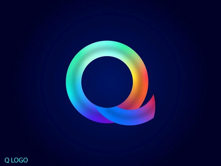
"When we approach a letter-based identity," one branding expert noted, "we are looking for the ‘tension’ in the letter. A ‘Q’ can be aggressive if the tail is sharp, or it can be welcoming if the stroke is fluid. We aren’t just designing a character; we are designing an expression."
This professional consensus highlights a shift: designers are no longer just "making things pretty." They are acting as brand architects, ensuring that the visual mark acts as a shorthand for the company’s core values.
Implications for Future Branding
As we look toward the next decade of digital evolution, the reliance on single-letter marks will likely intensify. With the rise of AI-driven design tools, the market will be flooded with generic templates. This makes the "human touch"—the subtle, manual adjustments to kerning, weight, and negative space—more valuable than ever.
The implications for businesses are clear:
- Prioritize Longevity: A simple lettermark is timeless. It does not go out of fashion as quickly as trend-heavy illustrative logos.
- Ensure Versatility: If your brand intends to scale from a startup to a global enterprise, your logo must work on a sticker, a skyscraper, and a smartwatch. The single letter is the only format that guarantees this level of versatility.
- Invest in Meaning: Do not settle for a default font. A lettermark should be a bespoke creation that tells a story, even if it is told with just one character.
Conclusion: The Path Forward
Whether you are a startup looking to make a bold first impression or an established company undergoing a rebrand, the single-letter logo offers a path to clarity. By stripping away the unnecessary, you allow your audience to focus on what matters most: your identity.
As showcased in the latest collections of modern lettermark designs, the possibilities are infinite. From the architectural rigidity of an ‘H’ to the flowing, organic curves of an ‘S’, these designs prove that you do not need a crowded canvas to create a masterpiece. If you are preparing for a branding project, take the time to study these shapes. Experiment with your own sketches, embrace the beauty of negative space, and remember that in the world of modern design, the loudest voices are often the ones that speak the simplest language.
The future of brand identity is not about how much you can say—it is about how clearly you can say it. Start with a letter, and build a legacy.