In the fast-paced world of broadcast design, few entities have managed to maintain a reputation for "unpindownable" creativity as consistently as 4Creative, the in-house agency for the British broadcaster Channel 4. This week, the agency unveiled a sweeping brand refresh that serves as a manifesto for the future of collaborative design. Moving away from the static, corporate-standard identities that dominate the agency landscape, 4Creative has introduced a fluid, ever-evolving visual language that mirrors the unpredictable, rowdy, and inherently creative soul of the institution it represents.
The Core Transformation: A Fluid Identity
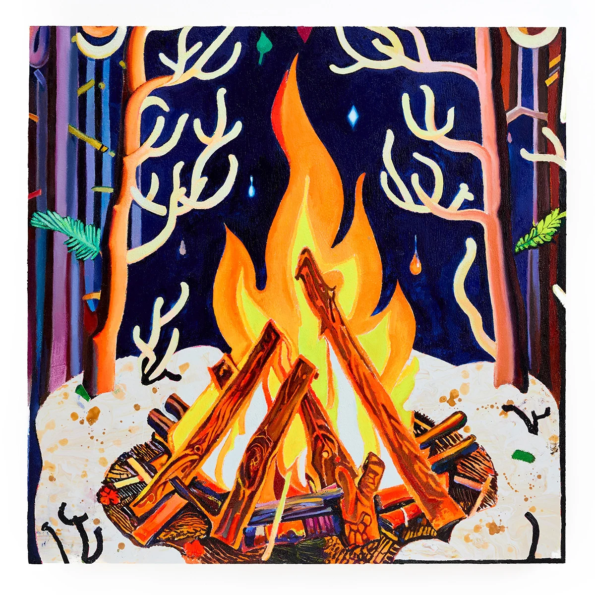
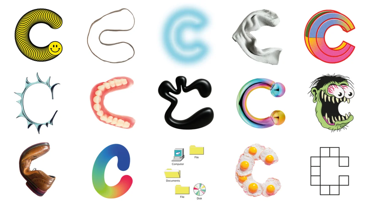
At the heart of this rebrand is the "4C" monogram—a radical departure from the fixed logos that typically define corporate branding. Rather than settling on a single, permanent mark, 4Creative has developed a system where the logo cycles through a variety of unique designs. These iterations are contributed by the entire team, from the newest apprentices to the executive creative directors.
This decision is not merely aesthetic; it is a structural statement about the value of collective input. By ensuring that no single logo dominates the visual identity, the agency is signaling that all voices within the organization are equally vital. It is a visual manifestation of Channel 4’s long-standing "Altogether Different" brand platform, proving that an institution can be both unified in its mission and diverse in its expression.
A Chronology of the Rebrand: From Concept to Launch
The journey toward this new identity was not a sudden pivot but a deliberate process of introspection. For years, 4Creative has been known for its disruptive advertising campaigns and its ability to push the boundaries of television marketing. However, the leadership team recognized that their own brand identity had become somewhat static, failing to capture the volatile and energetic nature of their daily output.
- Phase 1: Internal Audit: The process began with an analysis of the agency’s legacy—a history of inventive storytelling and playful, often confrontational, tone.
- Phase 2: Collaborative Ideation: Leadership engaged the entire staff, encouraging them to create their own versions of the 4C monogram. This was designed to democratize the design process.
- Phase 3: Integration of Heritage: Designers began integrating iconic imagery from Channel 4’s programming history—ranging from the cultural phenomenon of The Great British Bake Off to the cynical wit of Peep Show—into the new visual system.
- Phase 4: Digital Implementation: The final stage involved the rollout of a new website and a design system that could support the fluid, randomized nature of the new assets, ensuring the brand feels "alive" across every touchpoint.
Supporting Data: Why Fluidity Wins in 2026
Industry trends for 2026 suggest a significant shift away from the "minimalist, flat" branding that defined the early 2020s. Consumers and clients alike are increasingly drawn to brands that feel authentic, human, and adaptable.

The 4Creative rebrand aligns with this "generative identity" trend. By utilizing a randomized system, the agency ensures that its digital presence never feels stale. According to recent design psychology studies, brands that display a high level of visual variety tend to be perceived as more innovative and trustworthy. By moving the "4C" logo away from a static icon, 4Creative has effectively turned its brand into a living organism that keeps pace with the rapid changes of the media landscape.
Official Perspectives: The Philosophy of the Refresh
The leadership team at 4Creative has been vocal about the necessity of this shift. For them, the rebrand is an attempt to close the gap between how the agency functions internally and how it is perceived externally.
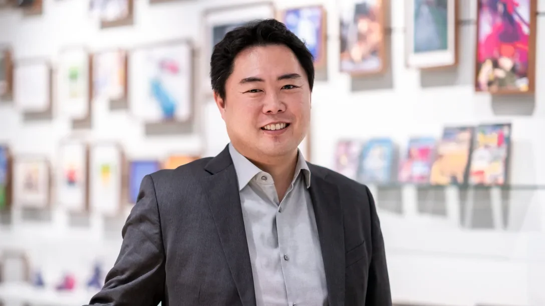
"4Creative isn’t one thing, and it never has been," says David Wigglesworth, Executive Creative Director and Creative Partner. "It’s rowdy, collaborative, unpredictable and proudly Channel 4. We needed an identity that actually reflects that. Something built from our people and our work, that can keep evolving as we do."
This sentiment is echoed by Producer Jazz Stradling, who emphasized the unfinished nature of the design: "The monogram is perpetually unfinished, and I am excited to see how the design continues to evolve with new team members adding their own bespoke ‘4C’ into the mix."
Rob Boon, Head of Design, underscored that the project was not an attempt to be "different" for the sake of it, but rather a reflection of their true nature. "We didn’t set out to be different with our approach; it’s a result of who we are and what we have to say. This refresh goes beyond a monogram, a design system, a website, or a t-shirt—it brings us and our work together and it shapes how we’ll show up for some time to come."

Finally, Miketta Lane, Director of 4Creative, highlighted the strategic importance of re-centering the Channel 4 identity: "Bringing the Channel 4 logo back into the heart of it reinforces our role as Channel 4’s creative partner. It is a collective identity built from within."
The Broader Implications: Redefining Agency Branding
The implications of this rebrand extend well beyond the walls of Channel 4. In an era where many agencies are struggling to define their unique value proposition amidst the rise of generative AI and automated design tools, 4Creative’s approach serves as a counter-argument. They are leaning into the "human" element—the specific, messy, and collaborative contributions of individuals—to create something that software alone cannot replicate.
1. The Death of the Rigid Brand Manual
For decades, brand guidelines have been synonymous with strict limitations. 4Creative is demonstrating that a brand can be governed by a "system of play" rather than a "system of rules." This move will likely influence other creative agencies to reconsider their own rigid identities, potentially leading to a new wave of "living logos."
2. Strengthening Internal Culture
By involving apprentices in the creation of the agency’s primary mark, 4Creative is fostering a culture of extreme inclusivity. This is an effective retention strategy; when team members see their work (and their personal aesthetic) represented in the agency’s primary identity, their sense of ownership and pride increases.
3. Bridging the Gap Between Heritage and Future
The integration of iconic imagery from shows like Peep Show acts as a bridge. It tells the audience that while the agency is evolving and modernizing, it remains firmly rooted in the specific, irreverent, and quintessentially British storytelling tradition that made Channel 4 a household name.
Conclusion: A New Standard for Creative Courage
4Creative’s new identity is not just a logo update; it is a strategic repositioning that challenges the status quo of design. By embracing the "unpindownable" nature of their work and their people, they have successfully created a brand that is as dynamic as the television landscape they operate within.
As we look toward the remainder of 2026, the success of this rebrand will likely be measured not just by its aesthetic impact, but by its ability to remain relevant and "unfinished." In an industry that is increasingly obsessed with polish and perfection, 4Creative’s decision to remain raw, rowdy, and collaborative is a refreshing reminder that the best design is, ultimately, an act of human connection. The agency has successfully transformed its identity from a mere badge into a living, breathing testament to the power of the creative collective.