
 Ammar Sabilarrohman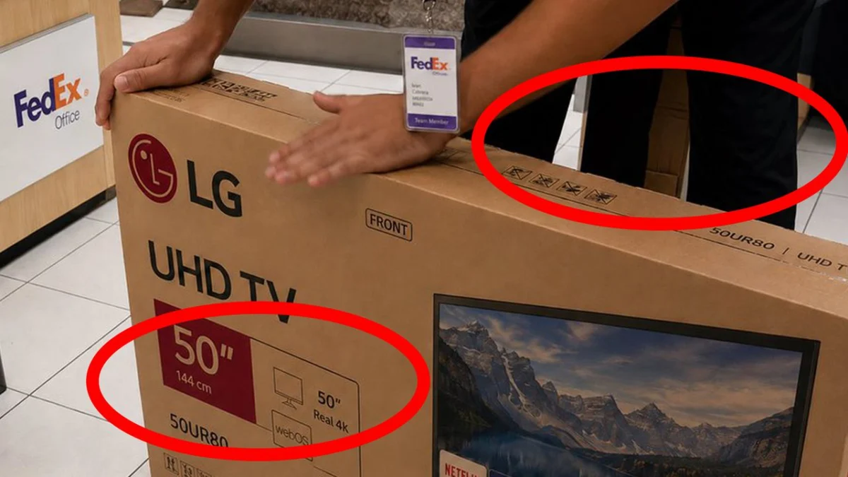
In the rapidly evolving landscape of digital media, the line between reality and synthetic hallucination is blurring. While AI-powered image and video generators have achieved remarkable milestones in photorealism—producing high-fidelity textures, complex lighting, and convincing human anatomy—they remain plagued by fundamental flaws. From viral videos depicting architectural impossibilities in New York to "lovecraftian" menu items that defy the laws of biology, the cracks in the AI facade are becoming a focal point for digital forensics experts and investigative journalists alike.
The latest challenge to our perception of reality comes from an unlikely source: a mundane, seemingly innocuous photograph of a courier office. Yet, beneath its unremarkable surface lies a masterclass in AI incompetence, serving as a stark reminder that while we fear the "death of truth," the technology currently powering our fears still has a long way to go before it can flawlessly mimic the physical world.
The Anatomy of a Synthetic Lie: A Case Study
The image in question, shared on social media platform X by AI researcher and verification expert Henk van Ess, depicts a person in a courier office preparing a 50-inch television for shipment. At first glance, the image feels entirely authentic. It features the standard elements of a professional courier environment: cardboard packaging, shipping labels, floor tiling, and a human subject.
However, van Ess, who co-authored the people-research chapter of the Verification Handbook for Investigative Reporting, used the image as a diagnostic tool. He challenged his audience to identify the "tells" of AI generation without the aid of detection software. The result was a crowdsourced deconstruction of the synthetic image that revealed exactly where the current generation of AI models fails to grasp the logic of the physical world.
Chronology of the Discovery
The image began circulating as a test of human intuition versus machine-generated deception. The progression of the discovery followed a predictable pattern for digital forensic investigations:
- Initial Perception: Users saw a standard, low-stakes photograph. The motion blur on the subject’s hand was initially interpreted as a sign of a high-shutter-speed photograph, a clever trick by the AI to simulate authentic camera behavior.
- The Skeptical Pivot: As users began to look closer, the "uncanny valley" effect set in. The human brain, programmed to identify inconsistencies in geometry and lighting, began to flag anomalies.
- Collaborative Deconstruction: Within hours, the online community began to map out the specific failures. Comments flooded the post, ranging from concerns about the physical dimensions of the television box to the impossible anatomical features of the person in the frame.
- Expert Synthesis: Henk van Ess synthesized these findings, confirming that the image was not just "fake," but structurally incoherent—a hallmark of current generative models.
Supporting Data: Where the AI Failed
The deconstruction of this image provides a masterclass in why AI struggles with spatial logic. The failures are categorized into three distinct domains: physical dimensions, graphic design, and human anatomy.
The Mathematics of Failure
The most glaring error, and perhaps the most humorous, was the conversion failure. The text on the shipping box claimed the television was "50 inches" and "144cm." Any student of mathematics knows that 50 inches is approximately 127 centimeters. This arithmetic error highlights a critical weakness in Large Language Models (LLMs) and diffusion models: they often prioritize the aesthetic appearance of text over its logical accuracy.
Spatial and Geometric Inconsistencies
Beyond the math, the box’s physical presence in the scene was fundamentally broken. The box appeared significantly smaller than the stated 50-inch measurement would allow, failing the most basic test of spatial perspective. Furthermore, the floor tiling in the background—a common pain point for AI—exhibited a "vanishing point" error, where the lines failed to converge correctly, creating a distorted, dream-like geometry.
Graphic Design and Branding Errors
For design professionals, the image was littered with red flags. The labeling on the box ignored the laws of optics; the edges of the stickers did not follow the vanishing point of the cardboard, making them appear as if they were floating on the surface of the image.
Perhaps most tellingly, the branding was a failure of corporate identity. The FedEx logo, a gold standard in minimalist design known for its hidden arrow in the negative space between the ‘E’ and the ‘X’, was rendered incorrectly. The AI, lacking an understanding of the brand’s fundamental design principles, produced a generic approximation that failed to connect the two letters, revealing a lack of "semantic intent" in the generation process.
Implications for Digital Literacy
The implications of this incident are twofold. On one hand, it is comforting to know that we are not yet at the stage where AI can flawlessly deceive the observant eye. The "third leg" and the impossible shadows under the subject’s hand serve as an alarm bell that alerts the viewer to the artificial nature of the content.
However, the rapid improvement of these tools cannot be ignored. We are currently in an arms race between the generative capacity of AI and the forensic capabilities of human observers. As models are trained on higher-quality datasets, these "glaring errors" will inevitably diminish.
The Role of Verification Tools
Henk van Ess is the creator of the "Image Whisperer" tool, an initiative designed to provide journalists and researchers with the means to probe the validity of visual media. In an era where deepfakes and AI-generated misinformation threaten to undermine democratic discourse, tools like the Image Whisperer are becoming as essential as the camera itself.
The strategy proposed by experts is a return to "analog" verification: checking the math, observing the shadows, analyzing the text, and questioning the context of the image.
Official Responses and the Future of AI Ethics
While there has been no "official" corporate response from the developers of the AI used to create this specific image, the industry-wide conversation is shifting. Major AI developers are under increasing pressure to implement "watermarking" and "metadata authentication" to signify when an image is synthetic.
Critics, however, argue that these measures are insufficient. As the "Courier Office" incident proves, the most effective watermark is currently the human brain. If a system can produce a third leg or a 144cm TV that doesn’t fit in its own box, the system is not yet a threat to the objective truth—provided we remain vigilant.
Conclusion: The Persistence of the Human Eye
As we navigate the next decade, the ability to spot the "glitch in the matrix" will be a fundamental requirement of digital citizenship. The "Courier Office" image serves as a perfect case study: it looks real, it feels real, but it is fundamentally, logically broken.
For now, the AI generator’s inability to grasp the nuance of a logo, the consistency of a measurement, or the simplicity of human anatomy is our best defense. But as we move forward, we must remember that today’s "third leg" is tomorrow’s hyper-realistic limb. The challenge is not just to detect the fakes of today, but to build a culture of skepticism and verification that will hold up against the increasingly sophisticated deceptions of tomorrow.
In the words of the experts: if it looks too perfect, look for the shadows, check the math, and always, always look for the third leg.

 Reynand Wu
 Basiran