The automotive landscape is currently undergoing a visual transformation as profound as the shift toward electrification. While engineers grapple with battery density and autonomous driving algorithms, brand strategists are engaged in a parallel battle: the quest for digital clarity. Mazda, a brand long associated with driving dynamics and a "human-centric" design philosophy, has officially joined the ranks of manufacturers transitioning to a flatter, monochrome brand identity. As of May 2026, the rollout of this refined emblem has reached major international markets, signaling a definitive departure from the chrome-heavy aesthetic that defined the company for nearly three decades.
The Shift: Moving Beyond the Chrome Wings
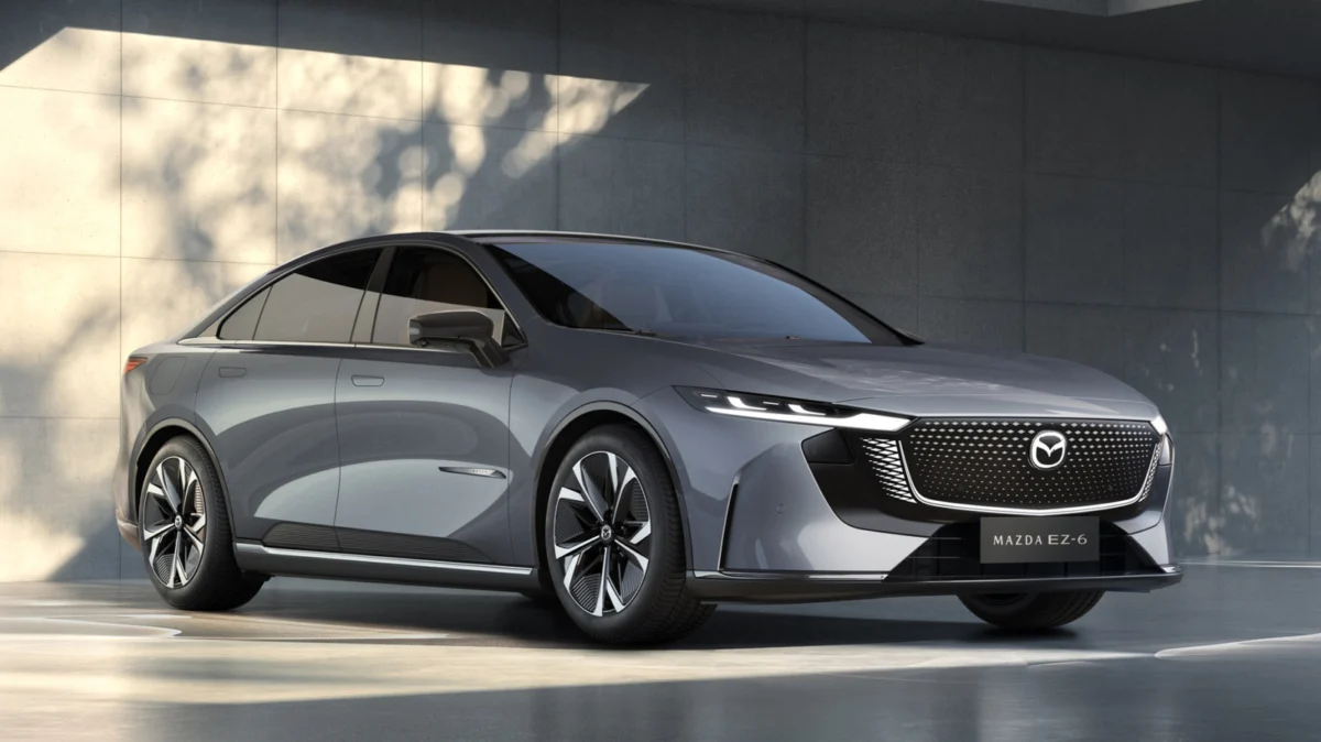
The rollout of Mazda’s latest logo began in late 2025, though the transition has been subtle enough to escape the immediate attention of the casual observer. The new design debuted at the Japan Mobility Show, following a series of teasers embedded within recent concept vehicle designs. Since its initial unveiling, the logo has been systematically integrated into the company’s global assets, with Mazda of Mexico serving as a recent major division to adopt the new visual language in mid-2026.
For industry observers, this represents the most significant design overhaul since 1997, the year Mazda introduced its iconic "chromed wings" emblem. The three-dimensional, metallic texture that defined the brand’s physical presence for years has been discarded in favor of a stark, monochrome silhouette. This change extends beyond the badge itself; the company’s official wordmark has been similarly simplified, favoring clean, minimalist typography that mirrors the aesthetic shifts seen at premium competitors like Cadillac, Volvo, and BMW.
A Chronological Perspective: A Century of Design Iterations
To understand why Mazda is pivoting to a 2D aesthetic, one must look at the company’s century-long history of branding. The transition to a monochrome look is, in many ways, a return to the company’s roots rather than a radical departure from its heritage.
The Early Years (1920–1959)
Mazda’s corporate journey began in 1920 as Toyo Cork Kogyo. Its inaugural logo was a utilitarian representation of the company’s primary function, featuring the letters "TC" housed within a border designed to mimic the shape of a cork crusher. By 1928, the company adopted a simpler, two-dimensional red logo, which was soon replaced by a wordmark that prominently featured the Mitsubishi logo in the background—a nod to the collaborative efforts of the time, particularly during the development of Mazda’s early motorcycle projects.
The Mid-Century Evolution (1936–1975)
In 1936, Mazda adopted a monochrome design composed of three stacked "M" letters, a testament to the brand’s early penchant for geometric simplicity. This was followed in 1959 by a lowercase "m" logo, a bold, simple mark that preceded the company’s shift toward the blue wordmark of the mid-1970s. These early designs were inherently two-dimensional, dictated by the limitations of print media and physical signage of the era.
The Chrome Era (1997–2025)
The late 1990s introduced the "wings" logo—a dynamic, 3D chrome emblem that became synonymous with the brand’s expansion into global luxury markets. While this logo served the brand well during the age of glossy brochures and dealership physical displays, it eventually became a liability in the digital age, where complex textures and drop shadows often fail to render effectively on high-resolution smartphone screens.
Digital Optimization: The Core Driver of Rebranding
The move to "flat" design is not merely a stylistic whim; it is a calculated response to the modern consumer experience. As noted by design experts, the utility of a logo has expanded exponentially in the 21st century.
The Digital Mandate
Designer Alex Center, in recent discourse regarding branding trends, emphasized that logos must now function across a dizzying array of touchpoints. A logo that once only adorned a vehicle hood or a dealership storefront must now serve as a favicon on a browser tab, a profile picture on social media, a loading screen animation in an infotainment system, and a static icon in a mobile app.
The complexity of 3D chrome—with its light reflections, gradients, and metallic highlights—often becomes muddy or unreadable when scaled down to a 16×16 pixel icon. Flat, monochrome logos offer "malleability," allowing the design to retain its legibility and brand recognition regardless of whether it is printed on a heavy steel vehicle tailgate or rendered on a small OLED smartphone screen.
Official Rationalization
Mazda has been transparent regarding the motivations behind this change. In a formal press release, the company confirmed that the primary objective of the redesign is to "enhance visibility, especially in digital environments." This is a pragmatic recognition that the digital "showroom"—the website, the configurator, and the mobile application—is now often the first point of contact between the buyer and the brand.
Supporting Data and Industry Trends
Mazda’s decision follows a well-documented industry trend. In recent years, automotive giants including BMW, Volvo, and Cadillac have all moved toward flattened, simplified badges. While the reception of these rebrands has been mixed—with some enthusiasts criticizing the loss of "prestige" once associated with intricate 3D emblems—the functional success of these changes is difficult to dispute.
When comparing these rebrands, industry analysts often highlight the "BMW problem." BMW’s recent update was met with significant backlash from its core fan base, with some critics labeling it one of the least successful rebrands in automotive history. However, the logic behind the change remained sound: the brand needed a logo that could exist as a clean, simple graphic in its digital marketing campaigns. Mazda appears to be navigating this transition with more caution, aiming for a design that feels like a natural evolution of its existing "wings" icon rather than a complete erasure of its history.
Strategic Implications: Moving Upmarket
The minimalist shift is widely speculated to be part of a broader corporate strategy to move the Mazda brand further upmarket. By adopting a cleaner, more understated aesthetic, the brand is signaling a move away from its historical position as an accessible mass-market manufacturer toward a more premium, "boutique" positioning.
Minimalism is often associated with high-end, luxury design. By stripping away the visual clutter of chrome and gradients, Mazda is effectively cleaning its brand slate. This aligns with the company’s recent efforts to launch more sophisticated, premium-feeling vehicles—such as the CX-90 and the electrification of its lineup—which compete directly with entry-level luxury offerings from German and Scandinavian rivals.
Conclusion: A Future-Proofed Identity
The history of the automotive logo is a history of the media that carries it. Just as the logo evolved from the early industrial marks of the 1920s to the high-gloss chrome of the 1990s, it is now evolving to meet the requirements of the digital age.
Mazda’s decision to embrace a 2D, monochrome logo is a strategic masterstroke that reconciles its past with its future. By looking back to its roots of simple, stacked letters and clean shapes, the company has found a way to move forward. As buyers spend more time interacting with the brand through screens than in physical showrooms, this new, simplified identity will ensure that the Mazda mark remains as recognizable and impactful as it was when it first debuted over a century ago.
While the chrome wings will be missed by those nostalgic for the aesthetic of the 2000s, the current transition ensures that the brand remains relevant, legible, and "digitally native" for the next generation of drivers. In the world of automotive branding, simplicity is no longer just a design choice—it is a competitive necessity.