In the fast-evolving landscape of global graphic design, few elements possess the evocative power of typography. Among the most sought-after aesthetics in recent years is the "Japanese style"—a versatile design language that bridges the gap between ancient calligraphic tradition and cutting-edge contemporary minimalism. Whether utilized for high-end restaurant branding, dynamic social media graphics, or intricate product packaging, Japanese-style fonts are no longer mere regional curiosities; they have become essential tools in the modern creative’s arsenal.

This article explores the rising popularity of these typefaces, providing a comprehensive analysis of why they are shaping the future of visual communication, followed by a curated selection of over 30 essential fonts for the discerning designer.

The Evolution of Japanese-Style Typography
Historical Context and Artistic Roots
The fascination with Japanese typography is rooted in the deep history of Shodo (calligraphy). Traditionally, Japanese text was not merely a way to convey information; it was a visual art form where the brush stroke’s energy, speed, and pressure defined the character’s soul. As design moved into the digital age, global creators began to emulate these organic, fluid movements.

The Modern Shift: From Traditional to Neo-Minimalist
The current trend in Japanese-style fonts is a fascinating hybrid. While many designers still favor the aggressive, raw energy of traditional brush fonts, there is an equally strong demand for "Neo-Japanese" styles. These typefaces strip away unnecessary ornamentation, focusing on clean lines, balanced negative space, and architectural precision—elements frequently found in Japanese signage and architectural posters.

The Impact on Global Branding and Commercial Design
Why Brands Are Adopting the "Eastern Look"
The primary appeal of Japanese-style fonts lies in their inherent ability to act as a focal point. In a crowded marketplace, brands are increasingly looking for ways to differentiate their visual identity. A well-chosen Japanese-inspired font can communicate a sense of heritage, precision, or avant-garde sophistication without the need for additional illustrative elements.

The Versatility of Hybrid Typefaces
A critical factor in the widespread adoption of these fonts is the inclusion of Latin character sets. By merging the structural aesthetics of Japanese kana and kanji with the readability of English alphabets, these fonts provide designers with unparalleled flexibility. This makes them ideal for international campaigns where the brand needs to maintain a consistent "flavor" while remaining accessible to a global, English-speaking audience.

Chronology: The Rise of Cultural Fusion in Digital Design
- Pre-2015: Japanese-style fonts were primarily niche assets, mostly restricted to cultural projects or martial arts-themed media.
- 2016–2019: The "Minimalist Wave" hits. Designers began experimenting with cleaner, sans-serif Japanese styles that mimicked the aesthetic of Tokyo’s modern urban signage.
- 2020–2022: The rise of "Brutalist" design brings back the demand for bold, rough-edged brush strokes, leading to a surge in high-texture, expressive typography.
- 2023–Present: The current era of "High-Tech Fusion," where traditional brush styles are being combined with digital glitches, techno-influences, and geometric overlays, creating a new sub-genre of display fonts.
Supporting Data: The Designer’s Preference
Market trends indicate that designers currently prioritize three specific qualities when selecting Japanese-style typefaces:

- Readability (42%): Even when highly stylized, the typeface must remain legible for digital interfaces.
- Versatility (35%): The inclusion of ligatures, alternate characters, and multi-language support is now a standard requirement for premium font packages.
- Texture and Character (23%): The "human touch"—imperfections that suggest hand-drawn origins—remains the primary driver for purchases in the creative community.
Official Industry Perspectives
According to leading design analysts, the shift toward these fonts is symptomatic of a broader desire for "authenticity" in design. In an age dominated by AI-generated imagery and perfectly polished vectors, the slightly rugged, historic, and deliberate aesthetic of a brush-stroke font provides a much-needed sense of craftsmanship.

"Designers aren’t just looking for a font," says one industry lead. "They are looking for a story. When you use a typeface that carries the DNA of a different culture, you are importing that culture’s sense of balance and rhythm into your own work."

Implications for Future Design Projects
The implications for the design industry are clear: Japanese-style fonts will continue to dominate in the sectors of luxury packaging, culinary branding, and entertainment media. As we move further into the future, we can expect to see more "variable" fonts—typefaces that allow designers to adjust the "brush weight" or "calligraphic intensity" in real-time.

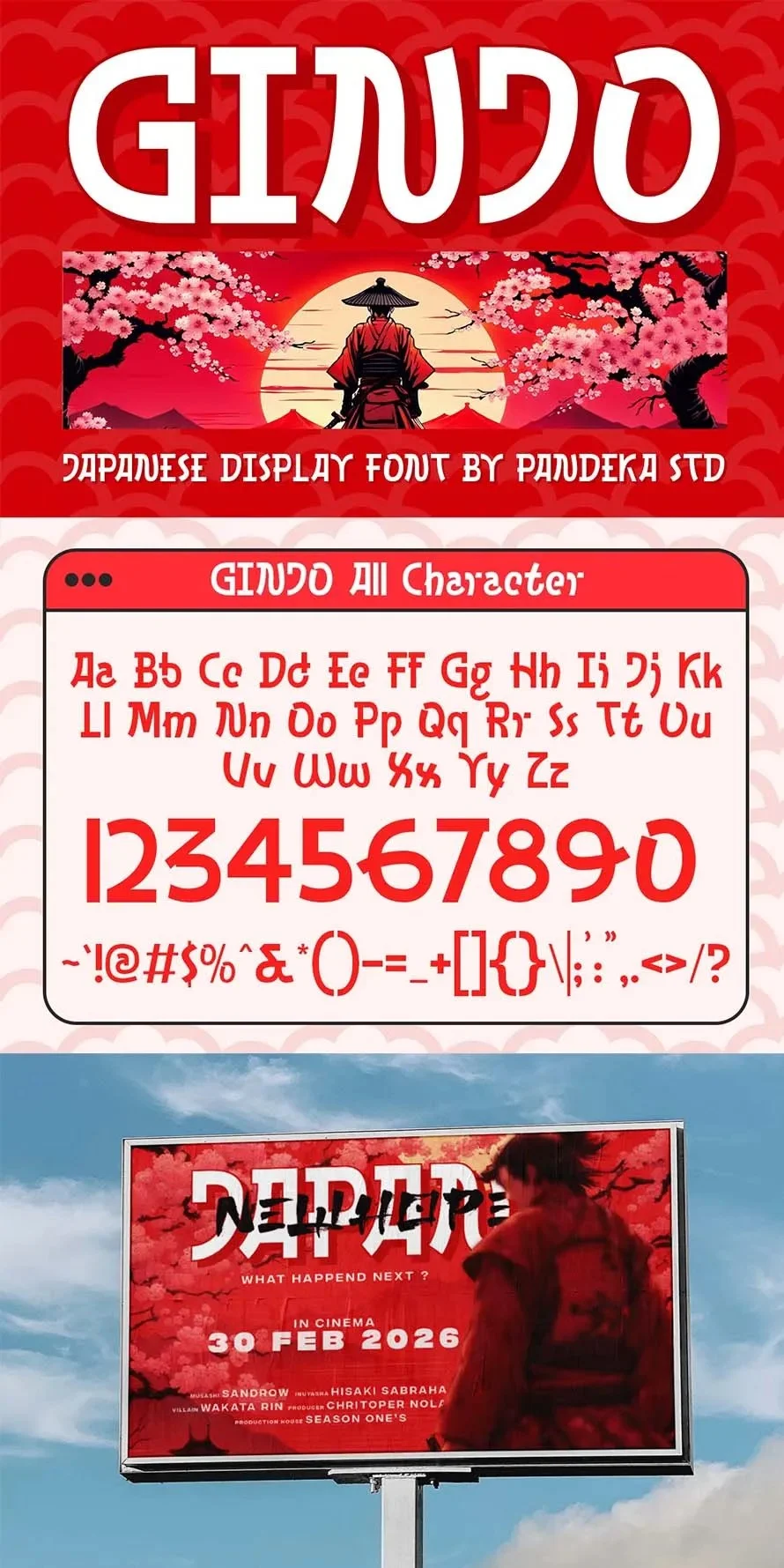
30+ Essential Japanese-Style Fonts for Modern Creatives
When selecting a font for your project, it is vital to balance aesthetics with function. Below is a curated list of top-tier assets that offer a range of styles from aggressive brush strokes to clean, modern geometry.

The Heavy Hitters: Bold and Expressive
- Abakura: A powerhouse of a brush font. Its all-uppercase structure and rough, hand-drawn texture make it the perfect choice for high-impact video titles and book covers.
- Ryu Japanese: Inspired by traditional calligraphy, this font is ideal for game titles and posters that require a sense of power and motion.
- Zenbou: A modern brush typeface that manages to look both organic and sharp. Its inclusion of outline versions makes it a versatile choice for apparel design.
- Tenkai: If you need a font that feels like a master calligrapher just finished the stroke, Tenkai is the industry standard for bold branding.
- Takiyo: This textured brush font captures the "weathered" look of aged signage, perfect for vintage-inspired projects.
The Modernists: Clean and Geometric
- Zaragi: A masterclass in simplicity. Its clean lines make it a favorite for social media graphics and modern product labels.
- Ginjo: Offering three distinct styles (including an outline), Ginjo is designed for flexibility, moving seamlessly from invitations to professional logo work.
- Kotaru: With its extrude and outline options, Kotaru provides a 3D aesthetic that works remarkably well in digital display ads.
- Kong Japanese: This typeface bridges the gap between old-world calligraphy and modern, minimalist geometry.
- Wato Kanon: A sophisticated choice that leans into the Kanji style while remaining perfectly legible as an English typeface.
The Hybrids: Where Cultures Collide
- Dangeol: A unique exploration of Korean-Japanese cross-pollination. It offers four distinct styles, perfect for designers who want to experiment with structural variations.
- Nebula Avenue: A fascinating "Duo Techno Brush" font that blends the precision of modern techno design with the soul of a brush font.
- Shinkaner: This script-hybrid is excellent for projects that require a feminine or elegant touch while retaining that distinct Japanese silhouette.
- Yokai Game: Chunky, loud, and incredibly fun. This is the go-to font for anime-themed projects and gaming interfaces.
Essential Utility Fonts
- Zhabuki: A highly versatile font that supports multiple languages, making it a reliable workhorse for international branding.
- Kyouka: With its soft, rounded edges, this block-style font feels approachable yet professional.
- Japanhip: Specifically crafted for the food industry, this font pairs perfectly with restaurant menus and packaging.
- Sughoiy: Bold, thick, and unpretentious—this is a go-to for social media headers and bold advertising campaigns.
- Gaze Nozarashi: Highly accessible, this font is a great entry point for students and beginners looking to add a Japanese flair to school projects.
Final Advice for Designers
Before committing to a font, test your chosen typeface against your project’s specific constraints. Check the kerning (the spacing between letters) to ensure it holds up at smaller sizes. Does the font retain its "calligraphic energy" when shrunk for a business card? Does it look too cluttered when used in a long paragraph?

By testing these variables, you ensure that your choice of font not only looks beautiful but functions as a cohesive part of your design system. Whether you are creating a simple logo or a full-scale brand identity, the right Japanese-style font can elevate your work from "standard" to "iconic."

Ready to start designing? Explore the extensive library of over 1,500,000+ assets, including these fonts, to bring your next creative vision to life.