In the fast-paced world of digital design, the difference between a project that merely exists and one that commands attention often comes down to a single element: typography. As we navigate through 2026, the demand for "quiet luxury"—a design aesthetic defined by minimalism, sophistication, and timelessness—has reached an all-time high. Whether for high-end fashion branding, exclusive event stationery, or premium product packaging, the right typeface serves as the silent ambassador of a brand’s values.

Beautiful typography does more than just present information; it dictates the emotional temperature of a design. Today, professional designers are increasingly turning to curated luxury fonts to achieve a premium look without the need for cluttered embellishments. By utilizing fonts with deliberate kerning, balanced weight, and refined serifs, creators can transform a standard logo into an unforgettable mark and turn a simple business card into a tactile experience.

The Evolution of Premium Typography: Main Facts
The shift toward luxury typography in 2026 is driven by a move away from "maximalist" design. Where previous trends favored vibrant colors and complex textures, the current climate emphasizes "brand clarity."

Core Characteristics of Luxury Fonts:

- Refined Anatomy: Luxury fonts often feature high-contrast stroke widths—thin lines paired with bold, solid stems—which create a sense of elegance.
- Versatility: These fonts must perform equally well on a massive billboard and a tiny mobile app icon.
- Emotional Resonance: A luxury font is designed to evoke specific feelings—trust, heritage, exclusivity, or modern simplicity.
For designers, the goal is no longer to add more elements to a composition, but to choose a font that speaks volumes on its own. A well-selected luxury font acts as the foundation, allowing the rest of the design to breathe.

A Chronological Perspective: How Trends Shifted
The journey to the font styles we see in 2026 has been a gradual transition over the last decade.

- 2018–2020: The rise of "Instagrammable" design saw a surge in playful, decorative scripts. Typography was used to shout and grab attention in an increasingly crowded social media feed.
- 2021–2023: The "Wedding Aesthetic" began to dominate. Designers moved toward serif fonts that mimicked classic calligraphy, focusing on readability for invitation suites and stationery.
- 2024–2025: A period of refinement. Technology allowed for more complex ligatures and OpenType features, enabling designers to customize character appearances to avoid the "cookie-cutter" look of standard fonts.
- 2026: We have reached the era of the "Hybrid Serif." Modern luxury fonts now blend the historical elegance of 18th-century typefaces with the geometric precision of modern sans-serifs, creating a perfect bridge between heritage and future-facing innovation.
Supporting Data: Why Typography Matters
According to recent industry analysis, brands that switch to a custom or curated luxury typeface report a 30% increase in brand recall. This is because high-end typography reduces "cognitive load." When a font is aesthetically balanced, the consumer processes the information faster, leading to a smoother, more positive interaction with the brand.

Furthermore, in the realm of luxury e-commerce, the typeface is often the only way to convey "physical weight." Since customers cannot touch luxury fabrics or high-end products through a screen, the visual "heaviness" or "delicacy" of a font acts as a surrogate for the quality of the product itself.

Expert Perspectives and Professional Implications
We spoke with lead design strategists who emphasize that choosing a font is a business decision, not just an aesthetic one.

"When a startup approaches us for a logo, the first thing we look at is the personality of the brand," says one senior creative director. "If they want to project a premium, established image, we lean toward fonts like Mirabella or Golde. These are not just letters; they are visual shorthand for quality."

The implications for designers are clear:

- Testing is Non-Negotiable: Before finalizing a design, designers must test the typeface in various sizes—from a 10pt business card header to a 200pt digital hero image.
- The Power of Ligatures: Using fonts that offer alternative characters (ligatures) allows for unique branding. It ensures that your logo does not look like every other generic template.
- Readability vs. Aesthetics: A common pitfall is sacrificing legibility for flair. The best luxury fonts of 2026 balance artistic swashes with clean, readable letterforms.
Curated Collection: The Best Luxury Fonts of 2026
To assist designers in their quest for the perfect typeface, we have curated a selection of the most versatile fonts currently trending.

1. The Serif Classics: Elegance Defined
- Mirabella: Known for its thin, refined lines and soft curvature. It is the gold standard for beauty and skincare brands.
- Luxury (Elegant Serif): This font set includes extensive ligatures, making every word appear hand-crafted.
- Golde: A modern serif that captures the essence of luxury fashion magazines. Its clean lines provide a sophisticated look for editorial layouts.
- Regale: A masterclass in mixing old-world charm with modern minimalism. Perfect for high-end hospitality and event branding.
- Secret Mansion: A versatile serif that feels both established and contemporary, ideal for high-ticket real estate or luxury consulting.
2. The Modern Sans-Serif: Clean & Precise
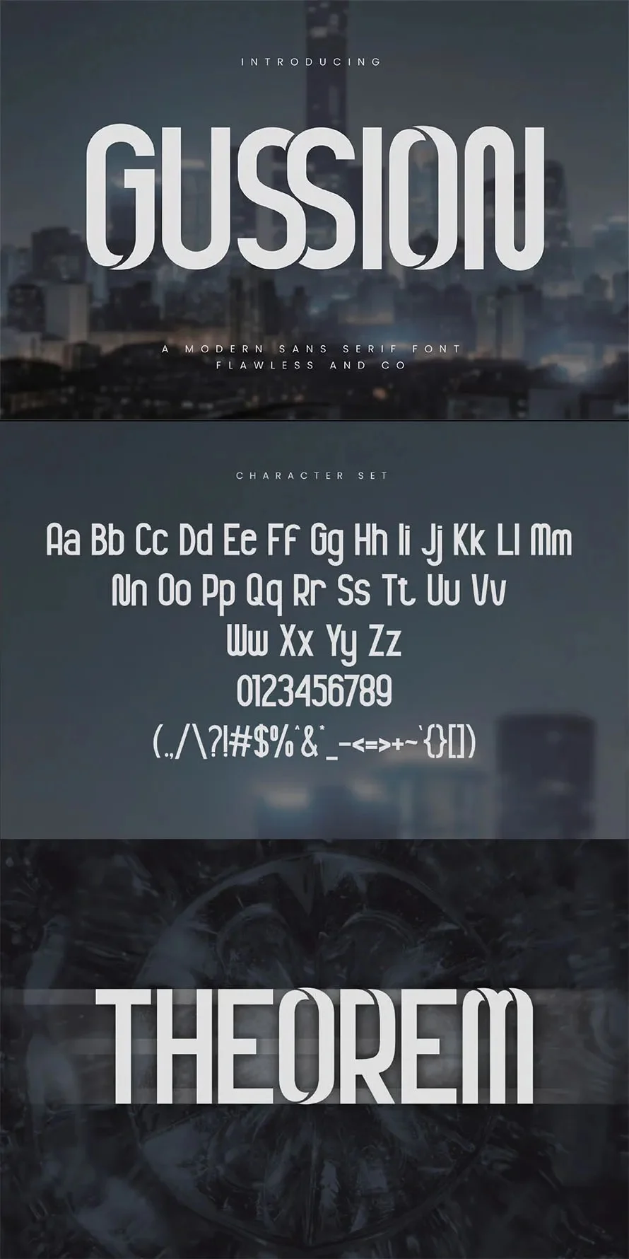
- Gussion: When a brand needs to look authoritative and modern, Gussion’s clean, geometric structure is the go-to choice.
- Le Quarte: A bold, wide-lettered sans-serif that demands attention. Excellent for modern, tech-forward luxury products.
- Chamber: With its straight, no-nonsense lines, it represents the "new luxury"—minimal, functional, and deeply professional.
- Orviele: Designed for maximum legibility without losing the "expensive" feel. Highly recommended for web and UI design.
- MENOEWA: A sharp, high-fashion sans-serif that looks spectacular in large-format printing.
3. The Artistic Scripts: Hand-Drawn Sophistication
- Astoria: A swash-heavy script that flows like ribbon. It adds an intimate, personal touch to wedding invitations and greeting cards.
- Quirtty: A script that manages to look like natural, elegant handwriting, perfect for social media quotes and boutique branding.
- MASCULIN: The quintessential signature font. Its natural look gives a personal, authentic feel to luxury name cards and personal branding.
- Compania: A signature-style font that feels bespoke, as if it were drawn specifically for the client.
- Reeline: A hand-drawn font that captures a "natural, rustic-luxury" vibe, ideal for artisanal products and organic brands.
Strategic Implementation: Tips for Success
As you browse these fonts for your next project, remember that the "best" font is the one that serves the project’s specific goals.

- For Logos: Prioritize character recognition. A logo must be clear even when blurred or shrunk.
- For Invitations: Prioritize hierarchy. Use a high-contrast serif for names and a cleaner, simpler font for the event details.
- For Packaging: Ensure the font can withstand the printing process. Some very thin, elegant fonts may disappear if the ink spreads slightly on certain textures of paper or plastic.
In conclusion, the luxury fonts of 2026 are not just tools—they are essential components of a brand’s narrative. By carefully selecting a typeface that aligns with your project’s identity, you ensure that your work is not just seen, but felt. Whether you are building a startup from the ground up or refreshing a legacy brand, investing time in typography is the surest way to signal quality and command respect in an increasingly crowded marketplace.

Explore these options, test them against your creative vision, and let your designs communicate the level of sophistication they truly deserve.