Warner Bros. Animation has officially entered a new era of branding. During this week’s prestigious Annecy International Animation Film Festival, the legendary studio unveiled a refreshed visual identity designed to serve as the banner for its ambitious 2026-2028 production slate. Moving away from the high-gloss, hyper-realistic CGI aesthetics that have dominated the industry for the past decade, the new logo embraces the tactile, nostalgic charm of traditional, hand-painted animation.
The reveal, which was met with immediate enthusiasm from the creative community, signals a broader pivot for Warner Bros. Picture Animation, suggesting a future where artistic heritage and modern minimalism converge to redefine the studio’s cinematic presence.
The Evolution of an Icon: Main Facts of the Redesign
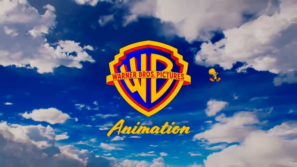
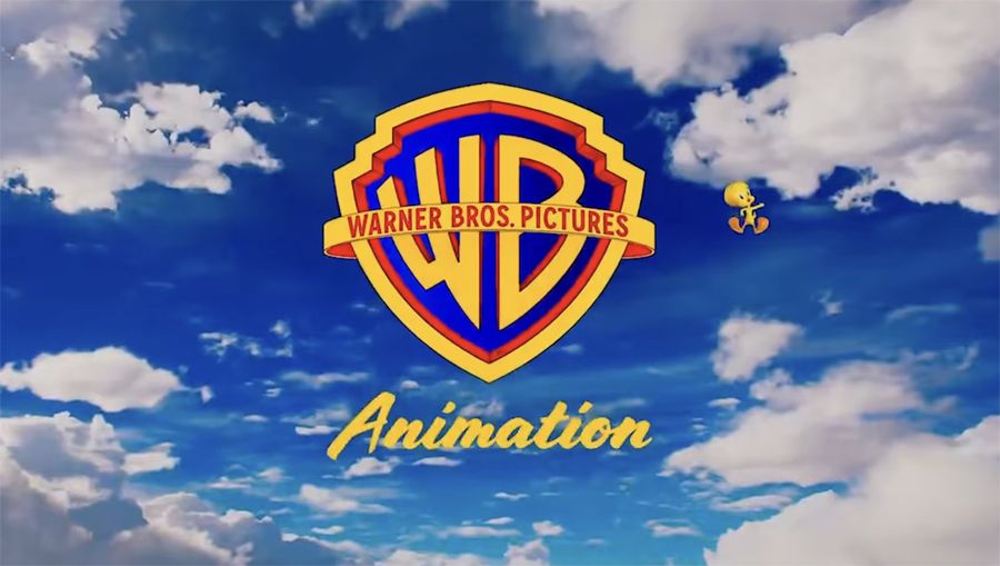
At the heart of the new identity is the iconic Warner Bros. "WB" shield. Widely considered one of the most recognizable and enduring corporate logos in entertainment history, the shield has undergone countless iterations since the studio’s inception. However, this latest version represents a significant departure from the metallic, textured, and deeply shadowed iterations that have defined the studio’s modern "blockbuster" era.
The new logo features a flat, clean design that strips away artificial depth. By abandoning the faux-3D sheen, Warner Bros. has reclaimed the "drawn" quality of its golden-age roots. The word "Animation," which previously occupied a more cluttered space within the branding, has been repositioned beneath the shield in an elegant, understated script font. This typographic choice mirrors the flat aesthetic of the shield, creating a cohesive, minimalist composition that feels both timeless and contemporary.
Perhaps the most delightful addition—and the one that has garnered the most viral attention—is the inclusion of Tweety Pie. The beloved Looney Tunes canary is depicted fluttering next to the logo, acting as a playful, irreverent mascot. This choice is widely viewed as a direct response to the "CGI saturation" currently plaguing the film market, offering a visual "antidote" that emphasizes character-driven storytelling over spectacle-heavy rendering.
A Chronological Shift: From Metallic Shimmer to Matte Simplicity
To understand the weight of this redesign, one must look at the trajectory of Warner Bros. branding over the last twenty years.
- The Early 2000s: Warner Bros. leaned heavily into "shiny" aesthetics. The logo was presented as a golden, reflective object, often soaring through clouds or integrated into elaborate, sweeping CGI environments.
- The 2010s: As the studio moved toward the LEGO Movie and other high-production animated features, the logo became increasingly complex, often incorporating depth-of-field effects and lighting flares that aimed to mimic the high-fidelity look of modern feature animation.
- 2024-2025: The shift began in the lead-up to the Annecy festival. Insiders noted that the studio was looking for a way to differentiate its "Picture Animation" division from its live-action counterpart.
- The Annecy Reveal (2024): The new logo made its public debut during a special showcase. The unveiling was not just a static image, but an animated sequence. The sequence began with a simple, hand-drawn pencil sketch of the studio’s iconic water tower, which slowly filled with color and light, transitioning from a vintage, monochromatic look into a vibrant, modern matte palette. The sequence concluded with the new logo, cementing the studio’s commitment to the artistry of the process.
The "Disney Effect" and the Role of the Mascot
The inclusion of Tweety Pie has sparked a fascinating debate regarding the use of "brand ambassadors" in corporate identity. Many industry analysts have drawn comparisons to Disney’s long-standing use of Tinkerbell to frame its film introductions.
"Tweety is perfect as the Warner version of Tinkerbell," noted one observer on social media. "It’s the perfect irreverent symbol that spells ‘Warner.’"
This comparison is not merely aesthetic; it is structural. By introducing a character that interacts with the logo, Warner Bros. is injecting a sense of personality into the brand. In an era where corporate logos are often criticized for being "bland" or "sterile" due to excessive simplification, the addition of a character—especially one as iconic as Tweety—adds a layer of warmth and narrative expectation. It signals to the audience that what they are about to watch is "cartoony" in the best possible sense: expressive, funny, and rooted in the history of the medium.
Supporting Data: Why Flat Design is Winning
The shift to flat design is not just a stylistic whim; it is a calculated response to the "flat-design" trend that has permeated the tech and entertainment sectors. Design experts often cite several reasons why this transition is effective:
- Scalability: A flat logo is significantly more versatile. It maintains legibility across a wide variety of formats, from the massive scale of a theatrical screen to the small, compressed thumbnail of a mobile device or a streaming service interface.
- Visual Clarity: By removing gradients and textures, the brand avoids becoming "dated." CGI trends shift every five years, but simple geometric shapes (like the shield) and clean typography are effectively immortal.
- Audience Sentiment: Preliminary social media sentiment analysis shows a marked preference for the new direction. Comments like "That’s fire," and "It keeps it cartoony" suggest that audiences are suffering from "CGI fatigue." The desire for a return to the tactile, hand-drawn look is a strong cultural signal that the audience craves authenticity in animation.
Official Responses and Strategic Implications
Warner Bros. has not yet released a detailed white paper on the branding strategy, but the context of the announcement is clear: the studio is preparing for a heavy influx of classic IP. The 2026-2028 slate, which was also unveiled at Annecy, includes Tom & Jerry, ThunderCats, Meercats, and The Cat in the Hat.
These are properties that are inherently tied to traditional, 2D-style animation. By updating the corporate logo to match the "feel" of these projects, Warner Bros. is creating a unified visual language.

"We are entering a phase where the brand needs to feel as nimble as the characters it produces," says one anonymous source close to the studio. "The old logo felt like a monument. The new logo feels like a playground."
This strategic move carries significant implications for the industry. If Warner Bros.—a behemoth of the industry—can successfully pivot to a more minimalist, hand-drawn aesthetic, it is highly likely that competitors will follow suit. We may be witnessing the beginning of the "Post-CGI" era of studio branding, where the focus shifts from "how realistic can we make this?" to "how expressive can we make this?"
Looking Forward: The 2026-2028 Slate
The upcoming projects offer a clear picture of why this branding change was necessary. The studio is betting big on nostalgic, character-heavy franchises. Whether it’s the slapstick chaos of Tom & Jerry or the adventurous scale of ThunderCats, these films require a brand identity that emphasizes heart over hardware.
The transition to this new logo is, in essence, a promise to the audience. It is a promise that Warner Bros. Animation will prioritize the soul of the work—the drawing, the personality, and the humor—above the technical polish that has often overshadowed the narrative in previous years.
As we approach 2026, the new logo will become a familiar sight, appearing at the front of every theater screening and streaming premiere. With the help of a little yellow bird, Warner Bros. has successfully managed to make its most iconic asset feel fresh again, proving that sometimes, the best way to move forward is to look back at what made the brand a titan in the first place.
The studio’s ability to balance its massive corporate history with a modern, design-forward sensibility is a masterclass in rebranding. By listening to the audience’s preference for character over complex geometry, Warner Bros. has set a high bar for the rest of the industry, signaling that the future of animation is not just about pixels, but about the artistry that brings them to life.