In 1991, Martin Scorsese delivered one of the most audacious, visually frantic, and psychologically invasive thrillers in the history of studio filmmaking. His adaptation of the 1962 classic Cape Fear was not merely a remake; it was a masterclass in cinematic anxiety. Through a dizzying barrage of whip-pans, Dutch angles, and aggressive, accelerated camera movements, Scorsese externalized the internal rot of the Bowden family and the terrifying, god-complex psychosis of Robert De Niro’s iconic antagonist, Max Cady.
Decades later, the challenge of revisiting such a visceral touchstone has fallen to series creator Nick Antosca—known for his work on The Act and Friend of the Family. The new Apple TV+ series adaptation of Cape Fear is a testament to modern ambition, daring to sustain that same level of visual intensity not for a two-hour runtime, but across ten sprawling, one-hour episodes. Under the stewardship of alternating cinematographers Celiana Cárdenas and Eben Bolter, the series manages to pay homage to Scorsese’s legacy while establishing a distinct, evolving visual language that ensures the show never stagnates.
A Legacy of Aesthetic Audacity
The original 1991 Cape Fear remains a benchmark for how cinematography can function as a character. Scorsese and his team understood that the Bowden family—portrayed by Nick Nolte, Jessica Lange, and Juliette Lewis—were fundamentally dysfunctional, their lives fragile and prone to collapse under the pressure of Max Cady’s vendetta.
The new series, currently streaming on Apple TV+, does not attempt to replicate Scorsese’s frames shot-for-shot. Instead, it adopts the philosophy of his visual style: a fearless commitment to subjectivity. By extending the narrative over ten hours, Antosca and his team have created a canvas that allows for a more granular exploration of guilt, innocence, and the shifting power dynamics between Cady and the Bowdens. As Cárdenas explains, the series is designed to keep the audience in a state of perpetual uncertainty regarding the true intentions of its characters.
Chronology: Crafting a Shifting Reality
The production of Cape Fear was defined by a commitment to episodic evolution. Unlike traditional procedurals, which often rely on a static visual template, the team behind this series approached each hour as a distinct movement in a larger symphony.

The Objective vs. The Subjective
Early in the production, the creative team established a fundamental rule: the camera’s perspective must shift in tandem with the psychological state of the characters. In the early episodes, the lens often maintains a detached, objective stance, observing the Bowdens as they navigate their lives. However, as the narrative progresses and the psychological siege intensifies, the cinematography adopts a more intrusive, subjective quality.
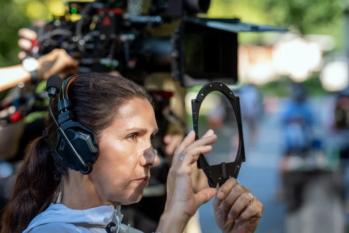
Cárdenas notes that this transition was critical. "Understanding the tone of each episode was important—where the characters are, and whether the camera should be objective or more subjective," she stated. This was not a linear progression; rather, it was a rhythmic expansion and contraction of perspective, mirroring the unpredictability of the plot.
The Acid Trip: A Case Study in Visual Distortion
Perhaps the most ambitious visual sequence in the series occurs during an episode where the Bowden family is incapacitated by a drink spiked with hallucinogens. Working alongside director Trey Edward Shults, Cárdenas faced a classic cinematographic dilemma: how to represent an altered state of consciousness without succumbing to cliché.
"With an acid trip, the first thing that comes to your mind is to use all kinds of crazy stuff to distort the image," Cárdenas admitted. "But I think what’s happening to the family is more internal than visual."
To capture this, the team eschewed overt CGI or heavy-handed post-production effects. Instead, they utilized a tactile, mechanical approach to optics. The series is primarily shot with Atlas Mercury lenses in a 2.35:1 aspect ratio. For the acid-trip sequence, Cárdenas swapped these for vintage 1960s Super Baltars. The shift provided a softer, dreamier quality that subtly undermined the viewer’s perception of the image.

Furthermore, the team experimented with the screen itself. As the hallucinogens take hold, the rigid 2.35:1 letterboxed format begins to subtly expand, filling more of the vertical space on the television screen. It is a disorienting, almost unconscious shift—a clever way to signal to the viewer that the walls of reality are closing in.
Supporting Data: Technical Choices and Artistic Intent
The visual identity of Cape Fear is rooted in its specific technical constraints and choices. The decision to use Atlas Mercury lenses throughout the bulk of the series provides a high-contrast, cinematic feel that elevates the material beyond typical television standards.
The "feverish" aesthetic that permeates the show is also tied to a specific narrative plot point: the summer heat and the family’s broken air conditioning. Cárdenas sought to translate this oppressive humidity into the camera work through a deliberate color palette. "I came up with the idea of these lens flares," she noted, "starting with blues and yellows, and then we finish with orange." This progression of light and color serves as a silent, atmospheric guide, tracking the characters’ descent into madness alongside the rising temperatures.
Official Responses and Collaborative Philosophy
At the heart of the series’ success is a culture of deep collaboration between the directors, the cinematographers, and the cast. Cárdenas emphasizes that her role is not to impose a visual style, but to facilitate the actors’ ability to inhabit their roles.
"I try to give the actors as much freedom as possible," Cárdenas said. "It’s challenging to give them 360 degrees in which they and the directors can move, but how many movies have we seen where the camera can be a little out of focus, or the framing is not quite right, but it doesn’t matter because the performances are amazing?"

This sentiment highlights the core philosophy of the production: that the story and the performance are the primary engines of the work. The cinematography, no matter how technically daring, must serve the humanity of the characters. By providing the actors with the space to exist in a "360-degree" environment, the crew allowed for a spontaneity that is often absent in high-concept thriller productions.
Implications for the Future of Prestige Television
The success of the Cape Fear series suggests a shift in the landscape of streaming television. As audiences become more visually literate, the demand for high-end, auteur-driven cinematography in long-form narratives is growing.
By treating a series with the same visual rigor usually reserved for feature-length prestige films, Apple TV+ has set a new benchmark. The ability to sustain a complex visual narrative over ten hours—without relying on repetitive motifs—proves that the "TV show" as a format is capable of the same artistic intensity as the most daring Hollywood cinema.
Furthermore, the show’s willingness to experiment with aspect ratios, vintage lenses, and lighting palettes signals a departure from the "uniform look" that has defined much of the streaming era. As viewers continue to consume content on larger, higher-resolution screens, the technical precision and artistic intent showcased by Cárdenas and Bolter will likely become the standard, not the exception.
In the final assessment, the Cape Fear series succeeds not because it tries to outdo Scorsese, but because it learns from him. It understands that the true horror of the story is not in the jump scares or the villain’s monologues, but in the slow, agonizing, and visually rich unraveling of a family under pressure. Through its innovative use of light, lens, and frame, the series manages to carve out its own identity, proving that even a story told many times can find new, terrifying, and beautiful ways to be seen.