
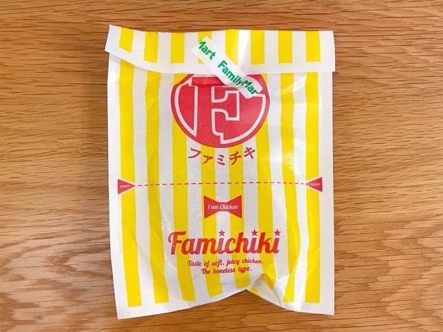
For millions of people in Japan, the scent of sizzling, golden-brown fried chicken wafting from a nearby konbini (convenience store) is the quintessential aroma of the urban landscape. At the heart of this cultural phenomenon stands the "Famichiki," the flagship hot snack of the FamilyMart convenience store chain. For nearly two decades, the boneless, succulent chicken fillet has been synonymous with its distinctive, bright yellow-and-white striped packaging, famously adorned with the playful, English-language declaration: "I am Chicken."
However, as of July 2026, that iconic phrase is being retired. In a bold move to mark both the 45th anniversary of the FamilyMart brand and the 20th anniversary of the Famichiki, the company has officially unveiled a comprehensive redesign of its most famous snack’s packaging. While the move represents a significant departure from the visual identity that defined a generation of Japanese snack culture, the company maintains that the change is an evolution—a bridge between the brand’s storied past and its future-facing aesthetic.
The Core Transformation: Modernity Meets Heritage
The announcement, released mid-July 2026, confirmed that the transition to the new packaging would begin appearing in stores nationwide on July 14. This is the first major visual overhaul for the Famichiki bag in nearly a decade.
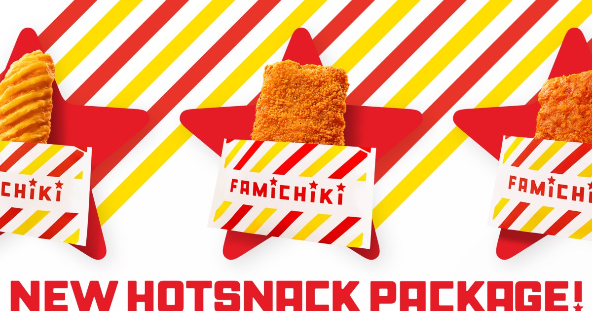
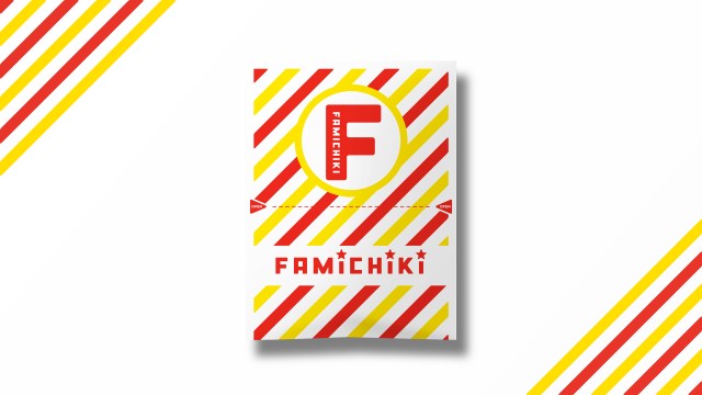
The new design, while retaining the signature color palette of yellow and white, opts for a more minimalist and streamlined aesthetic. The whimsical, conversational text—"I am Chicken"—has been removed entirely, replaced by a cleaner, more graphic approach that emphasizes the brand’s commitment to a modern lifestyle.
For many loyalists, the removal of the text is a bittersweet development. The "I am Chicken" slogan had become a staple of pop culture, frequently appearing in social media posts, travel vlogs by tourists, and even as a shorthand for the sheer simplicity and honesty of the snack itself. By stripping away the text, FamilyMart is signaling a shift toward a more sophisticated, global-ready brand identity that relies on color and silhouette rather than literal labeling.
A Chronology of a Culinary Phenomenon
To understand the weight of this change, one must appreciate the history of the Famichiki.
- 2006: The birth of Famichiki. FamilyMart introduces the boneless, juicy fried chicken fillet, aiming to capture the "on-the-go" market that demands high-quality, hot food at any hour of the day.
- 2006–2015: The "I am Chicken" era begins. The brand solidifies its identity with the iconic yellow striped bag, turning a simple convenience store item into a national staple.
- 2016–2025: The "Golden Decade." Famichiki becomes a cultural icon, with cumulative sales figures rising at an unprecedented rate. It becomes a mandatory stop for international tourists, with the packaging often featured as a souvenir of the Japanese "konbini experience."
- May 2026: FamilyMart announces that cumulative sales of Famichiki have officially surpassed 2.6 billion units.
- July 2026: The "Next FamilyMart Project" officially launches the new, minimalist packaging, marking the 20th anniversary of the snack and the 45th anniversary of the parent chain.
The Design Philosophy: The "Next FamilyMart Project"
The redesign was not a casual internal decision but a carefully curated project overseen by the renowned creative director NIGO. Known for his influence on global streetwear and his ability to bridge the gap between high fashion and everyday consumerism, NIGO was tasked with distilling the essence of the "Famichiki" brand into a visual language that feels at home in the modern, digital-first world.
The project operates under the philosophy that "the future lies in the past." This implies that while the design is being stripped of its 2000s-era playfulness, the core values—accessibility, warmth, and flavor—remain unchanged. The design is intended to complement the aesthetic of the recently opened "Famima Park Azabudai" flagship store, a futuristic hub that serves as a laboratory for the next iteration of the convenience store model.
By aligning the packaging with this new, upscale, and highly functional retail environment, FamilyMart is effectively positioning its fried chicken as a "premium-adjacent" product—still affordable and accessible, but visually elevated.
Official Stance and Consumer Assurance
In the wake of the announcement, concerns regarding the quality of the product were addressed immediately. FamilyMart executives were quick to reassure the public that the changes are strictly aesthetic. The "inside" of the bag remains, in every measurable way, the same product that has delighted millions for two decades.
"We understand that our customers have a deep emotional connection to the previous design," a spokesperson for the company stated. "However, the Famichiki itself—the crispy coating, the tender, juicy meat, and the specific spice blend—is the soul of the product. That remains untouched."
Furthermore, the company confirmed that there would be no price adjustments associated with this redesign. The standard Famichiki will continue to retail for 248 yen (approximately US$1.70, depending on market fluctuations). The company acknowledges that regional pricing may still vary slightly due to logistics and taxes, but the base price remains anchored to the pre-redesign era to ensure the snack remains a staple of the average consumer’s budget.

Supporting Data: Why Change Now?
The decision to rebrand an item as successful as Famichiki is backed by significant data.
- Global Appeal: With the massive influx of international tourists to Japan, the brand is looking to make its packaging more universal. English speakers often found the "I am Chicken" slogan amusing, but the new, cleaner design is meant to transcend language barriers and resonate with a broader, more diverse demographic.
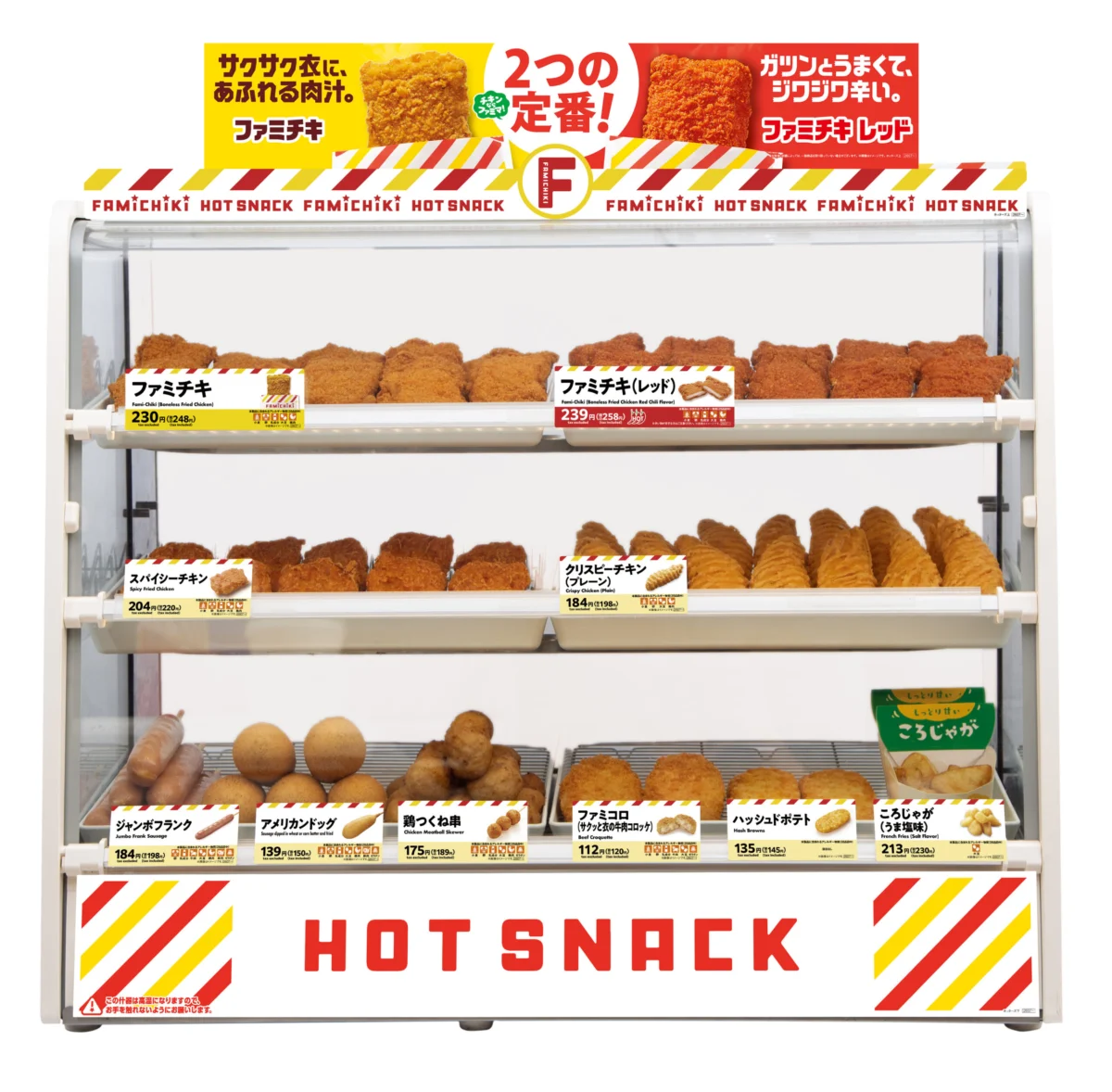
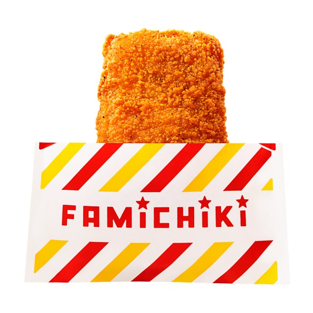
- Display Uniformity: The hot food display cases at FamilyMart are undergoing a concurrent update. By utilizing the same red-and-yellow striped design in the hardware of the displays as well as the paper packaging, the company is aiming for a "holistic visual experience." This makes the fried chicken section more visually striking and, crucially, more photogenic for the social media-driven generation.
- Sustainability and Efficiency: While not explicitly framed as a purely "green" initiative, the modernization of the packaging is often a precursor to material optimizations. By simplifying the graphics and the printing process, the company is also looking to streamline its supply chain and reduce the carbon footprint associated with high-volume, single-use packaging.
Implications: The Future of the Konbini Snack
The removal of the "I am Chicken" text is more than just a graphic design choice; it represents a maturation of the Japanese convenience store sector. For years, the konbini was viewed as a functional, utilitarian space. Today, brands like FamilyMart are competing on identity and brand loyalty.
By hiring a creative director of NIGO’s stature, FamilyMart is signaling that they are no longer just a place to pick up a quick bite—they are a lifestyle brand. The new, sleeker Famichiki bag is likely to become a collector’s item of sorts, marking a specific era in the company’s history.
For the average salaryman or student grabbing a late-night snack, the change might feel subtle, but for the industry, it is a significant pivot. If this redesign succeeds in maintaining the product’s status as a top-selling item while elevating the brand’s image, it is likely that other convenience store staples—from egg salad sandwiches to onigiri—will follow suit with their own minimalist, design-led makeovers.
Ultimately, while the words "I am Chicken" are fading from the shelves, the legacy of the snack remains secure. As the new packaging rolls out across Japan’s thousands of storefronts, customers will continue to reach for that familiar yellow-and-white bag, perhaps with a slight sense of nostalgia, but with the same appetite for one of the world’s most successful, and now redesigned, hot snacks.