
 Muslim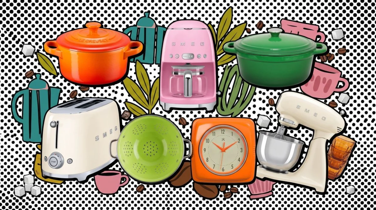
New York Fashion Week (NYFW) has long served as the global bellwether for aesthetic shifts, dictating the visual language that permeates everything from high-end couture to mass-market consumer goods. While the focus remains firmly on the sartorial silhouettes of the upcoming season, the influence of the catwalk is increasingly bleeding into the heart of the home.
In its latest Fashion Color Trend Report for Spring/Summer 2027, the Pantone Color Institute has unveiled a palette that signals a departure from the muted, minimalist tones of previous years. Moving toward a future defined by vibrancy and psychological restoration, the new seasonless shades—spanning electric lime greens, saturated rosy pinks, and high-octane fiery oranges—are set to redefine modern interior design.
Main Facts: The 2027 Chromatic Shift
The Pantone Color Institute’s latest forecast serves as more than just a guide for textile manufacturers; it is a cultural barometer. The Spring/Summer 2027 report identifies five key shades that represent a "zest for life," a collective reaction to the desire for optimism in an increasingly digital and often overwhelming world.
The selected hues—which include high-saturation greens and warm, grounding yet energetic oranges—are designed to be "seasonless." This is a critical pivot in industry standards; by moving away from strictly seasonal palettes, designers and manufacturers can promote sustainability, encouraging consumers to invest in pieces that remain relevant year-round rather than being relegated to a single quarter.
For the interior design enthusiast, this means the kitchen and living room are no longer restricted to "safe" neutrals. Instead, the current trend encourages the integration of statement pieces that serve as functional art, utilizing these high-impact colors to act as focal points in otherwise understated spaces.
Chronology: The Evolution of Color Forecasting
The transition to these bold, primary-adjacent hues did not happen overnight. To understand the significance of the 2027 palette, one must look back at the trajectory of color trends over the last decade:
- 2020–2022 (The Era of Comfort): Following global instability, the design world favored "cocooning" colors—soft beiges, warm terracottas, and sage greens intended to soothe the psyche.
- 2023–2024 (The Digital Infusion): As AI and virtual reality gained mainstream traction, "hyper-brights" and digital lavenders entered the fray, signaling a fascination with the blurring lines between physical and virtual spaces.
- 2025–2026 (The Return to Earthiness): A brief period of "quiet luxury" dominated, where monochromatic schemes and organic textures like stone and wood took center stage.
- 2027 (The Zest for Life): The current shift marks a rejection of the previous two years’ reserve. We are seeing a "maximalist revival" where color is used to inject personality and vigor back into domestic environments.
Supporting Data: Why Color Matters in Design
Psychologically, color is the fastest way to alter the perceived atmosphere of a room. According to architectural psychology studies, high-saturation colors like the "fiery orange" featured in the Pantone report are known to stimulate conversation and appetite, making them ideal for kitchen environments.
Market trends currently reflect a significant uptick in consumer interest regarding "colorful appliances." Data from major home retailers suggests that searches for "colored kitchen gadgets" have risen by 34% since the beginning of the year. This shift is being driven by:
- The "Dopamine Decor" Movement: A social media-driven design philosophy that prioritizes happiness and nostalgia over rigid minimalist aesthetics.
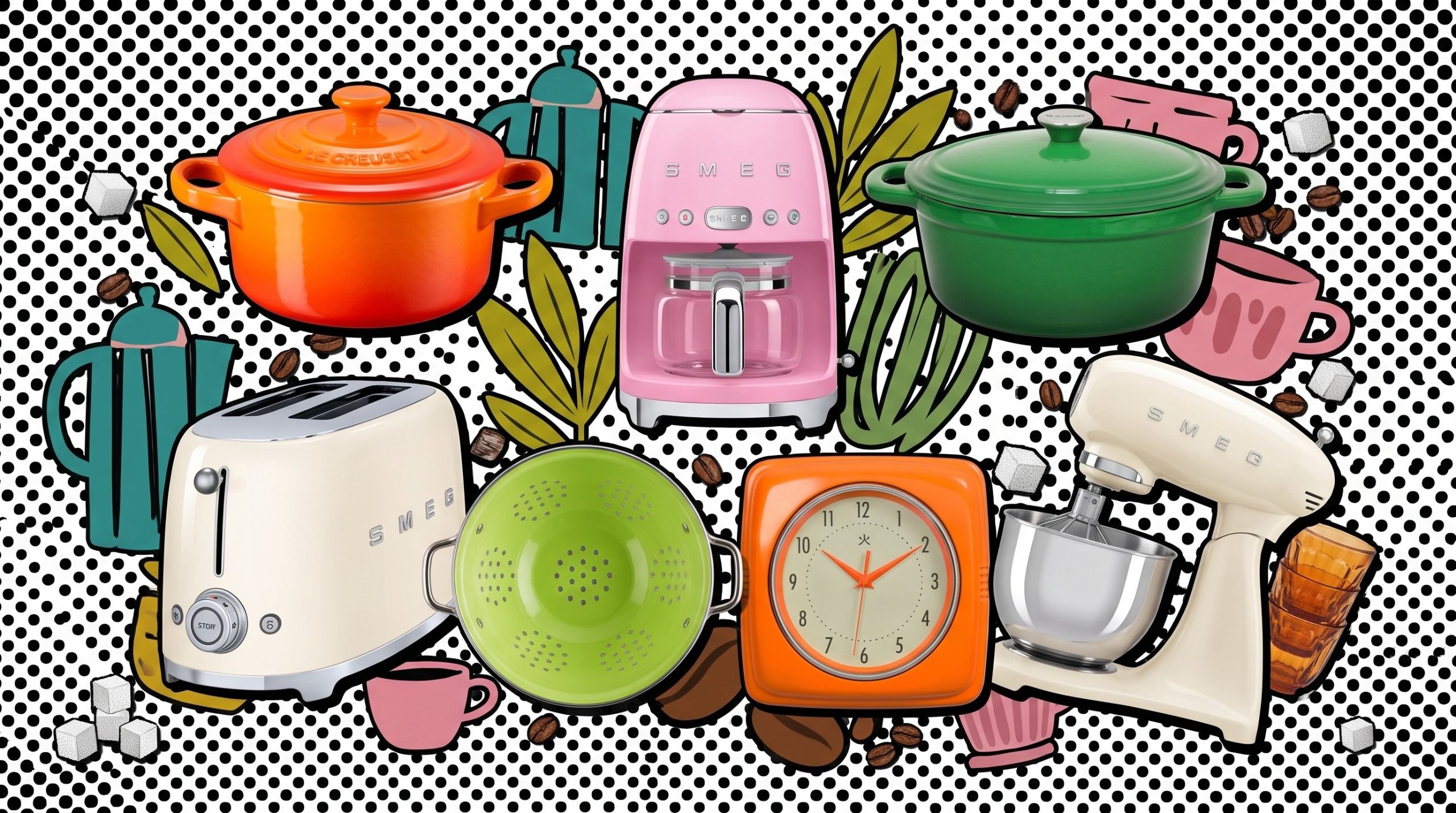
- The Rise of the "Hero Appliance": Consumers are moving away from all-white or all-stainless steel kitchens. Instead, they are opting for one or two high-end, colorful appliances—like a Le Creuset Dutch oven in a vibrant sunset orange or a Smeg toaster in lime green—to serve as the "hero" of the kitchen.
- Sustainability Metrics: By purchasing durable, high-quality goods in bold colors, consumers are moving away from "fast-fashion" home goods, choosing items they intend to keep for decades.
Official Responses and Industry Insights
Leatrice Eiseman, Executive Director of the Pantone Color Institute, has noted that the 2027 palette is a direct response to the "human need for vitality." In a recent statement, she noted: "Our choices for Spring/Summer 2027 represent a yearning for connection—both to nature and to our own internal sense of joy. These colors are not merely decorative; they are tools for emotional regulation."
Industry experts at Creative Bloq and other design platforms have echoed this sentiment. Designers are currently advising clients to avoid "color-drenching" an entire room in these intense shades unless they are seeking a highly stylized look. Instead, the current consensus is to use these hues as accents. "Think of your kitchen like a canvas," says one prominent interior stylist. "The neutral cabinetry is your background, but the appliances, textiles, and ceramics are your paint. The 2027 palette provides the perfect pigment to make that canvas pop."
Implications: How to Incorporate the Trend
If you are looking to update your home to align with these runway-inspired hues, the key is balance. Here is how you can apply the 2027 Pantone report to your living space:
1. The Kitchen as a Gallery
The kitchen is the most practical place to start. A lime green Smeg coffee machine or a fiery orange Le Creuset pot acts as a "functional accessory." These items are meant to be displayed on countertops, not hidden in cupboards. They provide the necessary color punch without requiring a full kitchen renovation.
2. Textile and Texture
If bold appliances feel like too much of a commitment, look to soft goods. Rosy pinks translate beautifully to kitchen linens, seat cushions, or even artwork. Because these items are easily swapped, they allow you to participate in the trend without the long-term cost.
3. The "Seasonless" Philosophy
The most important takeaway from the 2027 report is the idea of "seasonless" living. When choosing these vibrant pieces, consider how they will interact with your space during different times of the year. A fiery orange, for instance, provides a warm, cozy glow in the winter and a vibrant, tropical feel in the summer. By investing in pieces that bridge these seasonal divides, you create a timeless interior that remains relevant regardless of the fashion calendar.
4. Balancing the Bold
When working with high-impact colors, the "60-30-10" rule remains your best friend. 60% of the room should be a dominant neutral, 30% a secondary color (perhaps a muted variation of your bold shade), and 10% the "accent" color—the electric lime or vibrant orange that makes the room come alive.
Conclusion
The Pantone Spring/Summer 2027 report is a clarion call for color. By inviting the runway’s energy into our kitchens and living rooms, we are doing more than just keeping up with trends—we are curating spaces that reflect a more optimistic, bold, and personalized approach to design. Whether through a single statement appliance or a deliberate refresh of your home accessories, the future of design is undeniably bright, vibrant, and full of life. As the lines between high fashion and home design continue to blur, one thing is certain: the most stylish home of 2027 will be the one that isn’t afraid to show its true colors.

 Dwi Wanna
 Azzam Bilal Chamdy