As Wikipedia celebrates its 25th anniversary, the digital encyclopedia is reflecting on a quarter-century of democratizing knowledge. While the platform is best known for its mission to provide free access to information, it has recently captured the internet’s collective imagination with something far more whimsical: a long-lost, multi-legged mascot known as "Wikipede." Originally conceived as a rejected logo candidate during the site’s early developmental years, this pixelated creature has transitioned from a digital footnote to an official piece of merchandise, proving that even in the world of serious information, there is room for absurdity.
The Genesis of an Online Titan
When Jimmy Wales and Larry Sanger launched Wikipedia in 2001, the project was little more than a radical experiment in collaborative knowledge. As the platform grew from a niche academic project into a global cultural necessity, the need for a recognizable visual identity became paramount. The iconic "Puzzle Globe"—an incomplete sphere composed of jigsaw pieces featuring characters from various writing systems—eventually became the permanent face of the organization.
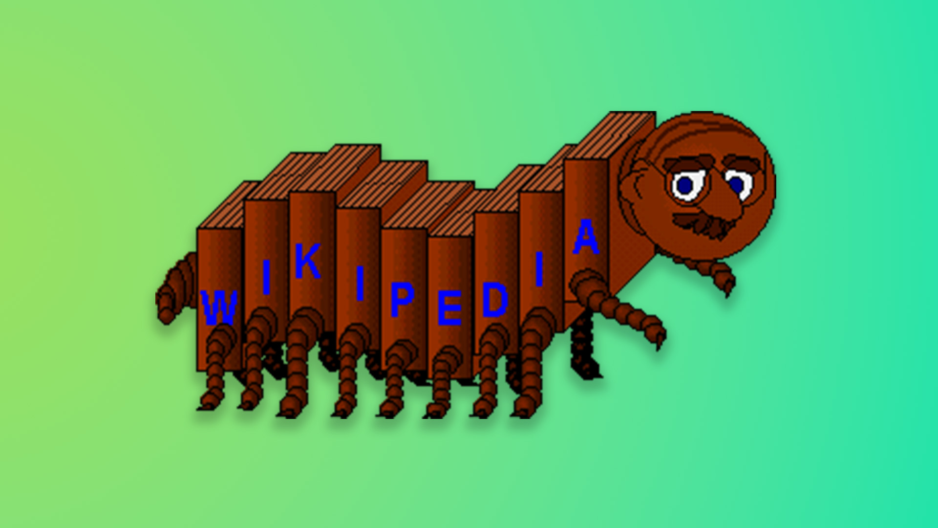
However, the road to that final logo was paved with dozens of discarded concepts. In the early 2000s, the design community surrounding the project explored a variety of metaphors for the gathering of human knowledge. These included abstract representations of spider webs, industrial saw blades, and complex geometric structures. Among these candidates was the Wikipede, a bizarre, moustachioed creature that looked as if it had been plucked directly from an early 2000s desktop browser game.
Chronology of a Cult Phenomenon
The history of the Wikipede is a study in unintentional branding. For years, the character remained hidden in the deep archives of Wikimedia design forums, known only to the most dedicated Wikipedians and design historians.

- 2001–2003: During the formative years of the platform, the Wikimedia community held informal design contests. The Wikipede was submitted as a candidate, likely intended to represent the "crawling" nature of search bots or the industrious, multi-handed nature of volunteer editors.
- The Archive Re-discovery: As Wikipedia approached its 25th anniversary, staff began combing through their historical archives to create a "time capsule" of early design concepts. The pixelated, charmingly awkward Wikipede was unearthed, sparking immediate fascination within the organization.
- April 2025: To mark the anniversary, the Wikimedia team decided to lean into the nostalgia. They jokingly announced the Wikipede as the new official logo for the entire site. The internet, starved for authentic, low-stakes humor, responded with an outpouring of genuine affection.
- The Aftermath: What began as a brief, lighthearted prank quickly spiraled into a grassroots movement. Fans on social media platforms began demanding physical goods featuring the creature, forcing the organization to recognize that they had accidentally created an aesthetic icon.
Why the Wikipede Resonates
Psychologists and brand strategists often discuss the "uncanny valley," but the Wikipede seems to bypass this entirely by leaning into its own digital imperfection. Its design—characterized by a slightly dazed expression, a distinct moustache, and an abundance of legs—encapsulates the specific "web-native" aesthetic of the early millennium.
For a generation that grew up with the early internet, the Wikipede represents a simpler time. It reminds users of the days when the internet felt like a vast, unmapped wilderness rather than a corporate-dominated landscape. Its "pixel-art" aesthetic is inherently non-threatening and suggests an era of amateur creativity, which aligns perfectly with Wikipedia’s ethos of volunteer-led contribution.
Official Responses and the Move to Merch
Following the viral success of the April Fools’ announcement, the Wikimedia Foundation found itself in a unique position. Unlike most corporate entities that would ignore such a trend or issue a cease-and-desist to avoid "diluting the brand," the Wikimedia team chose to lean into the community’s enthusiasm.
In a formal statement, a spokesperson for the Wikimedia Store noted that the decision to produce official merchandise was a direct response to the "overwhelming and enduring infatuation" expressed by the user base. "The community asked for the Wikipede, and we felt it was only right to acknowledge the history of the project, including its humorous and experimental beginnings," the representative stated.
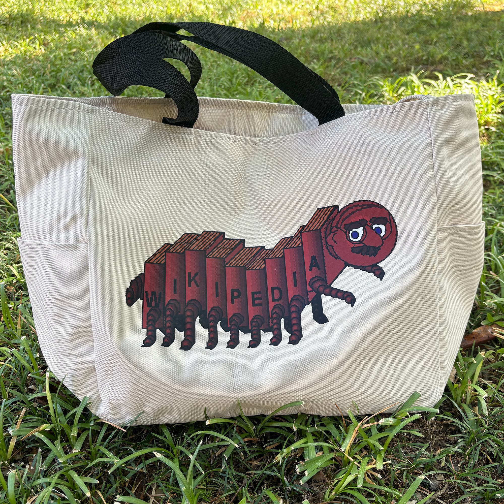
The resulting merchandise line—which includes high-quality tote bags and desk-friendly mouse pads—has sold out in several regions. This response indicates that Wikipedia’s brand equity is strong enough to survive, and even thrive, when it permits itself to be playful.
The Implications for Non-Profit Branding
The success of the Wikipede experiment carries significant implications for non-profit and educational organizations. In an age where digital fatigue is high, branding that feels human, nostalgic, and slightly self-deprecating can create a stronger emotional bond with users than polished, sterile corporate imagery.
By celebrating its "rejected" past, Wikipedia has managed to humanize its massive, faceless database. It signals to the public that the organization is managed by real people who share in the same internet culture as their users. This "brand transparency" acts as a powerful tool for community engagement, reinforcing the idea that Wikipedia is not just a utility, but a living, breathing part of the global cultural heritage.
The "Baby Globe" and the Future of Visual Identity
It is important to note that the Wikipede is not the only mascot currently enjoying the spotlight. Alongside the centipede-like icon, the organization has introduced a "Baby Globe"—a more modern, simplified, and undeniably "adorable" iteration of the classic puzzle sphere.
While the Baby Globe serves as a professional mascot for the 25th anniversary, the Wikipede serves as its irreverent older sibling. Together, they represent the two sides of the Wikipedia coin: the professional, highly organized commitment to knowledge, and the messy, chaotic, and lovable history of the internet that birthed it.
Conclusion: A Lesson in Digital Nostalgia
As Wikipedia looks toward the next 25 years, the lesson of the Wikipede remains clear: authenticity is the most valuable currency in the digital age. By refusing to hide its awkward origins, the site has managed to turn a relic of 2000s design into a symbol of collective memory.
Whether the Wikipede remains a permanent fixture of the Wikimedia Store or eventually returns to the digital archives, its brief moment in the sun has served a purpose. It has reminded us that even the most serious institutions are made of human effort, and that occasionally, it is worth looking back at the "rejected" ideas of the past to find something truly special. For those looking to own a piece of this history, the limited-edition merchandise remains a testament to the fact that, on the internet, even a moustachioed bug can become a legend.