 Muslim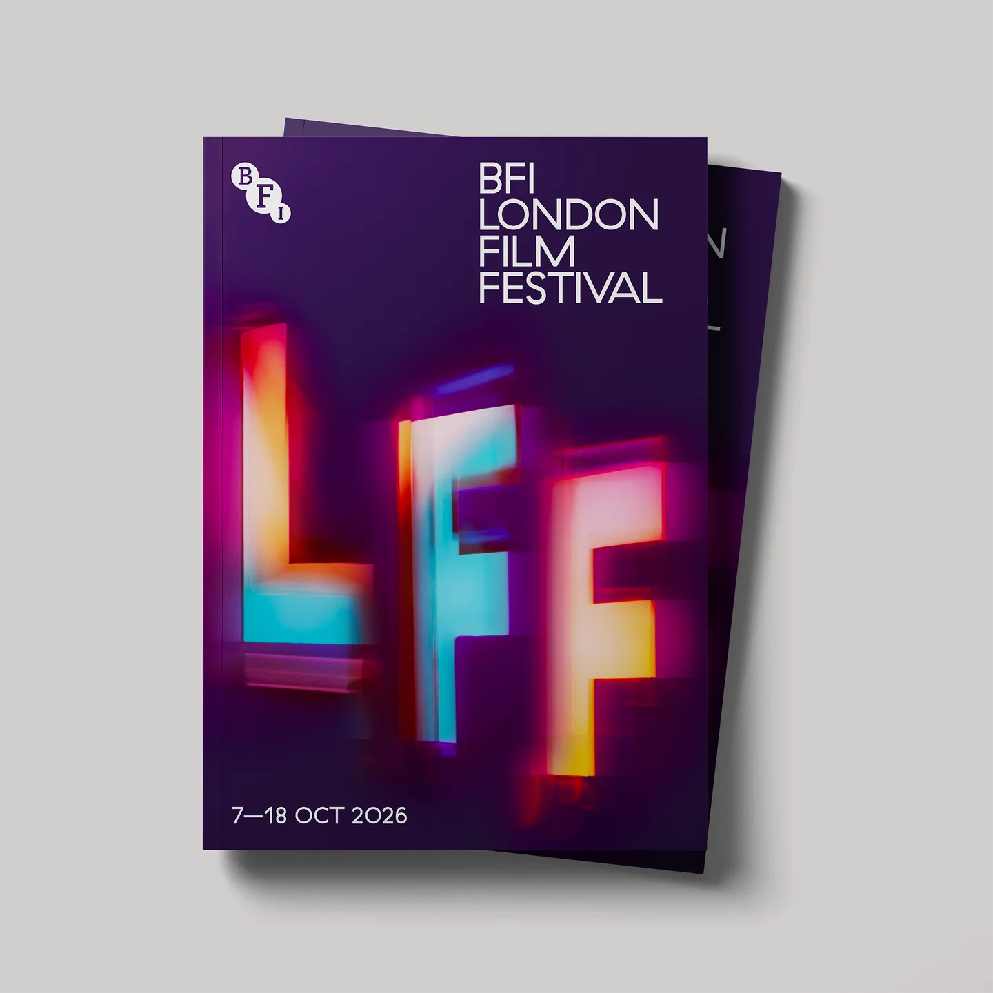
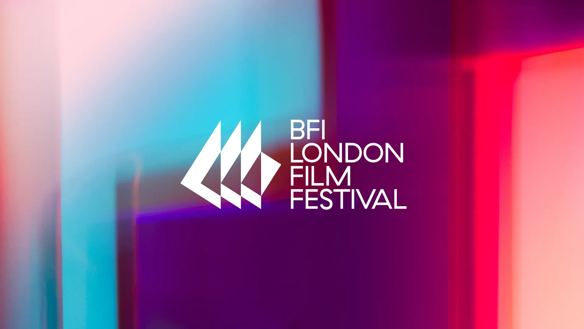
As the British Film Institute (BFI) gears up for the landmark 70th edition of the London Film Festival (LFF), the organization has unveiled a visual identity that serves as both a celebration of its storied past and a bold statement on the future of cinematic storytelling. Moving away from static, corporate aesthetics, the new brand identity—conceived by the world-renowned design consultancy Pentagram—embraces the tactile, analogue roots of filmmaking.
In an era where digital perfection often dominates the design landscape, this project stands as a testament to the power of human-curated, "living" design. By marrying the technical precision of modern typography with the organic chaos of light and physical movement, the festival has created a visual language that feels less like a corporate logo and more like a captured moment of film itself.
The Core Concept: Designing with Purpose
In the high-stakes world of festival branding, the temptation is often to chase fleeting trends—over-saturated colors, AI-generated surrealism, or overly minimalist logos that lack soul. However, the LFF’s new look intentionally avoids these traps, favoring what lead designer Marina Willer describes as a "design with purpose."
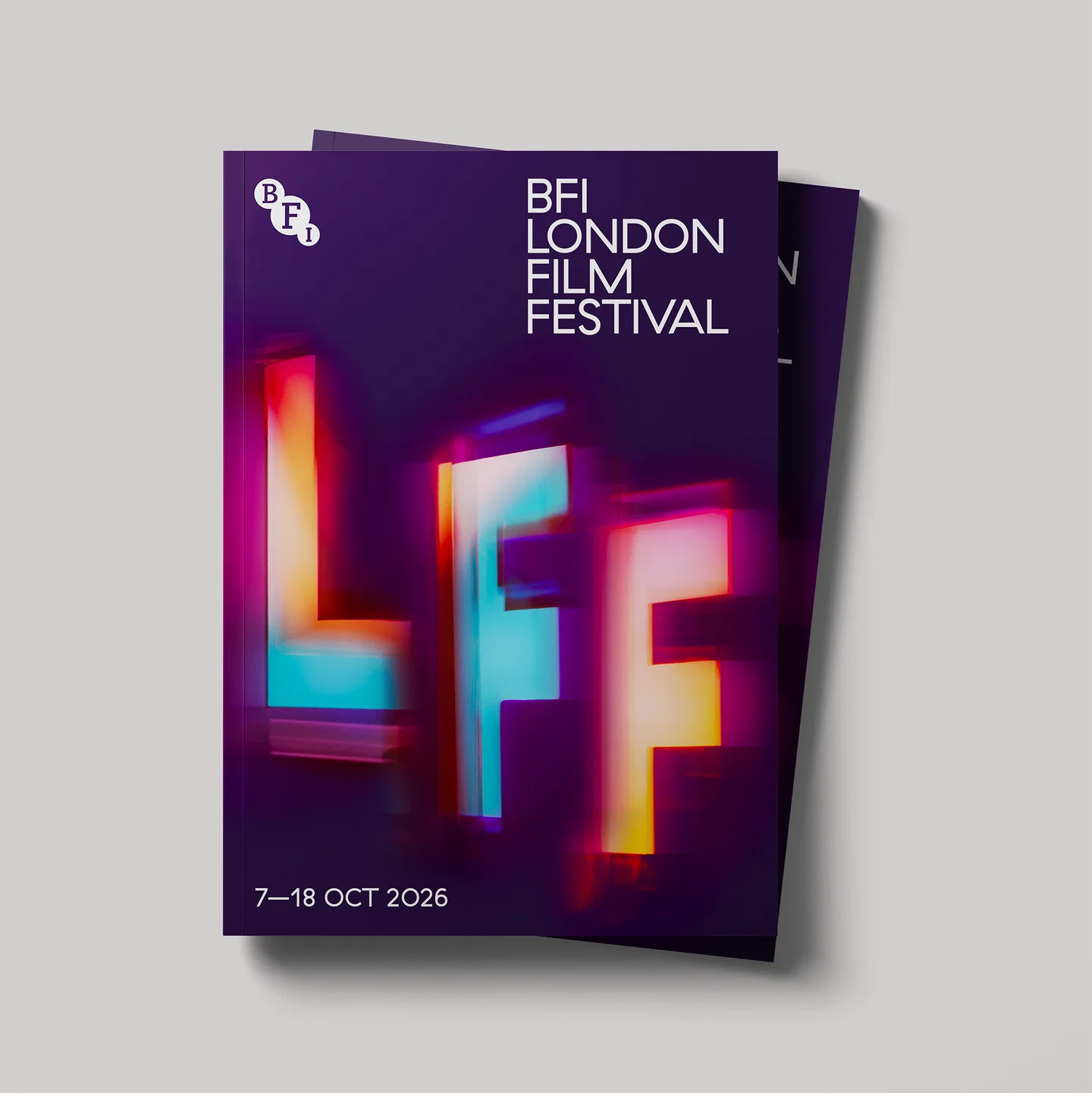
The centerpiece of the identity is a bespoke, custom-cut typographic system representing the festival’s shorthand: "LFF." Rather than being rendered purely in software, these letters were treated as physical objects. By manipulating them in real space—hanging them from wires, rotating them on tables, and casting light through them—the design team captured the interplay between shadow, depth, and the cinematic screen.
The resulting aesthetic is one of "tranquil dynamism." It acknowledges the heritage of the BFI while positioning the festival as a contemporary, living entity that breathes alongside the films it screens. It is a masterclass in restraint, proving that when design is rooted in the process of its subject matter, it resonates far more deeply than any digital flourish.
A Chronology of the Redesign
The evolution of the LFF brand has historically mirrored the changes in the cinematic industry itself. To understand the significance of this 70th-anniversary shift, one must look at the timeline of the festival’s branding journey:
- The Heritage Era (Early Decades): For much of its early history, the BFI London Film Festival relied on standard institutional typography and functional graphic design, prioritizing the "BFI" brand identity over the specific personality of the festival itself.
- The Modernization Phase (2010s): As the festival grew into a global powerhouse, branding began to focus on high-impact photography and bold, sans-serif palettes. This period saw the LFF solidify its status as a major player on the international circuit, though its branding remained relatively static.
- The 70th Anniversary Pivot (2025–2026): In preparation for the 70th anniversary, the BFI sought a partner capable of capturing the "analogue beauty" of film. The commission was awarded to Pentagram, with partner Marina Willer leading the creative direction.
- The Process (Late 2025): The development phase saw the team move from digital sketches to physical fabrication. The team experimented with light projections against black backdrops, mimicking the light of a cinema projector in a dark theater.
- The Unveiling (Current): The final system was launched to the public as the official identity for the 2026 festival, marking a departure from previous iterations by emphasizing motion and tactile texture.
Behind the Lens: The Technical Execution
The brilliance of this identity lies in its refusal to rely on "undo" buttons. By physically manipulating the typography, Pentagram introduced elements of serendipity that are difficult to replicate via algorithmic design.
The Physicality of Type
The "LFF" letters were not merely designed; they were manufactured. By physically cutting the letterforms, the team allowed for the introduction of real-world physics. When these letters were suspended, the natural swing and sway of the objects added a layer of human movement that translates into a sense of "presence" on the screen.
Lighting as a Narrative Tool
The use of light was perhaps the most crucial element. By placing the physical letters in front of projectors and varying the light intensity, the designers created shadows that elongated, distorted, and danced. This reflects the very essence of cinema—a medium defined by the projection of light through a medium to create an image. By using the tools of the filmmaker to create the branding of the festival, Pentagram closed the loop between the institution and the art form it celebrates.
Digital Enhancement and Editing
While the roots are physical, the final product is a marriage of old and new. Once the motion footage was captured, digital editing was used to refine the timing and emphasize the "weight" of the typography. This digital polishing ensures that the identity remains legible across various formats—from massive outdoor billboards to the small screens of smartphones—without losing the organic energy of the original footage.
Supporting Data: Why "Living" Design Matters
Recent studies in consumer psychology and brand identity suggest that audiences are increasingly fatigued by "perfect," machine-made aesthetics. A 2024 report on visual trends indicated that engagement rates for brands using "imperfect" or "human-made" aesthetics—such as hand-drawn elements, grain, or physical textures—are 35% higher than those utilizing purely flat, digital-first designs.
The LFF’s move toward this identity is not just an artistic choice; it is a strategic one. By grounding the brand in the tactile, the festival distinguishes itself from streaming platforms and corporate media outlets that rely on sanitized, algorithm-friendly visuals. The "LFF" logo acts as a sensory anchor, reminding the audience that the festival is an experience to be felt, not just a product to be consumed.
Official Perspectives
Marina Willer, the Pentagram partner behind the project, has spoken extensively on the need for design to tell a story rather than just identify a brand. "Cinema is about the manipulation of light and time," Willer noted in a recent interview. "By using physical letters and light projections, we weren’t just creating a logo; we were creating a dialogue with the medium of film itself. We wanted the identity to look like it was vibrating with the energy of a theater during a premiere."
BFI leadership has also lauded the project for its longevity. A spokesperson for the festival remarked, "As we hit our 70th year, we needed an identity that felt as timeless as the medium we champion. This new system isn’t just for 2026; it’s a framework that allows us to grow and adapt while remaining true to the soul of filmmaking."
Implications for the Future of Branding
The BFI London Film Festival’s rebranding signals a wider shift in the creative industry: a "return to the analog." As artificial intelligence becomes an increasingly standard tool in the designer’s kit, projects that emphasize physical craftsmanship will likely carry a higher premium.
1. The Death of the "Static" Logo
The days of the rigid, unmoving logo are numbered. The LFF identity demonstrates that brands are now expected to be "liquid"—capable of morphing, moving, and reacting to their environment. This requires designers to think like directors, considering motion, duration, and rhythm.
2. Craft as a Competitive Advantage
In a market saturated with generic AI-generated imagery, the "human touch" has become a unique selling proposition. The LFF identity proves that when you can point to a specific, physical process—"we hung these letters, we filmed them, we captured this light"—you build a narrative that is inherently more compelling than a generated graphic.
3. Sustainability and Heritage
By creating an identity that feels "timeless," the BFI is also making a nod toward sustainability. A brand that doesn’t need to be replaced every two years because it "feels old" is an investment in long-term brand equity. This is a lesson many organizations, both in the arts and the corporate sector, would do well to emulate.
Conclusion: A Celebration of Cinema
The 70th BFI London Film Festival is poised to be more than just a sequence of screenings; it is a milestone in the history of an institution that has done more to preserve the magic of film than almost any other. With this new brand identity, the LFF has successfully captured the essence of the cinematic experience—the flicker of the light, the weight of the story, and the thrill of the premiere.
As the festival approaches, the "LFF" letters will serve as a beacon for cinephiles worldwide. They are a reminder that while the technology of film may change—shifting from celluloid to digital, and now into the age of AI—the core of the medium remains the same: it is the art of light, the craft of the human hand, and the shared experience of watching a story unfold in the dark.
For those inspired by the LFF’s bold new look, the message is clear: design is at its best when it stops trying to be the most "efficient" or "modern" thing in the room and starts trying to be the most human. Whether through the lens of a camera or the tip of a pen, the future of branding belongs to those who dare to keep it organic.

 Sagoh
Sagoh
 Nana Muazin