
 Sagoh
Sagoh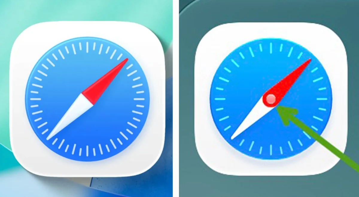
As the mid-September release of iOS 27 approaches, the tech world is buzzing with anticipation. From the integration of "Apple Intelligence" generative AI features to a comprehensively overhauled, context-aware Siri, the upcoming operating system promises a transformative experience for iPhone users. However, in the hyper-scrutinized ecosystem of Cupertino, innovation is rarely the only topic of conversation.
While engineers sweat the technical details of neural engines and large language models, the design community has been set ablaze by a seemingly innocuous change: the redesigned Safari browser icon. For many long-term Apple enthusiasts, this minor aesthetic tweak has become a lightning rod for a broader debate regarding the company’s commitment to the meticulous, detail-oriented design philosophy that once defined its market dominance.
The Anatomy of the Controversy
The core of the issue lies in the visual representation of the compass—the long-standing motif of the Safari browser. Beta testers of iOS 27 have noted that the new icon features a central pin, but it is the rendering of the needle that has drawn the ire of design purists.
In the latest iteration, the compass needle appears as two overlapping, distinct slivers—a red segment over a white segment. To the untrained eye, it might look like a stylistic choice; to those familiar with navigation instruments, it looks like a watch face.
"Whoever designed this doesn’t understand how a compass works," remarked one prominent designer on social media. "They don’t know it’s just a single pin. If it were like the classic iOS 6 iteration, with a clean, flat line intersecting the pin, it would be perfectly legible. This current design introduces a level of mechanical confusion that serves no functional or aesthetic purpose."
The criticism is not merely about the look of the icon, but about what it represents: a perceived departure from the "Apple standard" of functional, logical design. When an icon meant to represent a tool becomes physically impossible in reality, it breaks the subtle contract of skeuomorphic logic that Apple’s UI once championed.
A Chronology of Design Shifts
To understand why this small icon change has sparked such a heated discourse, one must look at the trajectory of Apple’s design language over the past two decades.
The Skeuomorphic Era (2007–2013)
In the early days of iOS, Apple leaned heavily into skeuomorphism—designing digital elements to look and behave like their real-world counterparts. The Safari icon was a faithful representation of a physical compass, complete with depth, shadows, and a singular, logical needle. It was a time when Apple’s design philosophy was rooted in familiar tactility.
The Flat Revolution (2013–2020)
With the launch of iOS 7, Jony Ive led a radical departure toward "Flat Design." While the shift prioritized clean lines and digital-first aesthetics, it arguably began the slow erosion of the functional realism that users had come to expect. The Safari icon was simplified, but it remained grounded in its original, recognizable silhouette.
The Modern Complexity (2020–Present)
As Apple has moved toward "Neumorphism" and more complex, layered iconography, the Safari icon has undergone several subtle refinements. However, the iOS 27 version marks a shift toward a more decorative, and arguably less accurate, depiction. The introduction of the "overlapping needle" has led critics to argue that Apple is prioritizing trendy, layered graphics over the structural integrity of its visual language.
Supporting Data: Why Precision Matters
Apple’s brand identity is built on a foundation of "Perfect Attention to Detail." This is the company that famously spent months refining the curvature of its retail store corners and the specific shade of white on its power adapters.
When that level of scrutiny is applied to a software icon, the current Safari design stands out as an anomaly. By comparing the current icon against the historical iterations, we can see a clear deviation:
- iOS 6 (The Gold Standard): A single, continuous needle bisected by a pin. Mechanically sound and visually iconic.
- iOS 15–16: A refined, flat version that maintained the singular, unified aesthetic.
- iOS 27 (The Current Controversy): A dual-needle design that ignores the physics of a magnetic compass, drawing criticism for its "watch-like" interference.
Designers who have attempted to "fix" the icon—proposing versions with liquid glass refraction or simplified, singular needles—have garnered significant traction on social media. These user-generated alternatives highlight that the community is not asking for a radical redesign, but rather a return to the logical consistency that once made Apple the gold standard for UI/UX.
Official Silence and Industry Implications
As of this writing, Apple has not issued an official statement regarding the Safari icon. This is standard procedure for the company, which rarely engages with community feedback on minor design choices during a beta cycle. However, the silence has only amplified the speculation.
Some analysts argue that this controversy is indicative of a "design fatigue" within the company. With the massive undertaking of integrating AI into the core OS, some suggest that the "finishing touches" on traditional UI elements are being outsourced or rushed.
"Someone drew that, and somebody approved it," says a vocal critic in the design community. "Details like that give a good idea of what direction things are going. If they can’t get the icon for their primary browser right, how can we trust them to handle the complex, abstract visual language of generative AI?"
The concern is that this isn’t just about a compass needle; it’s about the "broken window theory" of software design. If small, nonsensical details are permitted to reach the final build, it suggests a lack of top-down oversight that could eventually impact more critical features like security, accessibility, or system stability.
Looking Beyond the Needle: What’s Next?
The irony of the Safari icon debate is that it coincides with one of the most ambitious updates in Apple’s history. While users argue over a pixel-based needle, the company is attempting to redefine how users interact with their devices through "Apple Intelligence."
If Apple chooses to ignore the feedback and leaves the Safari icon as-is, it will likely be forgotten within a few weeks of the iOS 27 launch, eclipsed by the sheer utility of the new AI features. However, if the company chooses to tweak the icon in a subsequent point release, it will be a rare, tacit admission that they are listening to the design purists.
For now, the "Safari Compass Controversy" remains a fascinating case study in brand expectation. Apple has set the bar so high for itself that a single, slightly inaccurate compass needle is enough to trigger a global conversation about the company’s identity.
Perhaps, as one observer joked, "Apple knows something we don’t about the future of geomagnetism." Or, more likely, it is a reminder that in a world of complex, AI-driven software, the human need for simple, logical, and accurate design remains as strong as ever. Whether this is a sign of a company losing its north or merely a stylistic stumble remains to be seen when the final version of iOS 27 officially goes live. Until then, the design community will keep a watchful eye on the compass—hoping, perhaps, that the ship is still heading in the right direction.


 Dwi Wanna
 Lina Irawan