

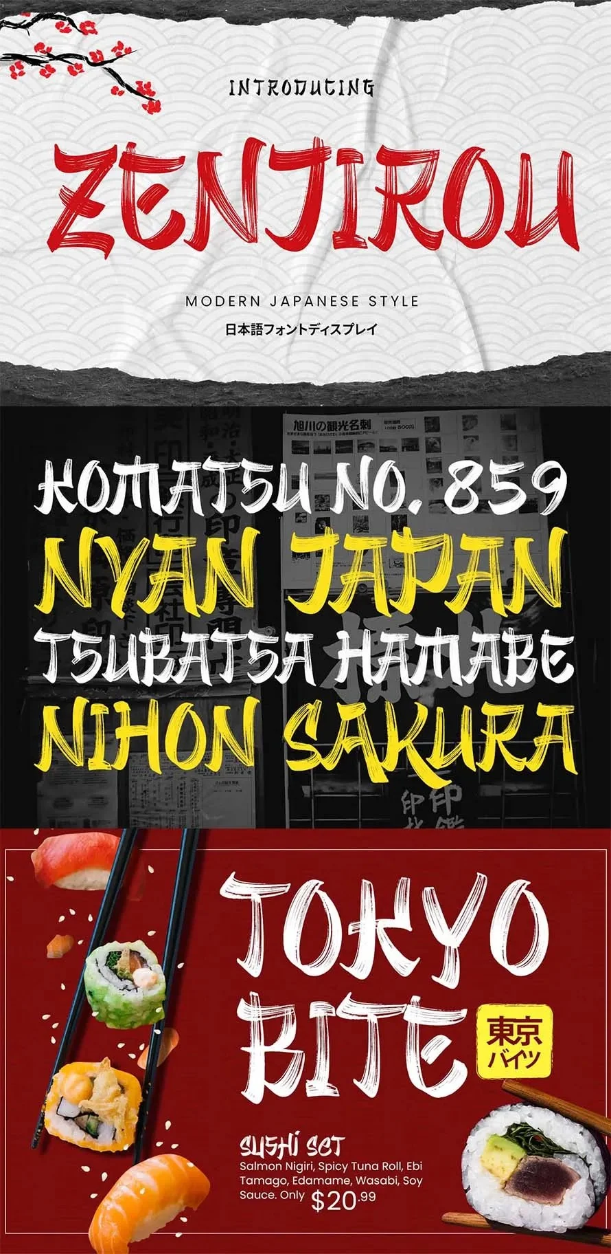
In the contemporary landscape of graphic design, the visual language of Japan occupies a position of distinct prestige. From the delicate, rhythmic strokes of ancient calligraphy to the hyper-modern, neon-drenched aesthetics of Tokyo’s urban signage, Japanese typography offers a vast spectrum of creative potential. For designers operating in the international market, incorporating these elements is no longer just about cultural homage; it is a strategic choice to infuse projects with a sense of sophistication, authenticity, and visual authority.

As we navigate the trends of 2025 and beyond, the demand for high-quality, Japanese-inspired fonts has reached an all-time high. Whether for high-end product packaging, immersive branding, or social media campaigns, these typefaces act as a bridge, allowing designers to convey the "spirit" of Japan while maintaining the accessibility of the Latin alphabet for global audiences.

Main Facts: The Intersection of Culture and Code
At the core of the Japanese typographic aesthetic lies a balance between minimalism and complexity. Unlike many Western typefaces that rely on serif or sans-serif structures developed through historical European evolution, Japanese-style fonts—often referred to as "Japonesque" or "Japanese-influenced" fonts—are engineered to replicate the movement of the fude (brush) or the structural precision of kanji and kana.

The most critical fact for modern designers is that these fonts are predominantly crafted for English-speaking environments. They utilize Latin characters but apply the "logic" of Japanese calligraphy—such as varying line thickness, sharp terminal points, or modular, geometric framing. This allows for immediate visual recognition of a "Japanese theme" without the necessity of actual translation, making these assets highly versatile for commercial branding.

Chronology: The Evolution of Japanese-Style Typography
The adoption of Japanese-influenced typography in the West has followed a fascinating trajectory:

- 1980s – 1990s: The Minimalist Wave: Following the economic boom in Japan, Western designers began experimenting with clean, geometric fonts inspired by Japanese industrial design.
- 2000s – 2010s: The Calligraphic Renaissance: As digital tools became more sophisticated, type foundries began focusing on "Brush" fonts, mimicking the raw, emotive power of traditional Shodo (calligraphy).
- 2020s – Present: The Hybrid Era: We are currently in an era where "Modern-Traditionalism" dominates. Fonts now combine the precision of vector technology with the organic, imperfect feel of hand-drawn ink. The current market, featuring over 35+ high-performance Japanese-style fonts, reflects a shift toward hyper-specific branding needs, such as esports, high-fashion labels, and sustainable food packaging.
Supporting Data: Why Designers Choose Japanese-Inspired Type
Market trends indicate that the use of culturally-themed typography significantly increases engagement in specific sectors:

- Brand Identity: Research into consumer psychology suggests that typography with high-contrast, sharp-angled Japanese influences is perceived as "premium" and "authoritative."
- Visual Hierarchy: Because many of these fonts are designed as "Display Fonts," they excel in creating strong focal points. In a crowded digital space, a bold, Japanese-influenced headline often captures attention faster than standard sans-serif alternatives.
- Versatility: The current collection of fonts spans from ultra-thin, elegant lines to thick, brush-stroke heavy designs. This range allows for use in diverse industries, including:
- Gastronomy: Menus and food branding benefit from the "hand-crafted" feel.
- Fashion: Streetwear labels utilize the sharp, geometric styles for a "Tokyo-cool" aesthetic.
- Digital Gaming: Futuristic, katakana-inspired shapes are becoming the gold standard for UI and title cards in the gaming industry.
Official Perspectives: The Professional Design Standard
Leading industry experts emphasize that the success of a Japanese-style font lies in its readability. "The greatest challenge," notes a prominent typography consultant, "is maintaining the cultural essence of the brush stroke while ensuring that an international audience can read the message at a glance."

Modern designers are encouraged to prioritize fonts that offer multi-language support and glyph variations. As seen in the latest high-end releases like Aokami or Tatsukaze, professional-grade fonts now include comprehensive character sets, ensuring that the visual "vibe" does not come at the expense of technical functionality.

The Collection: A Curated Overview of 35+ Essential Fonts
To help designers navigate the market, we have categorized the top-tier selections that are defining the current design cycle:

The Modernists: Clean Lines and Geometric Structure
- Aokami: A triumph of the modern aesthetic. It bridges the gap between traditional Japanese structure and sharp, contemporary edge.
- Kimochi: A sans-serif powerhouse. It is arguably the most versatile font for high-end corporate branding that requires a subtle nod to Japanese minimalism.
- Shibuya: Capturing the chaotic, electric energy of the Shibuya crossing, this font is the premier choice for fashion and streetwear design.
The Traditionalists: Brush-Inspired and Calligraphic
- Majisora Tenshei: This font utilizes a bold, brush-like flow that mimics the physical movement of the hand. It is ideal for book covers and cinematic titles.
- Sofude Japan Brush: A masterclass in organic design. It offers the most authentic "ink-on-paper" look currently available on the market.
- Kurhamo: Perfect for projects requiring a calm, meditative tone, this font excels in posters and editorial work.
The Futurists: Edgy and Aggressive
- RAIKO: Inspired by the intersection of traditional armor and modern sci-fi, this font is essential for gaming, esports, and tech-focused branding.
- Souta: This font leans into the structural logic of Katakana, providing a futuristic, angular look that is perfectly suited for technology startups and digital media.
Implications for Future Design Projects
As we look toward the future, the integration of Japanese-style typography is set to become even more nuanced. With the rise of AI-assisted design, the ability to manipulate these typefaces into unique, custom logos has never been easier. However, the implication for designers is clear: originality is paramount.

When selecting a font from this vast library, the goal is not merely to "make it look Japanese." The goal is to use the font as a tool to tell a story. Whether you are using the sharp, sword-like strokes of Katana to represent strength or the flowing, soft curves of Miko Wave to represent tradition, the font acts as the primary conduit for the viewer’s emotional response.

How to Choose the Right Asset
- Analyze the Brand Voice: Does the project require the grit of a samurai-inspired font like Samuraki, or the clean, corporate reliability of Sakuro?
- Consider the Medium: A font that looks stunning on a large-format poster (like the bold Banshou) may lose its impact on a small smartphone screen. Always test for legibility in multiple formats.
- Check Technical Specs: Ensure the font includes the necessary symbols, numbers, and language support required for your specific market.
Conclusion: A Timeless Aesthetic
The Japanese-style font movement is more than a fleeting trend; it is a profound appreciation for a culture that has mastered the balance between the ancient and the avant-garde. By utilizing these resources, designers are given the unique opportunity to tap into a rich visual heritage.

Whether you are a freelancer working on a boutique restaurant menu or a lead designer creating a global brand identity, the 35+ fonts highlighted in this collection offer the tools to craft a narrative that is both culturally resonant and undeniably modern. As you browse these options—ranging from the aggressive, sharp cuts of Kiyomori to the gentle, hand-drawn warmth of Ichibana—remember that the most effective design is the one that respects the tradition behind the characters while pushing the boundaries of what is possible in the modern digital age.

Download your assets, experiment with the stroke weights, and let the timeless spirit of Japanese typography transform your next creative project into a work of lasting impact.


No comments yet. Be the first to join the conversation!