You are putting the final polish on a brand identity. The logo resonates, the color palette is sophisticated, and the layout feels balanced. Yet, something remains elusive—a nagging sense that the design is missing its mark. You tweak the kerning, adjust the weight, and shift the margins, but the "visual friction" persists. Often, the culprit isn’t the composition; it’s the font pairing.
Typography is the silent voice of your brand. When two typefaces are forced into a relationship without a clear strategy, they create a dissonance that undermines the professional integrity of your work. As seasoned designers know, font pairing is where design systems succeed or fail. It is a decision of immense consequence, yet it remains a domain where even experts frequently fall into predictable traps.
To help you navigate this complex landscape, we consulted six leading designers and typographers to deconstruct the most common pitfalls in typeface combination and explore how to build a typographic system that sings.
The Core Fundamentals: Why Pairing Matters
At its heart, typography is about hierarchy and communication. When you introduce a second typeface, you are essentially introducing a new character into the brand’s narrative. If these two "characters" speak in conflicting tones, the reader becomes disoriented.

The primary goal of pairing is to create a visual dialogue. This requires a deliberate balance between contrast and cohesion. Too much contrast, and the design becomes chaotic; too little, and it feels like a mistake. Understanding how to manage this tension is the hallmark of a high-level designer.
01. The "Almost Same" Trap: Avoiding Minimal Differences
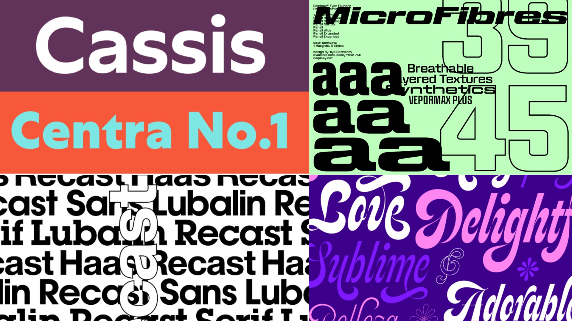
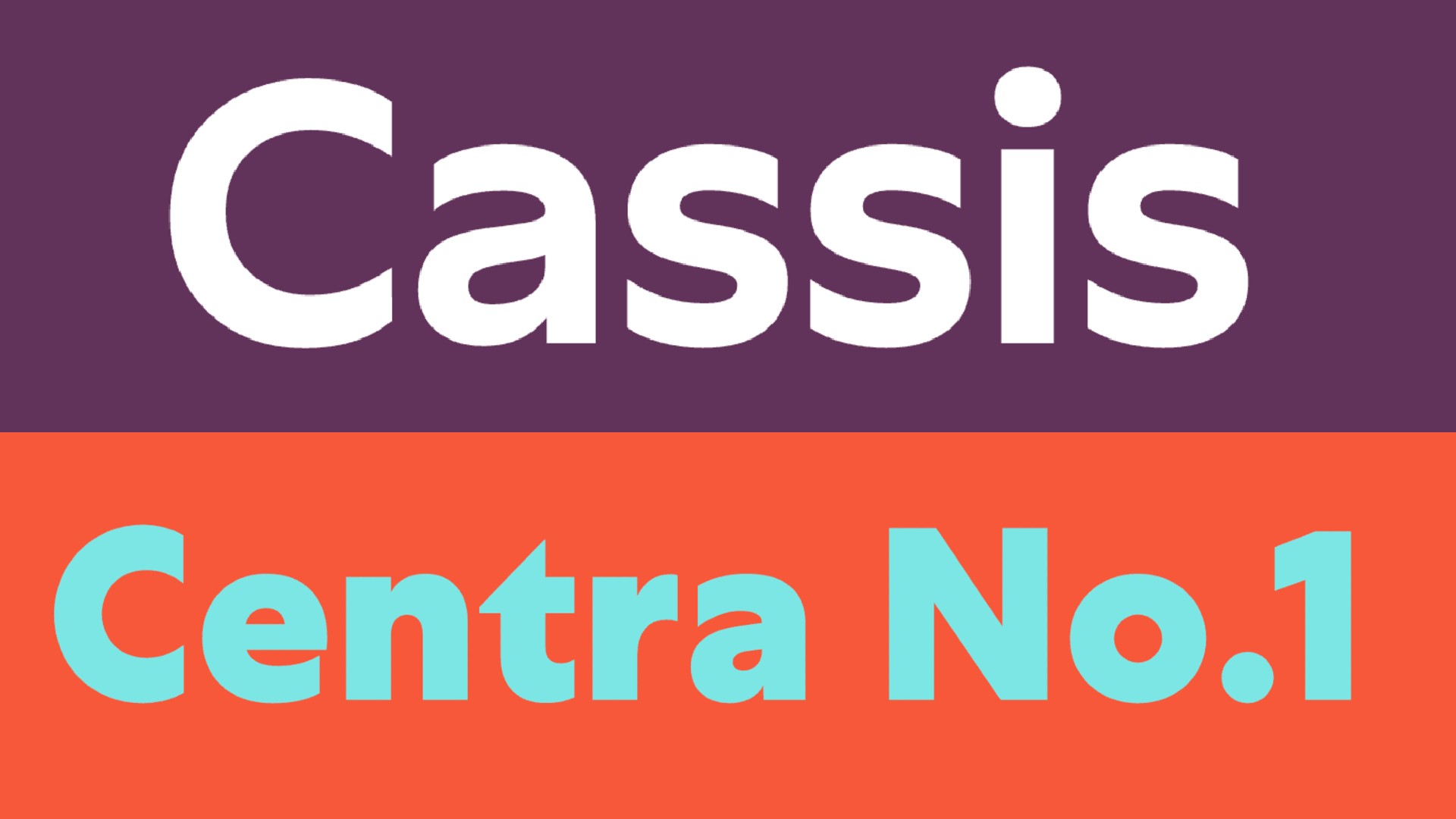
One of the most common errors is pairing two fonts that are near-identical, yet distinct enough to cause visual discomfort. This often happens when a designer selects two geometric sans-serifs that share similar x-heights but vary slightly in their terminals or stroke widths.
"Pairing two geometric sans-serifs that are very similar doesn’t look like a choice; it looks like a mistake," explains Charlie Beeson, design director at FutureBrand. "Viewers get hung up on those tiny yet jarring differences in x-heights or terminals, creating a ‘visual itch.’ If the hierarchy isn’t obvious, it reads as an accident."
Alice Munday, design director at Curious, reinforces this: "Using two fonts that are too similar in style creates a disjointed feeling. Why use both if they do the same job? The decision to be different must be intentional, not incidental."
The Solution: If you want to use two fonts, ensure the contrast is bold and immediately readable. If the difference between two fonts is not obvious to a casual viewer, you are likely better off sticking to a single, versatile typeface family.
02. Defining Clear Roles: The Functionality Framework
A beautiful pairing can fail if the typeface roles are left vague. Without a defined system, designers often use fonts interchangeably, leading to visual drift across various brand touchpoints.
Natasha Lucas, a specialist in visual identity, notes that undefined roles are the death of brand consistency. "Designers may begin using typefaces interchangeably, or introducing unnecessary variation. This weakens the coherence of the brand and dilutes recognition of the brand voice over time."
Mat Desjardins, founder and creative director at Pangram Pangram, argues that function must always precede aesthetics. "Don’t pair fonts just because they share surface traits like sharp terminals or quirky details," he advises. "Focus on how they behave: their proportions, spacing, texture, and their specific purpose within the layout. When font pairings contrast well, they sharpen the design. Each font elevates the other."
03. The Noise Floor: When Two Fonts Compete
A classic mistake is the "dual-hero" problem: pairing two loud, expressive display fonts that both demand the viewer’s undivided attention.
"This is like hiring two lead singers for the same gig," says Beeson. "They just end up shouting over each other. When everything is a hero, nothing is, and the system lacks harmony."
The hierarchy of a design is essential. A display font can bring character and presence, but a body font must prioritize clarity and rhythm. "Let one speak, and make sure the other knows when to stay quiet," Desjardins adds. If both fonts are highly expressive, they will fight for space, leaving the user fatigued.
04. The Serif Dilemma: Avoiding Unthinking Combinations
Pairing two serif typefaces is a high-stakes endeavor that requires deep typographical knowledge. Riccardo De Franceschi, creative director at Dalton Maag, compares it to fashion: "It’s a bit like wearing a jacket and a pair of trousers of slightly different colors. Pulling it off requires complete commitment and a detailed knowledge of the nuances."
If the two serifs are too close in origin but feel different in expression, the reader will inevitably be confused.
The Expert Recommendation: To avoid the complexity of blending two distinct serif families, opt for a "super-family." These are collections that include both serif and sans-serif variants designed specifically to work together. "Keeping it simple and opting for a super-family delivers a more polished user experience," says De Franceschi, citing Dalton Maag’s Aldgate and Bankside as prime examples of harmonious pairings.
05. The Trap of Flatness: Neglecting Internal Hierarchy
Even when a designer commits to a single, high-quality typeface family, they often fail to leverage its full potential, resulting in a flat, monotonous layout.
"It’s a mistake to ignore the potential of hierarchy by using the same font style and weight across headers, subheads, and body copy," explains Jenny Truong, associate creative director at Park & Battery. "It’s vital to take advantage of the font family’s full range of weights and styles. These bring personality and contrast to even the most neutral typefaces."
The Golden Rule: Stick to no more than two or three distinct type styles. Use sizing, capitalization, and letter spacing to establish a dynamic, engaging hierarchy that guides the reader’s eye through the content.
06. The Power of "None": Why Pairing Isn’t Mandatory
Perhaps the most liberating advice is the realization that you don’t always need to pair fonts at all.
"One of the most common mistakes is assuming that every brand needs multiple typefaces," says Natasha Lucas. "In many cases, a single typeface is enough to create a highly functional identity system. Introducing additional fonts without clear consideration can create unnecessary complexity."
When a project requires a diverse range of applications—from small-print captions to massive billboard headlines—look for typefaces with "optical size" variations. These are designed to perform optimally at different scales. For instance, a typeface like Haas Recast allows for tighter tracking in titles and more open spacing in body text, maintaining a consistent brand voice while solving for different functional needs.

Implications for Future Design Systems
The evolution of digital design has moved toward modularity and efficiency. As we look at the future of brand identity, the trend is shifting away from "font-pairing for the sake of variety" and toward "typographic systems based on intent."
Key Takeaways for the Modern Designer:
- Purpose Over Quantity: Strong typography systems are not built around how many fonts you use, but the purpose each one serves.
- Intentional Contrast: Every combination should be justified. If you cannot articulate why a specific font is paired with another, it likely doesn’t belong there.
- The Power of the Family: Utilize the full range of a single typeface family—weights, styles, and optical sizes—before reaching for a second, third, or fourth font.
- Legibility is King: No matter how beautiful a pairing is, if it sacrifices legibility, it is a failed design.
Final Thoughts
Whether you are building a global brand identity or designing a simple editorial layout, the underlying principle remains constant: every typographic decision must be deliberate, legible, and justified. By moving away from arbitrary pairings and focusing on the relationship, rhythm, and role of your typefaces, you ensure that your design not only looks professional but communicates with clarity and purpose.
Remember, in the world of design, sometimes the boldest choice you can make is to keep it simple.