In the meticulously curated world of smartphone home screens, an app icon is more than just a gateway to a service; it is a design element that users treat with the reverence of interior decor. This week, Spotify learned a hard lesson in user interface psychology when a celebratory change to its iconic green logo triggered a surprisingly vocal backlash across social media platforms.
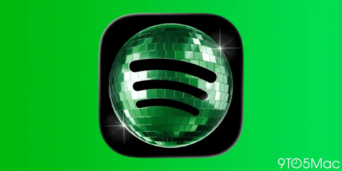
To mark its 20th anniversary—a milestone that underscores its transformation from a niche Swedish startup into a global audio juggernaut—Spotify replaced its signature flat, minimalist green logo with a high-fidelity, photorealistic disco ball. While the move was intended as a whimsical nod to the company’s two decades in the music industry, the internet’s reaction was swift, polarized, and, at times, deeply confused.
The Chronology of the Celebration
The rollout of the new icon began earlier this month as part of a broader marketing campaign titled "Spotify20." The campaign was designed to reflect on the evolution of digital music consumption, from the early days of desktop streaming to the mobile-first, algorithm-driven experience of 2026.
- The Launch: As part of the anniversary festivities, Spotify pushed an automatic app update to millions of users worldwide. The update swapped the familiar circular logo for an image of a spinning, reflective disco ball, designed to evoke the feeling of a dance floor.
- The Immediate Reaction: Within hours, the change became a trending topic on platforms like X (formerly Twitter) and Reddit. While some users praised the playful aesthetic, a significant segment of the user base expressed frustration.
- The Misunderstanding: The primary source of the friction was not necessarily the design itself, but the uncertainty regarding its duration. Many users assumed the disco ball was a permanent rebranding effort—a move that would have signaled a radical departure from the company’s established brand identity.
- The Clarification: Realizing that the celebratory intent was being misinterpreted as a permanent shift, Spotify’s social media team pivoted to a damage-control stance. By mid-week, the company began issuing direct replies to disgruntled users, confirming that the "disco glow-up" was strictly a temporary tribute.
The Anatomy of the Backlash: Why Icon Design Matters
To understand why a simple icon change caused such a stir, one must look at the modern smartphone ecosystem. In an era where users obsess over "Aesthetic" home screens—often spending hours matching widgets, wallpapers, and icon packs—the disruption of a core app’s visual language is viewed by many as an unwanted intrusion.
The Psychology of Home Screen Consistency
Human beings are creatures of habit, and the digital interface is a high-frequency environment. When a user opens their phone dozens of times a day, their muscle memory is tuned to the specific color and shape of their most-used apps. By shifting from a flat, high-contrast green circle to a busy, textured disco ball, Spotify inadvertently broke the visual rhythm of thousands of users’ home screens.

Critics argued that the disco ball lacked the visual clarity of the original logo. Where the original icon is instantly recognizable even in a cluttered app folder, the new design’s complexity created a "visual noise" that made the app harder to locate at a glance.
The "Permanent Change" Fallacy
A significant portion of the frustration stemmed from a lack of clear communication. Because mobile app updates often bring permanent UI changes, users were not given immediate context for the disco ball. Without a splash screen or an in-app notification explicitly stating "We’re 20, help us celebrate!", many users perceived the change as a lapse in professional design judgment rather than a temporary marketing gimmick.
Official Responses and Corporate Strategy
Spotify’s official stance, communicated via its social channels, was one of lighthearted apology. In a post addressing the feedback, the company stated: "Alright, we know glitter is not for everyone. Our temp glow up ends soon. Your regularly scheduled Spotify icon returns next week."
This response highlights a growing trend in corporate PR: the shift toward direct, conversational engagement with users. Rather than releasing a formal press statement, Spotify opted for a relatable, "human" tone that acknowledged the backlash without apologizing for the celebration itself.
By framing the issue as a difference in personal taste ("glitter is not for everyone"), Spotify maintained the integrity of its marketing campaign while effectively lowering the temperature of the discourse. This strategy serves as a blueprint for how tech giants handle the delicate balance between brand expression and user satisfaction in the social media age.

Implications for App Design and Customization
The "Disco Ball Incident" has reopened a long-standing debate within the tech community regarding the necessity of user-controlled app icons.
The Case for Customization
On iOS, Apple introduced support for custom app icons years ago, but the feature remains largely underutilized by major developers. If Spotify had allowed users to choose between the "Classic Green" and the "Anniversary Disco" versions, the backlash likely would have been non-existent. In fact, many users might have opted to keep the disco ball as a fun, aesthetic choice.
Instagram, which famously experimented with a variety of "legacy" and "seasonal" app icons in 2020 for its 10th anniversary, provides the gold standard for this type of event. By allowing users to toggle between the original Polaroid-style icon, the modern gradient, and various colors, Instagram turned a brand milestone into an interactive feature rather than a forced update.
The Cost of Forced Innovation
The controversy serves as a reminder to product designers: your app does not exist in a vacuum. When a brand updates its icon, it is essentially redecorating the user’s personal digital space. While internal stakeholders may view a redesign as a fresh, exciting evolution, the user may view it as an unnecessary hurdle in their daily routine.
Data and Trends in User Engagement
Industry data suggests that radical changes to app branding carry a high risk-to-reward ratio. According to studies on UI/UX, frequent changes to core assets like the app icon can lead to a temporary dip in "Open Rate" metrics as users adjust to the new visual cue.
Furthermore, the "Spotify20" campaign serves as a case study for the effectiveness of "Time-Bound Marketing." By ensuring the icon change was only active for a matter of days, Spotify effectively captured the attention of the media and the public without permanently alienating users who dislike the change. The scarcity of the design—the fact that it was "limited edition"—actually serves to increase its value in retrospect, turning a divisive icon into a collector’s item of sorts.
Conclusion: The Dance Ends
As the week concludes, the disco ball will fade, and the familiar green circle will return to millions of home screens. For Spotify, the 20th anniversary was a success by almost every metric: it generated significant buzz, reaffirmed the brand’s relevance in a crowded market, and provided an opportunity to engage directly with its community.
For the users, the incident serves as a brief, colorful interruption in the mundane cycle of daily digital life. While the "Disco Ball" may not have been for everyone, it forced a necessary conversation about the relationship between software developers and the users who host their applications.
Ultimately, Spotify’s 20th-birthday experiment proves that in the world of mobile tech, even the most minor visual change can trigger a major reaction. As we look toward the next decade of streaming, one can only hope that companies learn from this: if you want to invite your users to the party, it’s best to give them an RSVP option—or at least let them know when the music stops.