In the fast-paced digital era, where contact information is often exchanged via QR codes, LinkedIn profiles, or cloud-based contact sharing, the physical business card remains an indispensable tool for networking. However, the aesthetic expectations for these small pieces of cardstock have shifted dramatically. The era of cluttered, information-heavy cards is fading, replaced by a sophisticated movement toward minimalism and clean, intentional design.

A business card is often the very first tactile impression a potential client or partner receives from you. In that brief moment of exchange, it must convey not only your contact details but also your professional ethos. When executed correctly, a simple, minimalist business card does more than just share a phone number; it communicates confidence, clarity, and a refined sense of taste.

The Evolution of Professional Identity: A Chronology of Design
To understand the current obsession with "less is more," we must look at the trajectory of graphic design in the corporate world.

The Era of Information Overload (1990s – early 2000s):
During this period, technology allowed for an unprecedented level of complexity in printing. Businesses began packing their cards with multiple phone numbers, physical addresses, taglines, lists of services, and vibrant, often jarring, color schemes. The goal was to provide as much information as possible to avoid the need for a secondary follow-up.

The Transitional Period (2005 – 2012):
With the rise of user-experience (UX) design, the focus began to shift. Designers realized that "noise" on a card actually hindered memory retention. If a card is too busy, the recipient’s eye doesn’t know where to rest, leading to a forgettable encounter. This era introduced the concept of the "anchor," where a single piece of information or a bold logo took precedence.

The Minimalist Revolution (2013 – Present):
Today, minimalism is the gold standard of high-end corporate identity. This is driven by the realization that a business card is a "key" to your digital presence—not a directory of it. Modern designers emphasize white space, intentional typography, and high-quality paper stocks. The modern card is designed to be a conversation starter rather than a data repository.

The Mechanics of Minimalism: Why Clean Layouts Work
The science behind the success of clean, minimal business cards is rooted in cognitive load theory. Human beings process information most efficiently when it is presented in an uncluttered format. By stripping away extraneous graphical elements, you allow the most important information—your name and your brand—to stand out.

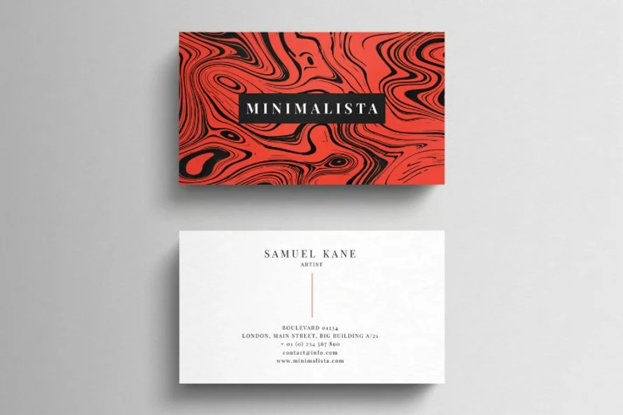
The Anatomy of an Effective Card
- The Focal Point: A single, high-quality logo or a bold, clean typeface for the name acts as the primary anchor.
- Strategic White Space: Often called "negative space," this is the most powerful tool in a designer’s arsenal. It provides "room to breathe," which subconsciously suggests that the person or company is organized and professional.
- Typography: Minimalist cards often rely on one or two carefully selected fonts. A sans-serif typeface, for example, can convey modernity and efficiency, while a classic serif can signal authority and tradition.
- Materiality: When the design is simple, the texture and weight of the paper become the focal point. Thick, textured, or matte-finish cards provide a sensory experience that compensates for a lack of visual "noise."
Supporting Data: The Impact of Professional Presentation
Market research consistently shows that physical marketing materials have a higher conversion rate for long-term brand recall than digital-only exchanges. A study by the Statistic Brain Research Institute suggests that for every 2,000 business cards handed out, a company’s sales increase by 2.5%.

However, the quality of that card is paramount. A flimsy, poorly designed card is often discarded immediately, while a thoughtfully designed, minimal card is frequently kept as a reference. The psychological implication is clear: the effort you put into the presentation of your contact details is viewed as a direct reflection of the effort you will put into a business relationship with that person.

Professional Perspectives and Industry Standards
Leading design professionals argue that the transition to minimalism is not merely a trend, but a necessary evolution in professional communication.

"When you remove the distractions, you are left with the core of the brand," says Sarah Jenkins, a senior brand strategist. "In a professional setting, we want to know three things: Who are you? What do you do? How do I reach you? If a card can’t answer those in three seconds, it has failed. Minimalist design is simply the fastest way to get to ‘yes’ in a networking environment."

Furthermore, the availability of professional-grade PSD templates has democratized high-end design. In the past, achieving a high-level, clean look required hiring an expensive design firm. Today, platforms offer sophisticated, pre-built layouts that allow even the non-designer to customize their identity. These templates provide the structural framework—ensuring perfect margins, balanced typography, and print-ready files—while allowing the user to inject their specific brand personality.

The Practical Benefits of Using Templates
For startups, freelancers, and small business owners, the use of professional templates provides several key advantages:

- Time Efficiency: Instead of spending hours or days on layout iterations, users can focus on their actual business.
- Consistency: Templates are designed to ensure that the back and front of the card are in harmony, maintaining a professional standard that is often missing from "do-it-yourself" designs.
- Print Readiness: Most modern templates come with bleeds, crop marks, and color profiles (CMYK) already configured, which prevents the common disaster of receiving a batch of printed cards that look different than they did on the screen.
Implications: The Future of Networking
As we move further into a hybrid work environment, the role of the business card is shifting from a purely functional object to a "trust token." In a world of deepfakes and automated spam, a high-quality, tangible, and well-designed physical object serves as proof of a real-world interaction.

The implication for professionals is that their design choices matter more than ever. By choosing a minimalist aesthetic, you are aligning yourself with values of transparency, efficiency, and modern sophistication. You are saying to your prospect that you value their time and that you are confident enough in your services that you don’t need to "shout" your information at them with busy graphics and aggressive layouts.

Conclusion: Crafting Your Legacy
Whether you are a corporate executive, a freelance photographer, or a creative agency lead, your business card remains a cornerstone of your professional identity. The collection of minimalist designs available today offers a roadmap for anyone looking to refine their presence.

Remember, the goal is not to fill the space, but to use the space to tell a story. When you strip away the excess, you are left with the most important element of any business interaction: the connection between two people. By investing in a clean, professional, and minimalist layout, you ensure that the lasting impression you leave is one of clarity and class.

As you move forward in your next project, consider the power of white space. Consider the impact of a single, perfect font. And remember that in the world of professional design, the most impactful statement you can make is often the one that speaks the least. Explore the vast world of clean, modern templates to find the one that best represents the future of your brand—because your first impression deserves nothing less than perfection.