
By Olivia Tauber
Updated August 27, 2026
In the rapidly evolving landscape of digital branding, consistency is often considered the gold standard. However, Instagram—the Meta-owned social media titan—decided this month that ten years of consistency was long enough. On August 13, 2026, the platform unveiled a refreshed visual identity, anchored by a new handwritten wordmark. While the company intends for the change to signal a "cleaner, more modern" era, the internet’s reaction has been swift, skeptical, and, in some corners, hilariously confused.
The Evolution of a Digital Icon
To understand the gravity of this change, one must look at the history of Instagram’s branding. Since its inception, the app has relied on a distinct, script-based wordmark that evoked a sense of personal, analog connection—a nod to the platform’s original identity as a home for curated photography.
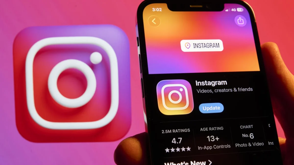
The familiar, multi-colored gradient camera icon remains untouched, preserving the brand’s most recognizable asset. However, the text that users see at the top of their screens every time they open the app has undergone a significant transformation. Instagram head Adam Mosseri announced the change on August 13, noting that after a decade of the same typeface, the company felt it was time for a refresh.
"The wordmark at the top of the app hasn’t changed in 10 years, so it was time for a refresh," Mosseri stated. The redesign aims to balance a minimalist aesthetic with the brand’s deep-seated heritage.
A Chronology of the Rebrand
The road to the new wordmark was not a short one. According to internal reports from Meta’s design team, the process involved a comprehensive exploration of hundreds of potential iterations.

- Initial Phases: Designers experimented with various styles, including bold all-caps lettering, minimalist sans-serif options, and even concepts that integrated the camera icon directly into the typography.
- The Pivot: Despite the allure of modern, ultra-minimalist trends, the design team eventually circled back to the script concept. The decision was rooted in the philosophy that "script reflects individuality."
- The Rollout: The global update began on August 13, 2026. This launch is merely the first phase of a broader brand overhaul, which will include the introduction of the "Instagram Pen" and "Instagram Mono" fonts, alongside a shift toward more restrained use of the company’s signature gradient.
The Design Philosophy: "Bolder and Simpler"
Jasmine Probst, Instagram’s director of product design, provided deeper insight into the strategic thinking behind the new look in a blog post for Meta. According to Probst, the goal was to create a wordmark that feels "bolder and simpler, with touches of unexpectedness."
The design choices—specifically the hybrid nature of the cursive and print elements—were intentional. By allowing some letters to connect while others remain isolated, the designers aimed to mimic the look of a personal, handwritten note. The objective was to "cue individual expression," a core tenet of Instagram’s user experience.
However, design experts are divided on whether this goal was achieved. The "unexpectedness" that Probst mentions has, for many users, manifested as confusion. The unconventional shapes of the ‘s’ and ‘r’ characters have become the focal point of the backlash, with many users claiming the new logo is less legible than its predecessor.
The "Instagzam" Phenomenon: A Case Study in Internet Reaction
Rarely does a subtle change to a digital brand elicit such a visceral reaction. Within hours of the announcement, social media platforms—ironically, including Instagram itself—were flooded with critiques.
The most prominent criticism centers on the readability of the new script. Due to the way the new ‘s’ and ‘r’ are rendered, a significant portion of the user base has jokingly (and sometimes harshly) concluded that the app is no longer named "Instagram," but rather "Instagzam."
The discourse quickly migrated to Reddit, particularly the r/logodesign community. Here, the feedback moved from lighthearted mockery to formal critique. One user described the mark as "fan-made," suggesting it lacked the polish one would expect from a multi-billion dollar tech conglomerate. Another user labeled it "an unsettling mix of manuscript and cursive," arguing that the inconsistency creates a visual friction that distracts from the user interface.

Perhaps most damaging is the accusation of the "sidegrade"—a term coined to describe a change that is neither better nor worse, but simply different, ultimately creating unnecessary friction for the user. As one Reddit commenter noted, "Instagram is simply following the minimalist branding trend five years too late."
Broader Implications for Brand Identity
The Instagram rebrand is a microcosm of a larger trend in corporate identity. As major tech companies shift toward "cleaner" aesthetics, they often lose the personality that initially endeared them to users.
1. The Death of Personality
For years, tech giants have been moving toward a homogenized, sans-serif, minimalist aesthetic. By attempting to "modernize," brands often strip away the unique character of their original logos. Instagram’s attempt to maintain a script style is an effort to avoid this, but the execution has left many feeling that the result is an "uncanny valley" of typography.
2. The Risk of User Alienation
Social media platforms are ingrained in the daily habits of billions. When an app changes its visual language, it can cause genuine psychological discomfort—a phenomenon known as "design fatigue." Even minor changes to a familiar wordmark can feel like an intrusion on the user’s personal space.
3. The Power of Public Perception
The "Instagzam" meme highlights the shift in power dynamics between corporations and their users. In the modern social era, a company’s branding is no longer controlled solely by their PR team; it is immediately subjected to the scrutiny of millions of voices. If a brand is perceived as out of touch or if a design is deemed "ugly," the internet will define the narrative faster than the company can correct it.
Moving Forward: What Comes Next?
While the immediate reaction has been largely critical, history suggests that users often acclimate to new designs over time. The "Instagram Pen" and "Instagram Mono" fonts, which are set to roll out in the coming months, may provide a more cohesive context for the new wordmark, potentially softening the transition.

Instagram is also banking on the fact that its global influence is strong enough to survive a bout of internet teasing. With over two billion monthly active users, the platform is far from a crisis. However, the "Instagzam" controversy serves as a stark reminder of the risks involved in altering a global cultural touchstone.
For now, users will continue to open their apps to see the new wordmark. Whether it becomes an accepted part of the digital furniture or remains a permanent punchline in the history of design blunders remains to be seen. One thing is certain: the team at Instagram has learned that when you try to reinvent your identity, you must be prepared for the world to have a very loud opinion about it.
Olivia Tauber is the deputy editor of digital culture at Mashable, covering creators, media, and the evolving intersection of technology and society. Her work has appeared in The New York Times, Vanity Fair, and The Cut.