In the fast-paced world of digital design, trends often cycle with dizzying speed. However, one aesthetic movement has shown remarkable staying power as we progress through 2026: the dominance of the rounded typeface. Characterized by soft terminals, gentle curves, and a deliberate absence of harsh, angular intersections, rounded fonts have transitioned from niche stylistic choices to a staple of mainstream corporate and creative branding. Whether appearing on a high-end mobile application interface, a bold social media banner, or the product packaging of a global startup, these fonts are defining what it means to be "modern" in the current era.

The Main Facts: Defining the Modern Rounded Aesthetic
At their core, rounded fonts are sans-serif typefaces where the traditional sharp corners of the letterforms have been replaced with radius-heavy, soft edges. This design choice is not merely cosmetic; it is a psychological signal. In 2026, brands are moving away from the aggressive, razor-sharp geometric fonts of the early 2020s, favoring instead a "friendly" minimalism.

The primary appeal lies in readability and accessibility. Research continues to indicate that on the high-resolution, pixel-dense screens of modern smartphones and tablets, rounded letterforms are perceived as less jarring. They create a "soft" silhouette that reduces eye fatigue, making them the preferred choice for UI/UX designers tasked with building user-friendly mobile environments.

Chronology: A Brief History of the Round Curve
The journey of the rounded font is intrinsically linked to the evolution of technology:

- The Early Digital Era (1990s–2000s): Rounded fonts were largely relegated to "fun" or "casual" designs, often associated with children’s media or informal signage.
- The Mobile Revolution (2010s): As mobile screen technology improved, designers realized that hard-edged fonts could suffer from "aliasing" or pixelation at smaller sizes. Rounded fonts, with their forgiving geometry, provided a clearer, more professional look at small scales.
- The Modern Integration (2020–2026): Today, we see a fusion of the "tech-forward" aesthetic with "human-centric" design. Rounded fonts are no longer seen as merely playful; they are now utilized by fintech firms, healthcare startups, and even established tech giants to convey transparency, warmth, and accessibility.
Supporting Data: Why Designers are Making the Switch
A recent survey of graphic design professionals in 2026 reveals that over 65% of agencies now maintain a dedicated library of rounded typography for their daily branding tasks. The reasons cited for this shift are compelling:

- Lower Cognitive Load: The lack of sharp serifs or abrupt corners allows the human brain to process letter shapes faster, aiding in rapid content consumption—a necessity in the social media era.
- Brand Perception: Psychological studies consistently show that consumers equate rounded shapes with "safety," "comfort," and "honesty," whereas sharp, angular shapes are often perceived as "aggressive," "elite," or "industrial."
- Cross-Platform Versatility: A well-designed rounded typeface, such as the Kindel Rounded or Quasar Soft models, performs equally well on a massive physical billboard as it does on a 6-inch smartphone screen.
Official Perspectives: The Professional View
Industry experts and type foundries emphasize that the current popularity of these fonts is a direct response to the "technological fatigue" of the mid-2020s.

"We are living in an era where AI and automation are becoming the norm," says a lead designer at a major branding firm. "People are craving human-made, approachable design. A font with soft, organic edges feels more like a conversation than a command. It is the visual equivalent of a smile."

However, professionals warn that the trend requires restraint. "You cannot simply use a rounded font for everything," cautions a veteran typographer. "In heavy body copy, too many curves can lead to a ‘bubbly’ look that undermines professional authority. The key is in the weight. Using bold, heavy-set rounded fonts for headlines—like Milne Rounded or Blinko—creates that modern, balanced punch, while keeping body text in more traditional sans-serifs provides the perfect contrast."

Implications for Future Branding
As we look toward the remainder of 2026 and beyond, the implications for branding are clear. The era of the "cold" tech aesthetic is fading. Businesses that fail to soften their visual communication risk appearing dated or out of touch with a consumer base that values empathy and clarity.

For YouTube creators, startups, and marketing agencies, the move toward rounded typography is a low-cost, high-impact way to pivot toward a more inviting brand identity. By adopting these fonts, companies are signaling that they are "easy to use" and "easy to understand."

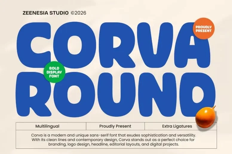
A Curated Selection: 30+ Top Rounded Fonts for 2026
Choosing the right typeface is a delicate balance between style and utility. Whether you are aiming for a retro-badge look or a clean, futuristic techno vibe, the following selection represents the best of the current market:
- Retro & Antique Inspirations: For those seeking nostalgia with a clean finish, ROUNDLANE and Lotzo offer that classic badge-style aesthetic updated for modern digital clarity.
- Bold & Heavy Headers: If your project requires high-impact, attention-grabbing titles, look no further than Milne Rounded, Blinko, and Torkue. These fonts provide a structural density that demands attention without the harshness of traditional block lettering.
- Modern Tech & Futuristic: For software interfaces and digital branding, Untech and Quasar Soft lead the pack. They manage to retain a sense of "techno-precision" while keeping the edges soft enough for human-centric interfaces.
- Playful & Organic: If your brand identity leans toward the creative, culinary, or social-forward, fonts like Butter Humble, Kidpop, and Kravent offer an organic, hand-crafted feel that is perfect for packaging and social media graphics.
Best Practices for Implementation
To successfully integrate these fonts into your workflow, consider the following:

- Hierarchy is King: Use the bolder, more extreme rounded fonts (like Makio or Porten) strictly for display and headlines. Never force a display font into long-form body copy.
- License Awareness: While many fonts are available for free personal use, always ensure you have the correct commercial license if your project is for a business. Resources like the Envato library offer massive, curated collections that simplify the licensing process for busy designers.
- Contrast Matters: Pair your rounded headline with a neutral, high-readability sans-serif for body text. This creates a balanced visual experience that guides the reader’s eye without overwhelming them with "softness."
- Test the Scaling: Before finalizing your design, test the font at small sizes. A "soft" font that loses its character at 12pt is a liability. Ensure the letterforms have enough "aperture" (the opening inside a letter like ‘e’ or ‘o’) to remain legible when scaled down.
Conclusion: The Soft Power of Design
The enduring popularity of rounded fonts in 2026 is a testament to the fact that design is not just about what looks cool; it is about how the audience feels. By choosing a typeface that communicates friendliness and accessibility, you are lowering the barriers between your message and your audience.

As you embark on your next project, remember that simplicity is often the ultimate sophistication. A clean, rounded typeface does not need extra shadows, glows, or complex effects to stand out. Its strength lies in its silhouette. By carefully selecting from the vast array of available high-quality fonts, you can ensure that your brand, product, or message remains not only relevant but deeply inviting in an increasingly crowded digital landscape. Explore the collections, download your favorites, and let the soft curves of your typography do the heavy lifting.