For decades, the "ALL CAPS" aesthetic has reigned supreme as the gold standard for visual impact. From the aggressive, attention-grabbing slogans of political campaigns to the saturated, punchy headlines of Instagram influencers and digital advertising, uppercase lettering has been the default setting for anyone needing to be heard. It is bold, it is loud, and it is omnipresent.
However, this ubiquity has birthed a new problem: when everything shouts, nothing stands out. In a digital landscape saturated with high-intensity visuals, the constant use of all-caps has shifted from a signifier of confidence to one of digital aggression. It feels combative, wearying, and increasingly disconnected from the modern consumer’s desire for authenticity.
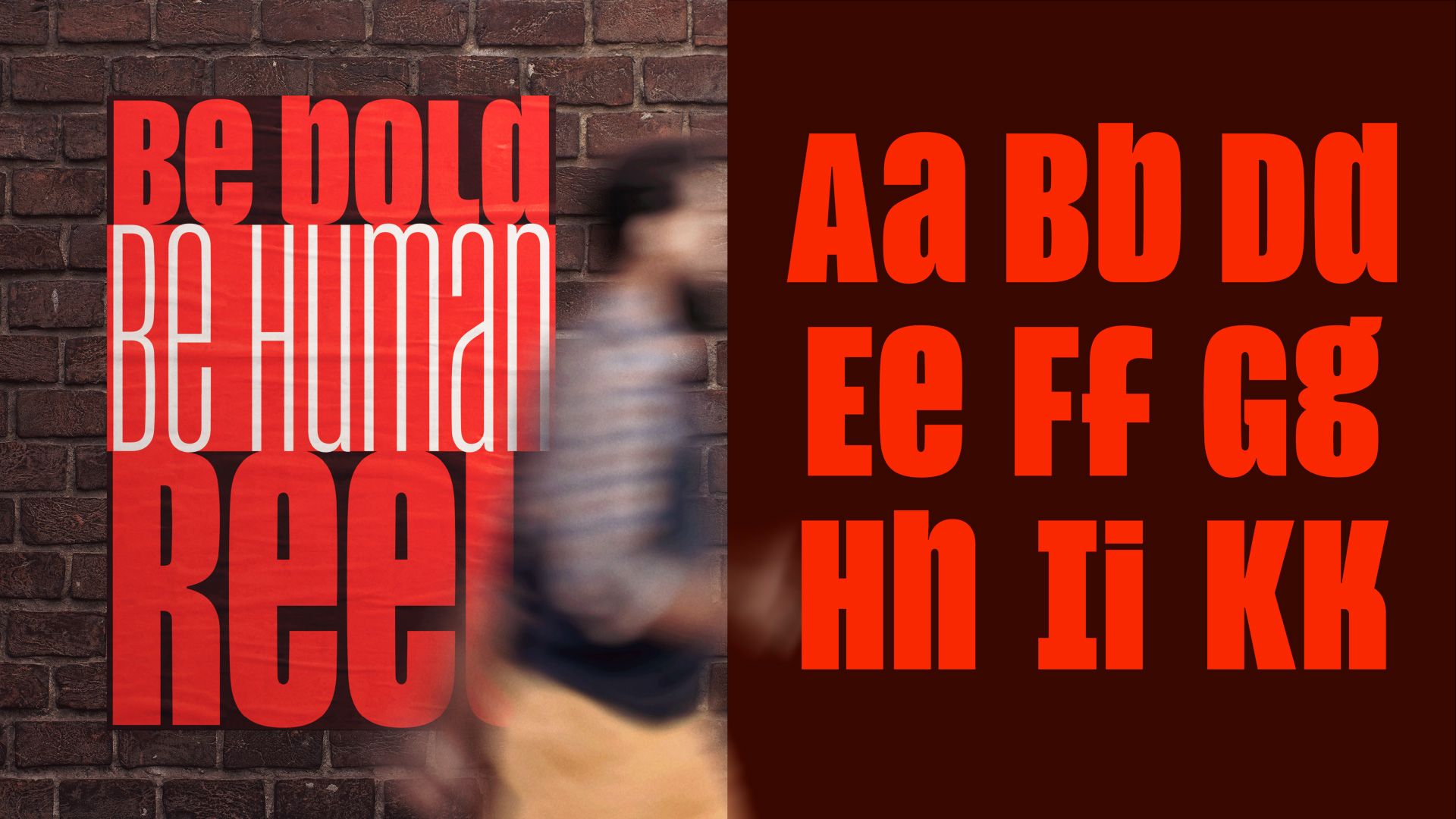
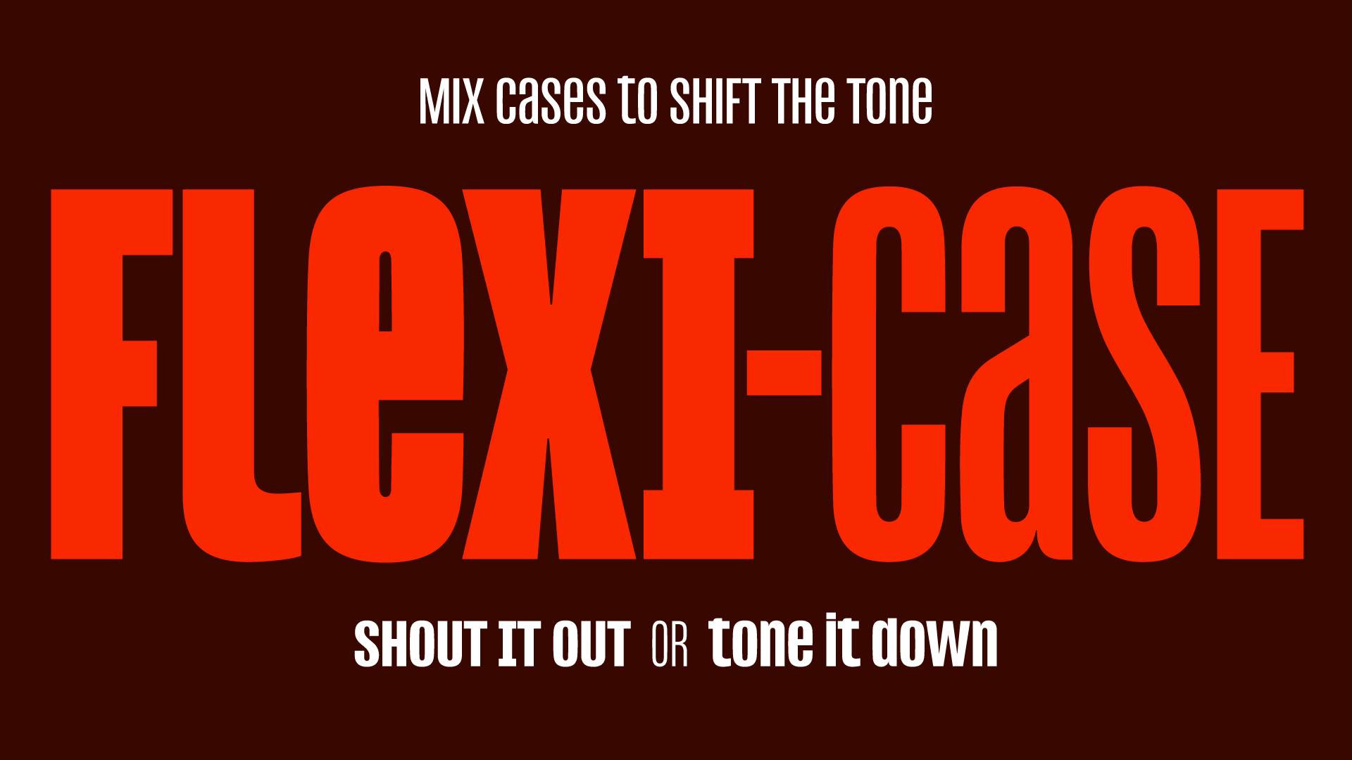
Enter type designer Jamie Clarke, a veteran in the field of expressive, high-impact lettering. His latest project, Reel, offers a sophisticated pivot away from the "shouty" design paradigm. By introducing a groundbreaking "Flexi-case" system, Clarke is challenging designers to reconsider the function of case, allowing for a hybrid approach that maintains structural integrity while softening the tone of communication.
The Chronology of the "Shout": From 1856 to the Digital Age
To understand why Reel is such a significant disruption, one must first understand the history of our obsession with capitals. Working alongside writer and researcher Doug Wilson—the creative force behind the acclaimed documentary Linotype—Clarke conducted an extensive investigation into the evolution of uppercase dominance.
The research reveals that our modern reliance on all-caps is not merely a byproduct of the internet’s "shouting" culture. The trend can be traced back as far as 1856, where the roots of high-impact, condensed lettering began to take hold in print advertisements and signage. For over a century and a half, the "all-caps" aesthetic was synonymous with authority, commerce, and urgency.
However, the digital revolution accelerated this trend into a state of hyper-saturation. As social media platforms began to reward high-contrast, immediate visual impact, the nuances of lowercase lettering were largely abandoned in favor of the instant recognition provided by caps. By the early 2020s, the visual landscape had reached a point of exhaustion. The "shout" had become white noise.
The Shift Toward Vulnerability: A Cultural Correction
The transition toward Reel and the "Flexi-case" philosophy is not occurring in a vacuum. It aligns with a broader cultural movement in which major cultural figures have begun to reject the performative aggression of previous eras.
Prominent artists and musicians—including Taylor Swift, Charli XCX, and Bad Bunny—have made a deliberate aesthetic pivot in their album art and social media presence, favoring lowercase stylization. This is more than a stylistic whim; it is a calculated signaling of vulnerability and authenticity. In an era where public discourse feels increasingly fractured and aggressive, the lowercase aesthetic provides a "softened" landing. It invites the audience in rather than forcing them to submit to the message.
For designers and brand strategists, this is a critical signal. The "lowercase movement" represents a pushback against the performative toxicity of contemporary visual culture. When a brand chooses to use a mix of cases or lowercase-dominant typography, they are communicating an approachable, human, and transparent identity.
Official Perspective: The Philosophy Behind "Reel"
Jamie Clarke, whose portfolio includes prestigious work for Aardman Animations and Disney+, as well as a robust retail catalog through Adobe Fonts, designed Reel with a specific goal in mind: to be "expressive, not oppressive."

"I wanted to see if a typeface could still have strength while feeling more conversational and human," Clarke explains. His solution was the Flexi-case system. Unlike standard typefaces that force a binary choice between the rigidity of capitals and the fluid nature of lowercase, Reel allows designers to blend both within the same word or headline.
Crucially, the typeface maintains the "tight, rectangular structure" that makes condensed type so effective for modern screens. In traditional typography, mixing cases often ruins the "color" of a line—the perceived grey value of the text on a page. By giving lowercase letters the same height and visual weight as their uppercase counterparts, Reel preserves the muscularity of a headline font while enabling a more nuanced, rhythmic expression of tone.
Technical Implications: Why "Reel" Matters for Branding
For the working designer, Reel is not merely an aesthetic experiment; it is a powerful tool for visual storytelling. The practical applications for this typeface are immense, particularly in branding and editorial design.
1. Unified Visual Identity
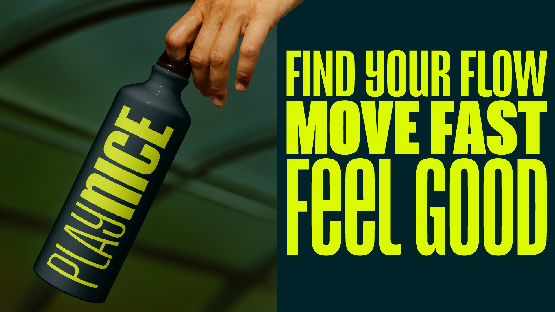
One of the most common challenges in branding is maintaining a consistent "voice" while adjusting the volume of the message. Typically, a brand might use an all-caps font for a bold, punchy headline and a different, softer font for more intimate or informative sub-copy. With Reel, this requires no typeface swap. A single family can handle both registers, allowing for a seamless transition from a loud, authoritative statement to a conversational, empathetic invitation.
2. Navigating the "Aggression" Problem
Brands today are hyper-aware of the connotations their visual assets carry. A company attempting to project authority without appearing domineering can use the Flexi-case system to dial back the intensity. By replacing just a few characters with lowercase counterparts, the overall "temperature" of a headline can be adjusted. It allows for a design that is strong enough to command attention but subtle enough to avoid being off-putting.
3. Structural Consistency
Condensed headline faces are notorious for being fragile; if the kerning, tracking, or height balance is off by a fraction, the design falls apart. Reel’s technical brilliance lies in its ability to hold this "rectangular discipline." Even when mixing cases, the font retains its geometric rhythm, ensuring that the final output remains crisp, readable, and professional across both print and digital mediums.
Future-Proofing Design: What Designers Can Learn
As we look toward 2026 and beyond, the design community must grapple with the fact that "loudness" is losing its effectiveness. The future of effective communication lies in the ability to modulate.
Designers who embrace tools like Reel are positioning themselves at the forefront of a new era of visual literacy. The ability to "dial the tone" of a headline up or down provides a level of creative control that was previously difficult to achieve without resorting to clunky workarounds.
The lesson for the industry is clear: our tools should evolve alongside our cultural sensitivities. As the public becomes more cynical toward brands that "shout," the most successful campaigns will be those that learn how to whisper with the same intensity that they once used to scream.
Conclusion: A New Standard for Headlines
Jamie Clarke’s Reel is more than just a new font family; it is a manifesto for a more thoughtful approach to typography. By deconstructing the rigid divide between uppercase and lowercase, Clarke has provided a bridge to a more versatile future.
Whether you are designing for a global brand, a boutique editorial project, or an experimental digital campaign, the Flexi-case system offers a compelling way to navigate the complexities of modern tone of voice. In a world where attention is the scarcest currency, the most effective strategy may no longer be the one that shouts the loudest—but the one that knows exactly when to change its case.
For those looking to showcase their own mastery of typographic tone, the Brand Impact Awards 2026 are currently open for submissions. Creatives are encouraged to enter their most innovative branding work from the past year, with a deadline of July 9. For more information, visit the Brand Impact Awards website.