The Google Play Store, the digital storefront for billions of Android devices worldwide, is undergoing a subtle yet significant architectural shift. Recent discoveries in the latest APK teardown suggest that Google is moving away from its "all-in-one" approach to home screen widgets, favoring a more modular, granular design for its "Collections" feature. This evolution represents the company’s ongoing commitment to personalizing the Android experience, allowing users to curate their digital environments with surgical precision.
The Main Facts: A Shift Toward Customization
In an upcoming update to the Google Play Store (specifically version 52.1.26-31), code analysis reveals that Google is preparing to dismantle the monolithic nature of its current Collections widgets.
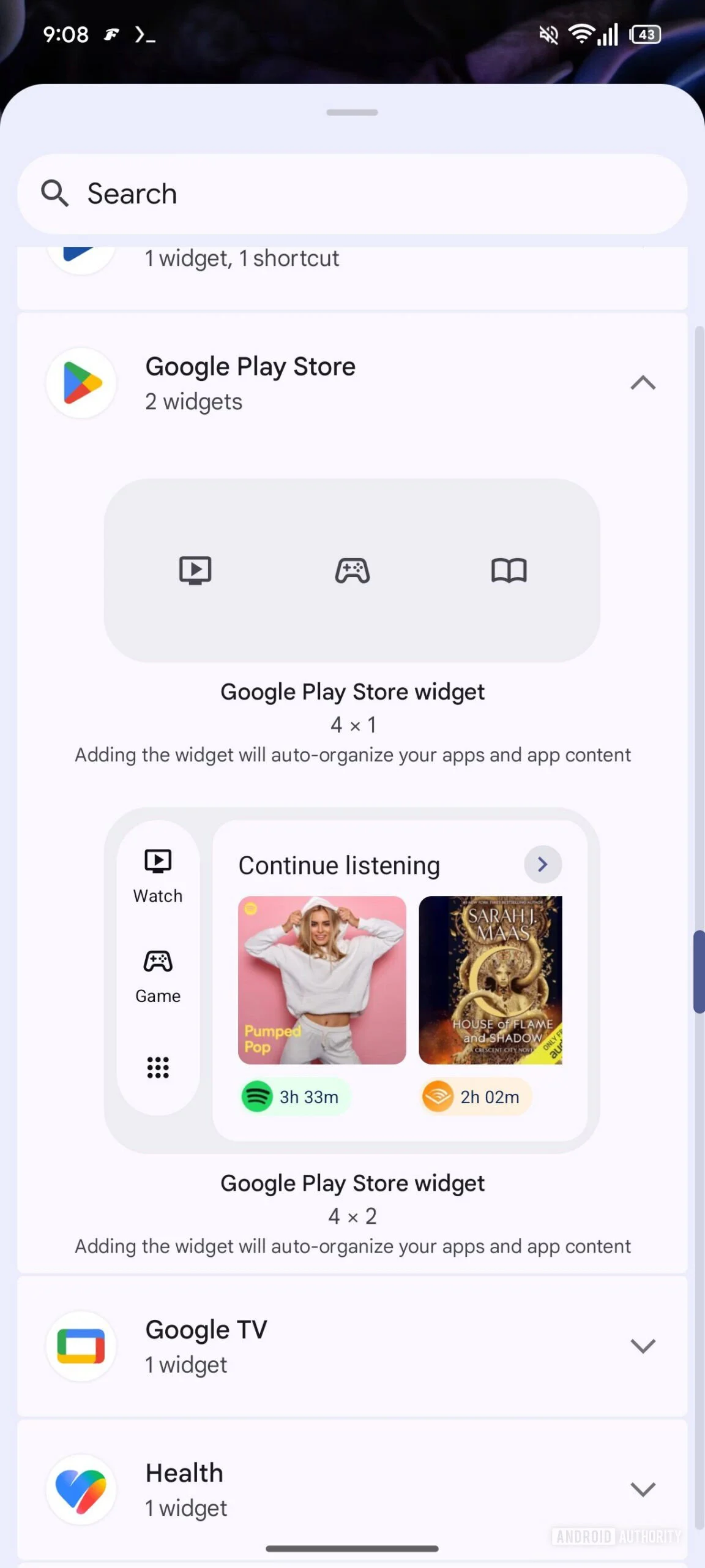
Currently, users who utilize Play Store widgets are limited to a "take it or leave it" approach. You can select a small icon-based widget or a larger, list-style layout, but both force you to interact with a broad spectrum of app categories—Shop, Listen, Food, and more—simultaneously. The forthcoming update will transition these into independent, standalone widgets. Instead of a single widget container, users will eventually be able to drag and drop specific, single-category widgets onto their home screens.
The anticipated lineup includes eight distinct categories:
- Food
- Game
- Listen
- Read
- Shop
- Social
- Travel
- Watch
This granular approach allows a user who frequently uses travel apps to place a dedicated "Travel" widget on their home screen without being forced to clutter their UI with "Listen" or "Social" apps that they may not prioritize.
A Chronological Evolution of Collections
To understand why this change is significant, one must look back at the trajectory of the Google Play Store’s user interface design over the past several years.
The Inception of Collections (2023)
Two years ago, Google introduced "Collections" as a strategic response to app discoverability issues. As the Play Store swelled with millions of applications, finding high-quality content became a daunting task. By grouping apps into thematic buckets—like "Listen" for music and podcasts or "Shop" for e-commerce—Google provided a more intuitive way for users to browse their existing library and discover new content without wading through a generic list.
The Introduction of Widgets (2024)
Shortly after the initial rollout of Collections, Google recognized that the "walled garden" of the Play Store app was a friction point. To drive engagement, they released Collections widgets. These allowed users to bypass the store’s primary interface entirely, offering a "shortcut" to their most-used app categories. This was a clear attempt to integrate the Play Store deeper into the daily habit loops of Android users.
The Current Pivot (2025/2026)
As we move into the current development cycle, the move to split these widgets into independent entities signifies a shift from "discovery" to "efficiency." Google has learned that users don’t necessarily want a mini-storefront on their home screen; they want a launcher for their specific needs. By unbundling these features, Google is effectively treating the Play Store as a utility service that can be sliced and diced to fit the user’s specific workflow.
Supporting Data and Technical Context
The data supporting this report stems from an APK teardown of the Play Store version 52.1.26-31. For the uninitiated, an APK teardown involves decompiling the Android application package to examine the underlying XML files, resources, and Java/Kotlin code.
In this specific instance, researchers identified new resource identifiers corresponding to individual widget types for each of the eight categories. While the current build does not allow these widgets to be rendered or deployed to a live home screen—indicating the feature is in the "under construction" phase—the presence of these code hooks is a reliable indicator of product intent.

It is essential to note that in the world of software development, especially within a company as large as Google, "under construction" does not always equate to "guaranteed release." Sometimes, features are tested internally, deemed less than optimal for the final user experience, and subsequently pulled from the development branch. However, given the push toward Android’s "At a Glance" and more personalized, modular widget systems, this development aligns perfectly with Google’s broader design language, Material You.
Implications for the User Experience
The implications of this update are threefold: design consistency, reduced cognitive load, and increased app utility.
Reduced Cognitive Load
When a user opens a generic widget that displays everything from food delivery to news reading, the brain has to process extra information to find the specific app needed. By allowing a user to pin only the "Watch" widget, the user is presented with a streamlined, context-specific interface. This reduces "decision fatigue," a key metric in modern UX design.
Enhanced Home Screen Real Estate
Android users are famously protective of their home screen real estate. The ability to deploy a 1×1 or 2×2 widget dedicated solely to "Games" or "Travel" allows for a more aesthetically pleasing layout that doesn’t sacrifice functionality. Users can now build "themed pages" on their phones—a "Travel" page with the Maps, Translate, and the new Play Store Travel widget, for instance.
Increased Engagement for Niche Apps
For developers, this is a double-edged sword. While it may mean more competition for space within the "widget," it also means that their apps are more likely to be accessed. If a user has a specific "Food" widget, they are statistically more likely to open a food-related app than if they had to hunt for it in a general folder or the full Play Store app.
Official Responses and Corporate Strategy
Google has not yet issued a formal press release regarding this feature, which is standard procedure for in-development features discovered through APK teardowns. Historically, Google tends to announce these types of UI updates during major developer conferences (like Google I/O) or through "Feature Drops" that hit Pixel devices first.
However, the strategy is clear. Google is fighting for "attention time" on the most valuable piece of real estate in the tech world: the mobile home screen. By making the Play Store more useful and less intrusive, they are ensuring that the platform remains the primary gateway for digital interaction.
Conclusion: What to Expect Next
As Google continues to refine the Android ecosystem, the line between the operating system and the apps installed upon it continues to blur. These new, granular Collections widgets are not just a minor tweak; they are part of a larger ecosystem play.
If you are an Android power user, keep an eye on your Play Store updates. While this feature is currently hidden in the code, it is likely to undergo a phased rollout. First, we may see it appear for beta testers, followed by a broader release to the public.
In the interim, the community is left to speculate on the potential for further customization. Will we see the ability to create "Custom Collections" where users can group apps by their own criteria rather than Google’s predefined categories? If the current trend toward modularity holds, the answer is a resounding "perhaps."
For now, we wait. The evolution of the Play Store into a more modular, user-centric tool is a welcome development, proving that even a mature platform can find new ways to adapt to the changing needs of its users. Whether these widgets become a permanent fixture of your home screen or just another option in the drawer, one thing is certain: Google is doubling down on the idea that your phone should work the way you do.