
The Legend of Zelda franchise stands as one of Nintendo’s most enduring crown jewels. Its longevity is not merely a byproduct of tight controls or clever dungeon design; rather, it is anchored in a relentless commitment to visual reinvention. From the humble, flickering sprites of the NES era to the sprawling, painterly vistas of the modern Switch titles, Zelda has constantly redefined what a fantasy world can look like.
However, art direction remains a subjective and contentious topic within the gaming community. This was made abundantly clear following the recent announcement of the highly anticipated Ocarina of Time remake. The reveal sparked a polarized debate: while some fans praised the transition to a modern aesthetic as a realization of the original developers’ vision through contemporary technology, others criticized the look as "uncanny" or indistinguishable from generic Unreal Engine hobbyist projects.
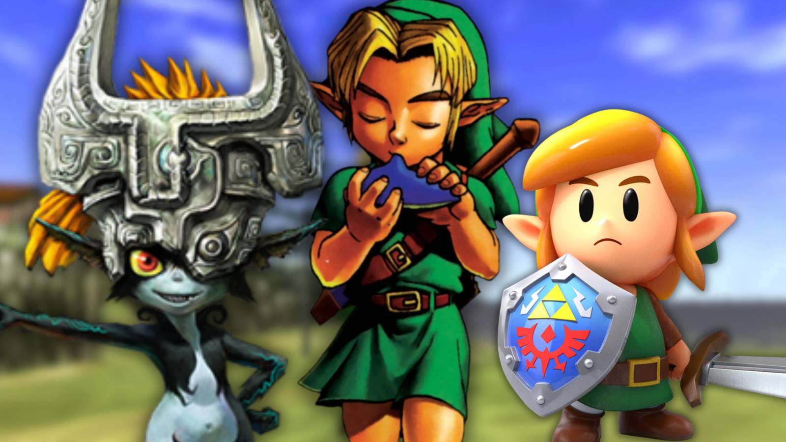
This friction serves as a perfect catalyst to examine the franchise’s visual history. When we look back at the best art styles the series has offered, we see a masterclass in how to pair gameplay with visual identity, ensuring that these games age not just gracefully, but iconically.
The Philosophy of Zelda’s Visual Identity
Nintendo’s art teams operate under a unique philosophy: functionality must marry aesthetic intent. Unlike many AAA studios that chase photorealism—a metric that inevitably degrades as technology marches forward—Zelda titles often lean into stylistic choices that prioritize expression over raw pixel counts.
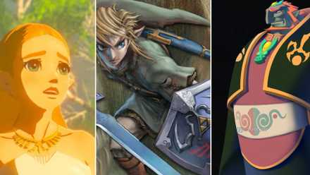
This approach has allowed the franchise to maintain its relevance for nearly four decades. By choosing aesthetics that lean toward the surreal, the painterly, or the stylized, Nintendo ensures that the visual "language" of a game remains readable, regardless of the hardware it runs on.
A Journey Through the Eras: Ten Definitive Art Styles
10. Link’s Awakening (Remake) – A Dream Inside a Toybox
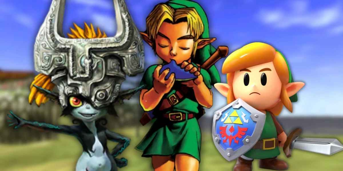
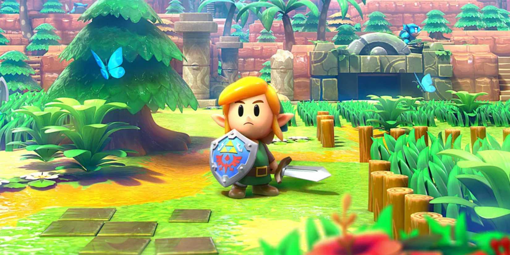
The 2019 remake of Link’s Awakening remains one of the most polarizing yet distinct shifts in the series. By adopting a "tilt-shift" diorama aesthetic, Grezzo and Nintendo turned Koholint Island into a literal toy box. The shiny, plastic-like textures and rounded character designs transformed the melancholic, dream-like atmosphere of the original Game Boy title into something tangible and intimate. It is a brilliant example of using art to emphasize a game’s central theme: the idea that the entire world is a fragile, contained construct within a sleeping deity’s mind.
9. A Link to the Past – The Gold Standard of 2D
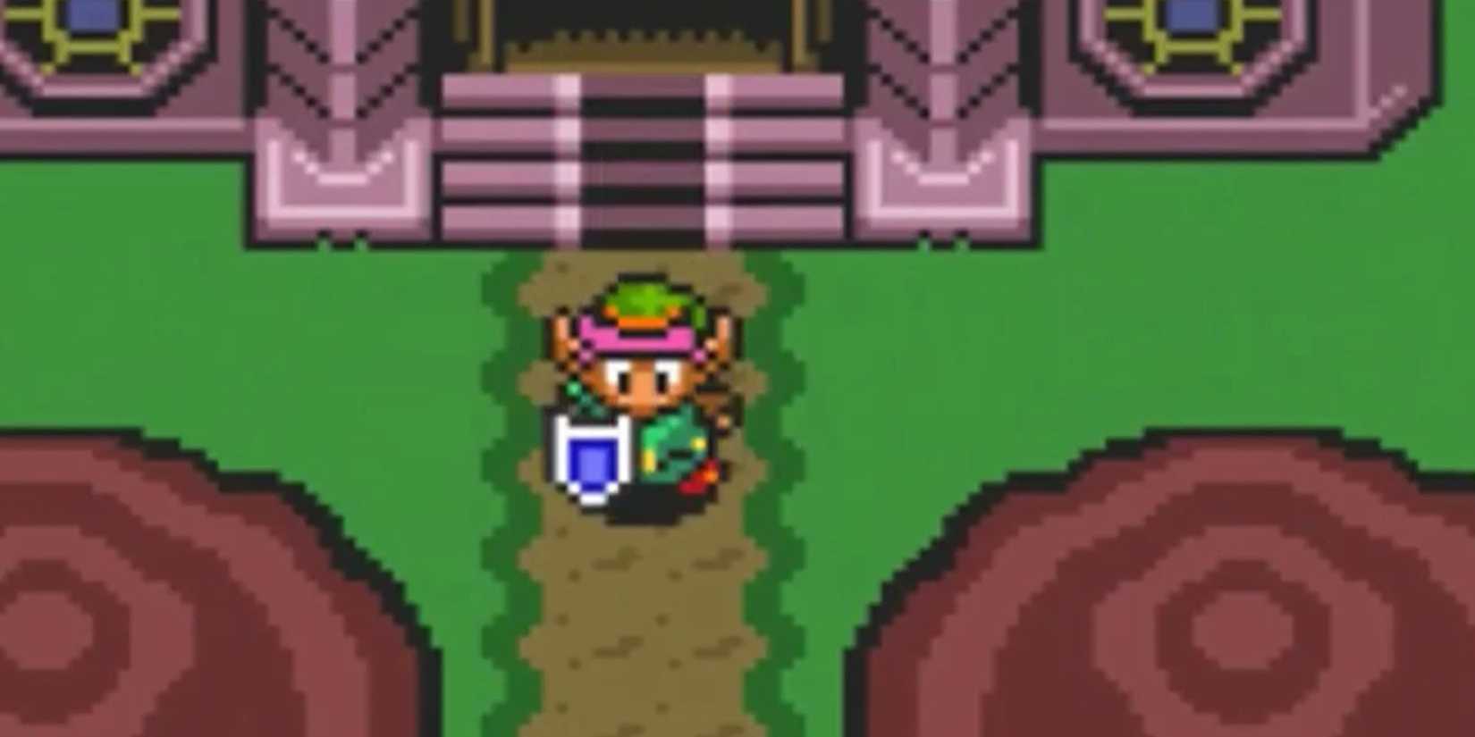
It is impossible to discuss the history of pixel art without bowing to A Link to the Past. This Super Nintendo masterpiece didn’t just set the template for the series; it created a visual language of color-coded keys, distinct dungeon biomes, and the duality of the Light and Dark worlds. Its art was functional, readable, and incredibly atmospheric, proving that simple 16-bit sprites could convey a sense of scale and stakes that rivaled modern cinema.
8. The Minish Cap – Handheld Perfection
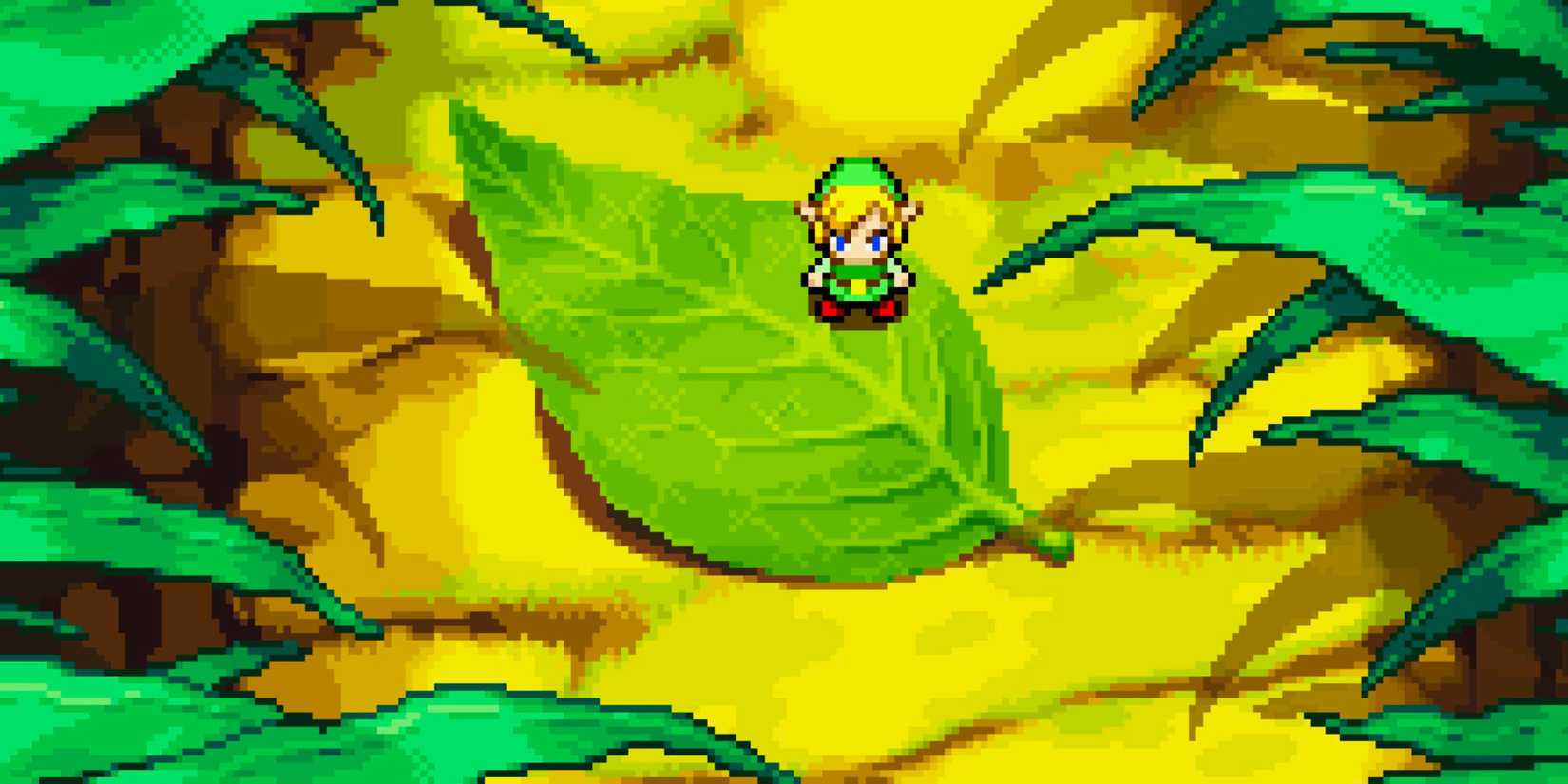
Often cited as a "hidden gem," The Minish Cap features perhaps the most vibrant and polished pixel art in the entire franchise. Developed by Capcom, the game utilized a saturated, bright color palette that perfectly complemented its whimsical premise. The animations are fluid, the sprites are characterful, and the ability to shrink down to the size of a bug creates a sense of scale that remains visually impressive to this day.
7. A Link Between Worlds – Bridging Dimensions
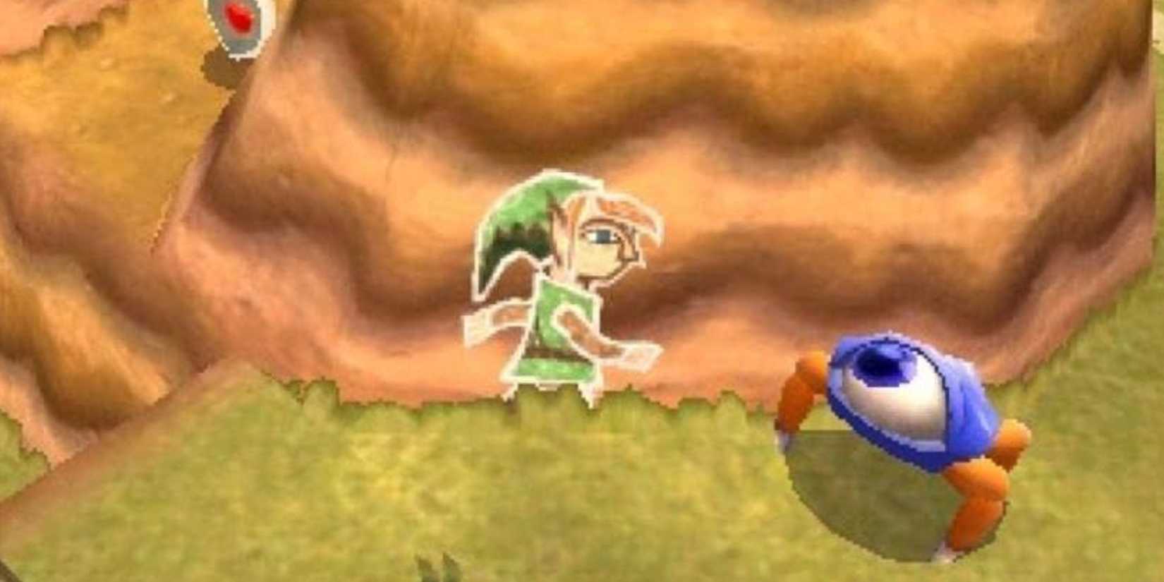
Acting as a spiritual successor to A Link to the Past, this 3DS entry was tasked with a difficult job: modernizing a 2D classic without losing its soul. By utilizing 3D models with a top-down, diorama-like camera, the developers achieved a seamless blend of depth and classic gameplay. It feels like a tactile, pop-up book version of Hyrule, proving that 3D technology can be used to enhance 2D sensibilities rather than replace them.
6. Twilight Princess – The Dark Fantasy Dream
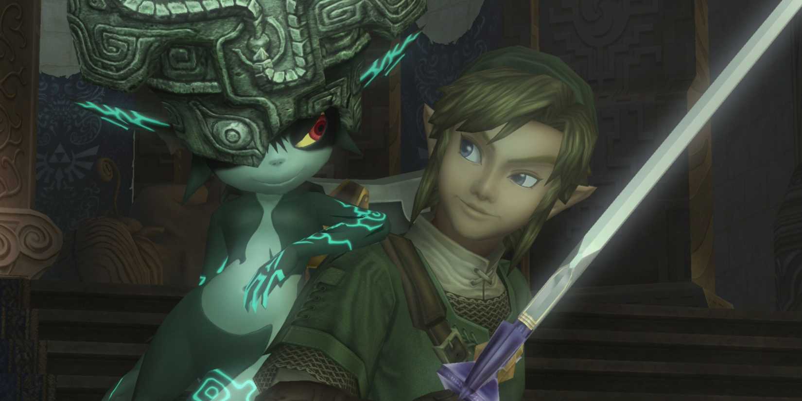
Twilight Princess remains the series’ most successful attempt at a "realistic" and gritty aesthetic. It is a moody, desaturated, and grounded take on the Zelda mythos that excels in its atmospheric storytelling. The corruption of the Twilight Realm and the unsettling, otherworldly designs of its enemies—such as the terrifyingly cool Zant—remain some of the most memorable visuals in the series. While its textures have aged more noticeably than its more stylized siblings, the sheer weight of its art direction remains unmatched.
5. Breath of the Wild – The Living Watercolor Canvas
Breath of the Wild marked the most significant visual departure in the series’ history. By marrying cel-shaded characters with a soft, impressionistic landscape inspired by Studio Ghibli, Nintendo created a world that feels like an interactive painting. The art style is deliberately designed to emphasize the vastness of the environment, using lighting and color to guide the player’s eye. It is a masterclass in longevity; even years after its release, it feels as fresh and vibrant as the day it launched.
4. Ocarina of Time – The Cinematic Birth of 3D
The transition to 3D was a daunting challenge for Nintendo, but Ocarina of Time succeeded by focusing on "stylized realism." The blocky, low-polygon models may look dated by modern standards, but the art direction—the way the sun sets over Lake Hylia or the claustrophobic lighting of the Shadow Temple—was designed to evoke a sense of cinematic grandeur. It captured the feeling of a grand, epic adventure, and for many, that feeling remains frozen in time, unburdened by technical fidelity.
3. Majora’s Mask – The Surrealist Sibling
Majora’s Mask proved that you could do more with less. By reusing many of the assets from Ocarina of Time, the developers were forced to lean into a distinct, surreal, and often nightmarish art style. The result is a game that feels completely different from its predecessor. From the clockwork gears of Clock Town to the unsettling, ever-present gaze of the moon, the art direction creates a sense of impending doom that is purely visual. It is, quite simply, a "vibe" that has never been replicated.
2. Skyward Sword HD – Impressionism Refined
Initially released on the Wii, Skyward Sword was a game ahead of its hardware’s capabilities. The HD remaster on Switch finally allowed its gorgeous, watercolor-inspired art style to shine. Every frame is a study in color theory, with landscapes that bleed together into soft, brush-stroked horizons. It is the most "artistic" game in the series, choosing to present a world that feels as much like a painting as it does a game.
1. The Wind Waker – The Ageless Cartoon
The Wind Waker is the ultimate testament to the power of art direction over graphical fidelity. When it was first unveiled, the "toon" aesthetic was met with widespread fan backlash. Today, it is widely considered the best-looking game in the series. Its cel-shaded graphics have aged flawlessly; because the game was never trying to look "real," it never had to worry about looking "old." It is a timeless, expressive, and joyful adventure that remains as visually striking today as it was in 2002.
Implications for the Future
The ongoing debate surrounding the Ocarina of Time remake highlights a critical juncture for the franchise. As hardware continues to evolve, the pressure to adopt more "realistic" or "modern" graphics becomes stronger. However, the success of titles like The Wind Waker and Breath of the Wild serves as a stark reminder that Zelda’s greatest strength is its uniqueness.
When Nintendo chooses to ignore industry trends in favor of a cohesive, intentional, and artistic vision, they create experiences that transcend the platform they are released on. The "generic Unreal Engine" criticism directed at the new Ocarina of Time footage is not just a critique of the graphics; it is a plea from the fans to maintain the distinct, handcrafted identity that has defined the series for decades.
As the industry moves toward photorealism, the Legend of Zelda has the potential to remain a beacon of artistic integrity. Whether the next title is a 2D throwback or a massive open-world epic, the lesson from history is clear: the most memorable games are not the ones that look the most real, but the ones that look the most like themselves. By staying true to this core principle, Nintendo ensures that the Master Sword will continue to shine, reflecting the light of a thousand different artistic styles for generations to come.