In the sprawling landscape of contemporary visual communication, the "less is more" philosophy has transitioned from a stylistic preference to a strategic necessity. As brands compete for split-second recognition in an increasingly cluttered digital marketplace, the single-letter logo—or lettermark—has emerged as the ultimate vehicle for clarity, authority, and memorability. By distilling an entire brand identity into a single character, designers are creating visual anchors that resonate across global markets.
The Evolution of Minimalist Branding: A Historical Context
The history of the lettermark is rooted in the ancient traditions of seals, monograms, and signets. Long before the era of digital design, royalty, guilds, and artisans used stylized letters to denote ownership and authenticity. However, the modern iteration of the single-letter logo began to take shape during the mid-20th century, coinciding with the rise of corporate identity programs.
Designers like Paul Rand and Saul Bass championed the idea that a logo should not attempt to tell a brand’s entire story. Instead, it should act as a signpost—an evocative symbol that triggers recognition. In the 1970s and 80s, the emergence of international shipping, global media, and mass consumerism necessitated symbols that could transcend language barriers. A single, well-crafted letter became the perfect solution: it was phonetically neutral yet visually iconic.
Today, we have entered the "Digital Minimalism" era. With the advent of mobile-first web design, app icons, and social media avatars, the requirement for scalability has never been higher. A complex illustration loses its integrity when shrunk to 32×32 pixels; a bold, singular letter, conversely, gains strength through reduction.
The Anatomy of a Successful Lettermark
Creating a single-letter logo is a process of intense subtraction. Unlike a wordmark, which relies on the interaction of multiple characters, or a pictorial logo, which relies on narrative, a single-letter logo must hold its own as a self-contained sculpture.
Balancing Form and Function
The core challenge for a designer is to infuse a standard character with a brand’s personality without sacrificing legibility. This involves:
- Negative Space Manipulation: Using the internal white space of a letter to imply secondary shapes or movement.
- Geometric Construction: Utilizing grids and golden ratios to ensure the letter feels balanced, stable, and mathematically "correct."
- Stroke Variation: Adjusting line weights to provide depth, dynamism, or a sense of luxury.
The Role of Typography
While many designers start with existing typefaces, the most iconic logos are often bespoke. Customizing a serif or sans-serif font allows the designer to adjust the "personality" of the letter—rounding corners for friendliness or sharpening edges for a tech-forward, aggressive edge.
Supporting Data: Why Minimalism Wins
Market research consistently shows that consumers process simple, geometric shapes faster than complex, illustrative ones. A study on visual retention suggests that logos with high "structural simplicity" are recognized 40% faster in a scrolling feed than those that utilize busy iconography.
Furthermore, the versatility of the single-letter mark is unmatched. Consider the following applications:
- Digital Favicons: The mark remains legible even when compressed into the browser tab icon.
- App Icons: It provides a bold, recognizable silhouette on a crowded smartphone home screen.
- Physical Product Embossing: Simple, bold letters are easier to manufacture via laser engraving, foil stamping, or injection molding on product packaging.
Official Perspectives: The Designer’s Process
Industry-leading designers emphasize that the "final" product is rarely the result of a single burst of inspiration. Instead, it is the product of iterative testing.
"We begin by sketching on paper, not screens," says one branding expert. "You must test the letter in black and white first. If the shape doesn’t hold up without color, no amount of gradients or shadows will save it."
Many designers leverage professional logo templates to rapidly prototype layouts. By experimenting with the placement, rotation, and distortion of a letter, they can quickly discard ineffective concepts before committing to a final, refined vector file. The consensus among the community is clear: the goal is not to fill space, but to create a symbol that the human brain can store with minimal cognitive load.
Case Study: Analyzing Modern Interpretations
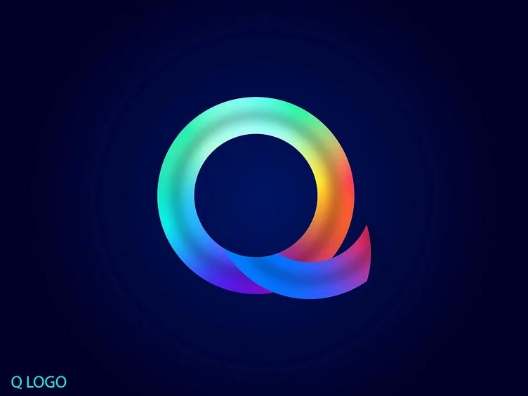
The recent collection of 50+ creative lettermarks showcases the diversity of this approach. From the sharp, tech-oriented angles of a ‘Q’ logo designed by Shaud Pantho to the fluid, organic ‘H’ by Roma Korolev, the spectrum is wide.
- Negative Space Mastery: Projects like Salma’s ‘H’ lettermark demonstrate how the absence of ink can be as important as the ink itself. By carving out a shape within the letter, the designer adds a layer of intellectual discovery for the viewer.
- Abstract Merging: Designs that combine two letters—such as the ‘CD’ or ‘AG’ marks—show how monograms can bridge the gap between a single letter and a full brand name, maintaining simplicity while conveying the duality of a business.
- Sector-Specific Styling: We see that tech and SaaS companies tend to favor sharp, angular, sans-serif styles, while luxury or fashion brands lean toward high-contrast, elegant serifs.
Implications for Future Brand Identity
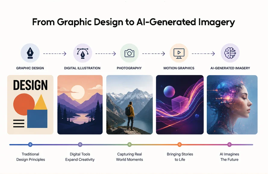
As we move toward a future dominated by AI-generated content and increasingly fragmented media, the demand for "brand shorthand" will only grow. A brand that relies on a complex, multi-element logo will find it increasingly difficult to compete for attention on wearable technology, smartwatches, and augmented reality interfaces.
The shift toward single-letter logos represents a maturation of the design industry. It signifies a move away from the "illustrative" logo style of the early 2000s toward a more symbolic, abstract, and timeless aesthetic.
Strategic Recommendations for Businesses:
- Focus on Versatility: Before finalizing your logo, place it in a 50×50 pixel box. If you cannot identify the letter, the design is too complex.
- Prioritize Monochromatic Integrity: Ensure your logo works in black and white. Color should be an additive element, not a foundational one.
- Refine the Silhouette: Think of your logo as a stamp or a silhouette. A great logo should be recognizable even if it were cut out of black paper.
Conclusion
The single-letter logo is the ultimate test of a designer’s restraint. It requires the courage to discard the unnecessary and the precision to elevate a basic typographic element into a memorable icon. As we look at the trends defining 2026 and beyond, it is evident that the most successful brands will be those that embrace this minimalist ethos. By focusing on the strength of a single character, companies can build an identity that is not only visually striking but also enduringly relevant. Whether you are a small startup or a global corporation, the path to a powerful identity often begins with just one letter.